Exercises for mastering Widgets and Menus
If you have reached this far in the course, you have already learned 80% of the important concepts in WordPress.
It’s time to get more practice.
I skipped two things completely while building the header and footer. First comes the mobile responsive menu.
So, here is your first exercise.
Exercise: Mobile Responsive Menu
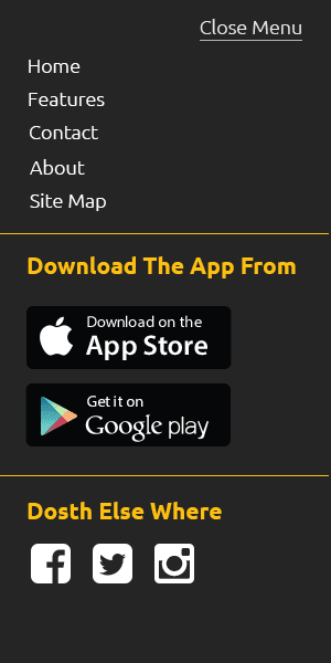
I want you to build an off-canvas menu for the Dosth Site using the Sidebar and Widget concepts.
Dosth is an App promotion website. There will be so much to promote. It is important to make proper use of the mobile screen real-estate. So, I have decided to go with an off-canvas menu.
And here is what I want you to put inside the off-canvas menu:

Photoshop mockup is available inside the exercise files.
Off-canvas menu doesn’t always have to contain just a navigation menu. You can put just about anything inside it as long as it makes sense. So, You have to use a dynamic sidebar and a number of widgets to build the content of the above mobile off-canvas element.
Exercise: Site’s responsive styles
I did not take care of Responsive Styles for the Dosth Site because this is a course about Theme Development.
You have to take care of them yourselves and after you are done with the course, I want you to submit the finished theme with responsive styles.
I saved the best for the last
In the next lesson, we will take a look at various methods to build the content of the Homepage.

 © 2026 UsableWP. A project by Naresh Devineni.