Styling the Above the Fold content of the Homepage and fixing other layout problems
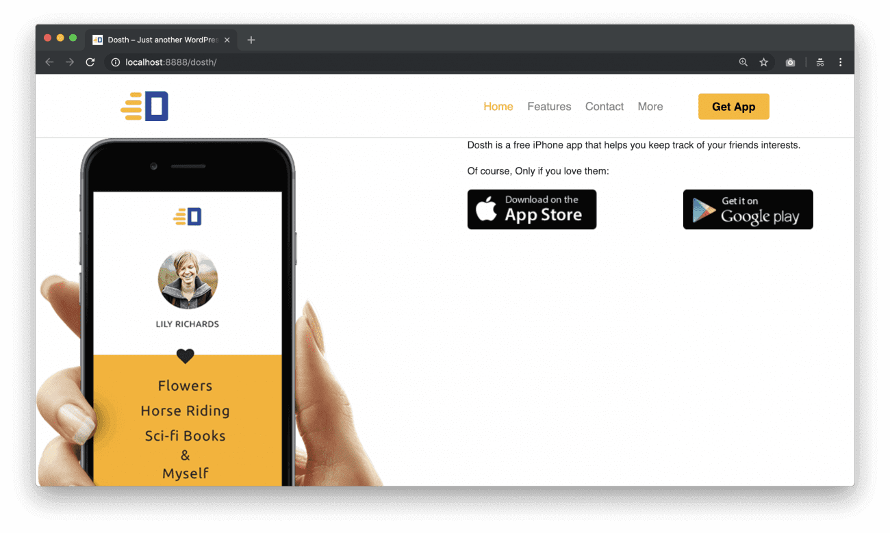
Here is how the above the fold content looks like now:
If you observe the mockup design, there is a neat pattern as the background image. And, We are already using the same background pattern for the Footer Section One. So, let’s re-use it for this section as well.
“Can’t we apply this background image using the Gutenberg Editor?”
No. We can not. As of now, we can not apply a background image to any of the Blocks.
So, open up the front-page.php file and add the “above-the-fold” class to the <div class="actual-content"> element. And wrap the_content() function inside the Bootstrap Container elements.
Here is the updated While Loop for this lesson:
<?php while( have_posts() ): ?>
    <?php the_post(); ?>
    <div class="actual-content above-the-fold">
        <div class="container">
            <div class="row">
                <div class="col-sm-12">
                    <?php the_content(); ?>
                </div>
            </div>
        </div>
    </div>
<?php endwhile; ?>
Next, add the following CSS at the end of the style.css file:
/*-------------------------------------------------------------------------------
  9.Homepage Above the Fold Styles
-------------------------------------------------------------------------------*/
.home .above-the-fold{
    background-image:url(assets/images/background-pattern.png);
}
.home .above-the-fold .introduction-text{
    margin-top:30px;
    font-size:25px;
    margin-bottom:20px;
    line-height: 1.3;
}
.app-store-image-links > div:first-child{
    margin-right:5px;
}
.app-store-image-links > div:last-child{
    margin-left:5px;
}
.app-store-image-links img{
    width:100%;
}
.secondary-color{
    color: #2e489d;
}
.home .above-the-fold .secondary-color{
    font-size:22px;
    font-weight:400;
}
@media only screen and (min-width:992px){
    .pull-me-up img{
        position:relative;
        margin-top: -80px;
        display:block;
        left: 15%;
        z-index: 1;
        max-width:500px;
    }
    .above-the-fold > div:last-child{
        position: relative;
        z-index:2;
    }
    .home .above-the-fold .introduction-text{
        font-size:30px;
        margin-top:60px;
    }
    .home .above-the-fold .introduction-text,
    .home .above-the-fold .secondary-color,
    .home .above-the-fold .app-store-image-links{
        margin-left:15%;
    }
}
@media only screen and (max-width:991px){
    .pull-me-up img{
        margin-top:40px;
    }
    .app-store-image-links img{
        width:180px;
    }
}
@media only screen and (min-width:768px) and (max-width:991px){
    .above-the-fold .has-2-columns:not(.app-store-image-links){
        -ms-flex-wrap: nowrap;
            flex-wrap: nowrap;
    }
}
@media only screen and (max-width:991px){
    .app-store-image-links{
        -ms-flex-wrap: nowrap;
            flex-wrap: nowrap;
    }
}
Here is the updated Outline of CSS styles inside the style.css file:
The problem with the Gutenberg editor is, the Column Blocks are not fully responsive. Although WordPress took care of styles for the Desktop and the Mobile, it does not handle the styles for the tablets. So, we have added the responsive styles ourselves for the tablets.
After adding the above styles, here is how the Homepage looks on Desktop:
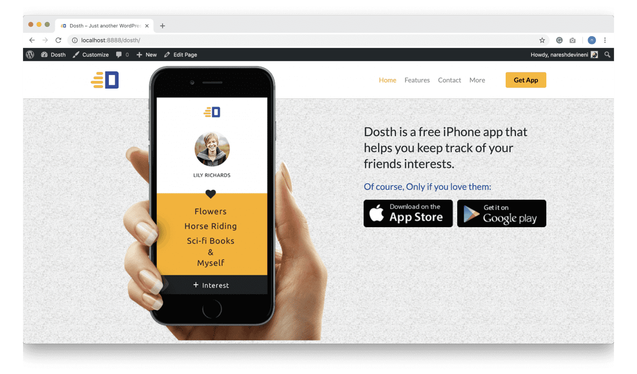
I can see two problems right now. Observe the below mockup.
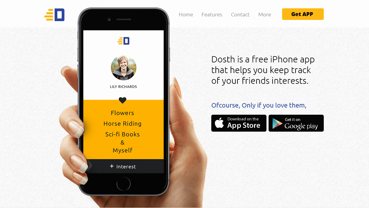
First of all, the designer used Ubuntu Light and Ubuntu Regular fonts, but we are still using some other font stack.
Next, there is a very small amount of gap between the Navigation and the iPhone image. But if you observe the header in the browser, there is a huge gap between them. The problem is, in mockup the content is restricted to 960px but in our case, since we are using Bootstrap, the content width is 1140px wide.
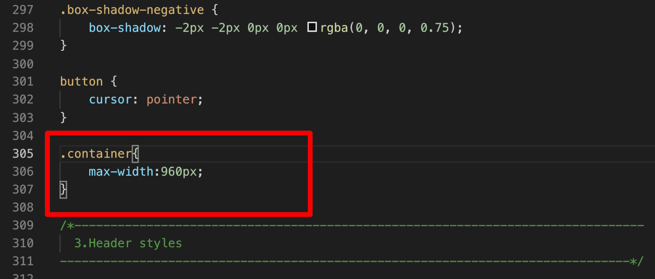
So, let’s fix it right away by adding the following code at the end of the General Styles section of the style.css file:
.container{
    max-width:960px;
}
Now if we refresh the Homepage in the browser, the output looks closer to the mockup. Fantastic.

Unfortunately, there is a negative side-effect because of this change! If you scroll down to the Footer, the footer menu is no longer neatly fitting inside a single line.
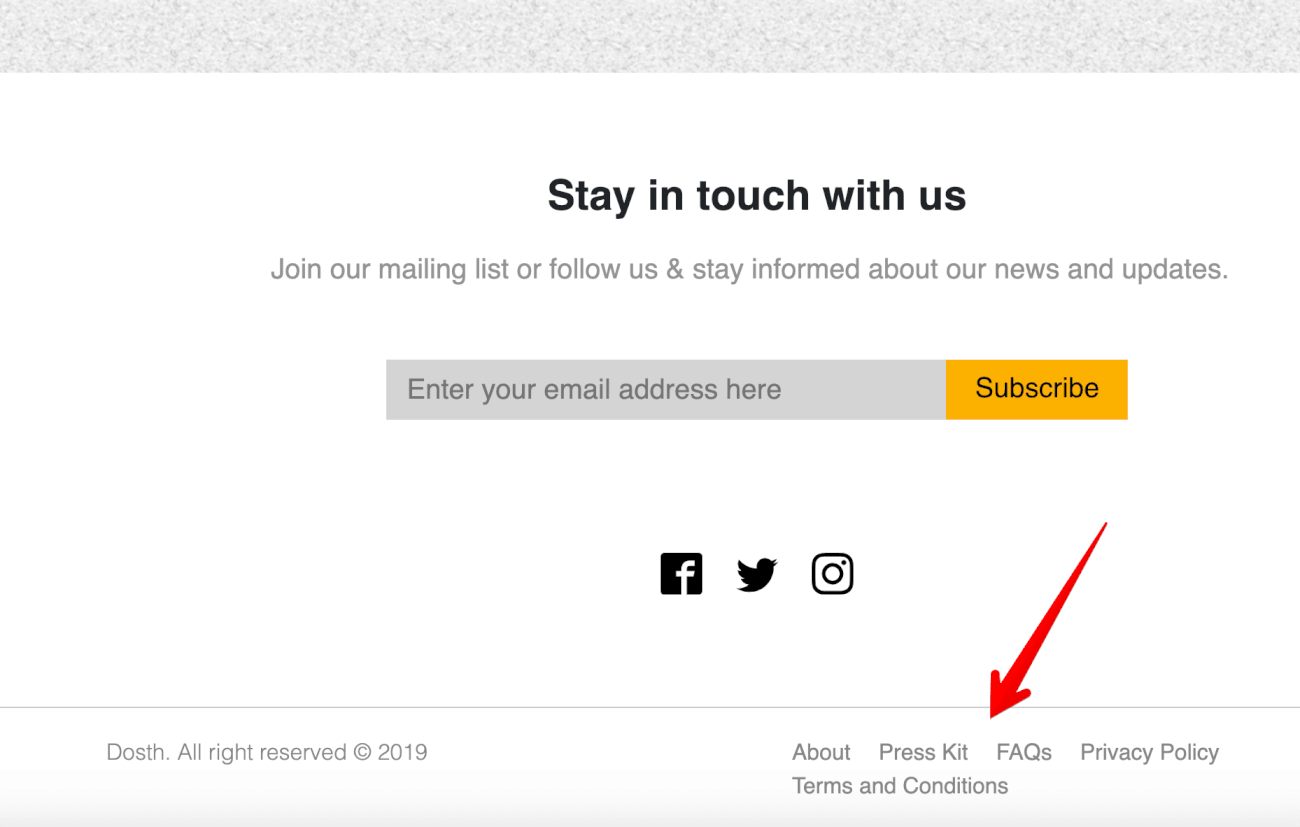
There are three ways to fix this:
- Reduce the font size of the Links so that they fit in single Line (Not always possible)
- Remove a link
- Re-word the name of a link
Again, there is no one right method. It all depends on the situation. I usually remove a Link to fix this issue by telling the client that:
“Hi! there is not enough room for five links inside the footer, so, please pick a link that is ok to remove from the footer, or else please adjust the design of the footer so that it accommodates five links”.
Most of the time, Client agrees to remove the Link, Some time they want us to just adjust the Wording of the links in the footer.
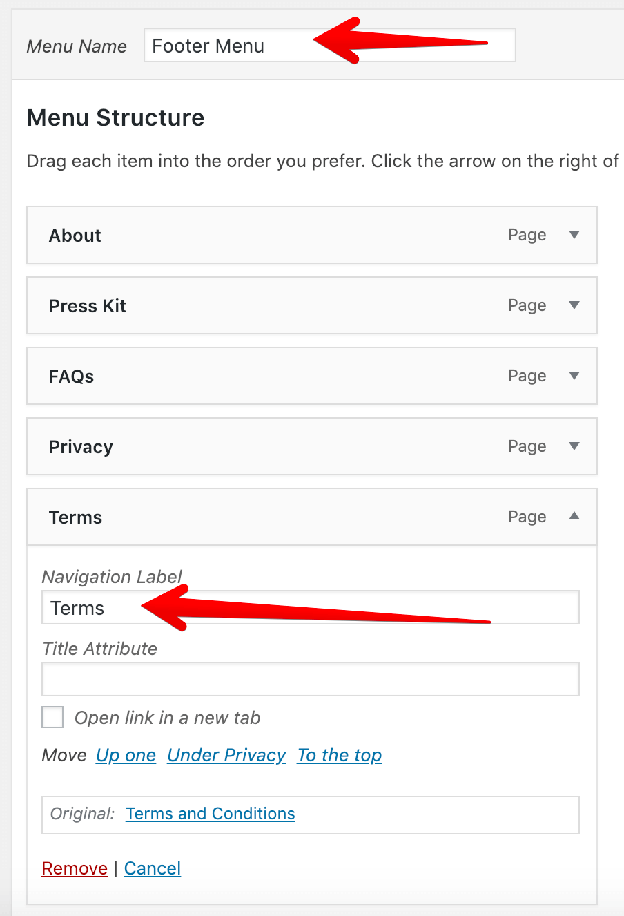
In our case, I am gonna adjust the wording of:
- Privacy Policy -> Privacy
- Term and Conditions -> Terms
Remember, we don’t have to the change the Title of the Pages to changing the Wording for menus, instead, we just have to temporarily modify navigation labels of the above-mentioned links inside “Footer Menu” using the Menus Panel.
So, go to Admin Dashboard -> Appearance -> Menus -> Footer menu and adjust the Wording, like this:
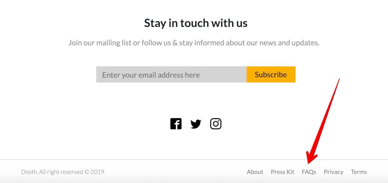
Now everything is fitting nicely inside a single line.
Anyway, we are not quite there yet! Because of the font, the site is looking totally different from the mockup. So, In the next lesson, we will fix this problem by learning how to add Google Fonts to our site.
 © 2026 UsableWP. A project by Naresh Devineni.