
How to Create an Expense Tracker Dashboard in Excel (Step-by-Step Guide With Formulas)

Most expense tracker templates look nice until you add a new category or a new month, and then something breaks. In this tutorial, you will build your own expense tracker dashboard in Microsoft Excel, starting from a blank workbook. No macros, no add-ins and no paid templates. By the end, you will pick a month from a dropdown and every number, table and chart on the dashboard will update on its own.
I built this on a MacBook Pro using Microsoft Excel for Mac (Microsoft 365), so the screenshots are from the Mac version. Every step works the same way in Excel for Windows. Wherever the menu path or keyboard shortcut is different, I have mentioned both.
What You Will Build
The finished workbook has four sheets:
- Transactions: where you log every expense. It is an Excel Table, so it grows automatically as you add rows.
- Budget: your monthly spending limit for each category.
- Lists: the payment methods and months that feed the dropdown menus.
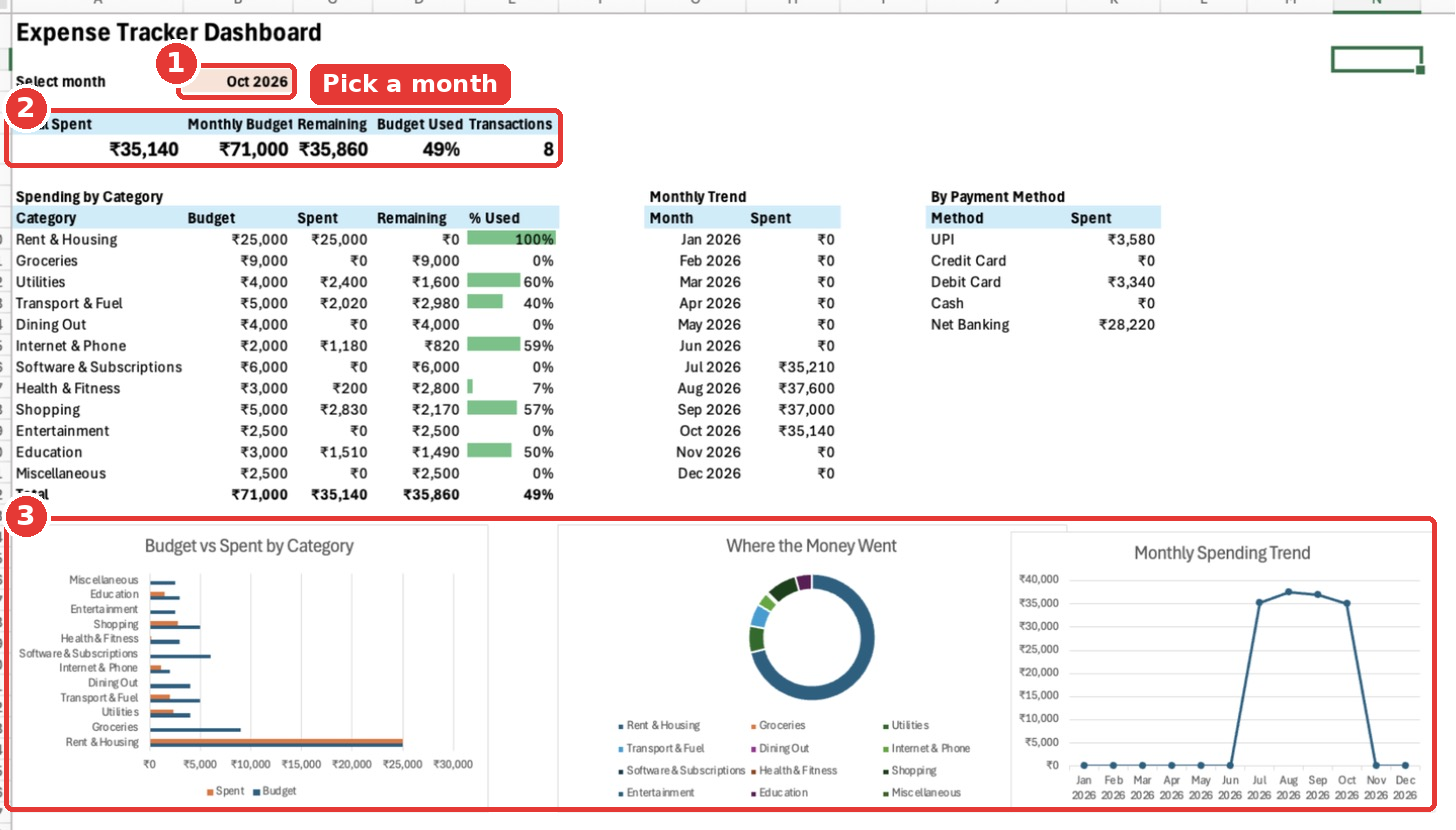
- Dashboard: a month selector, five summary cards, a category-wise budget table with progress bars, a monthly trend table, a payment method table and three charts.
What You Need
- Microsoft Excel 2019, Excel 2021 or Microsoft 365 (Windows or Mac). The formulas also work in Excel 2010 and later.
- About 45 minutes.
- Basic comfort with typing a formula into a cell. I will explain every formula in plain English.
Tip: Follow along with the same sample data I use. Once everything works, you can delete the sample rows and start adding your own expenses.
Step 1: Create a New Workbook and Set Up Four Sheets
Open Excel and create a blank workbook (File → New Blank Workbook, or press Cmd + N on Mac / Ctrl + N on Windows). You will see one sheet called Sheet1.
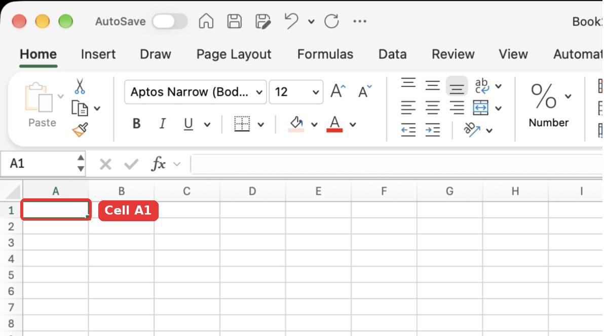
- Double-click the Sheet1 tab at the bottom, type
Transactionsand press Enter. - Click the + button next to the tab to add a new sheet. Double-click it and rename it to
Budget. - Add another sheet and rename it to
Lists. - Add one more sheet and rename it to
Dashboard.
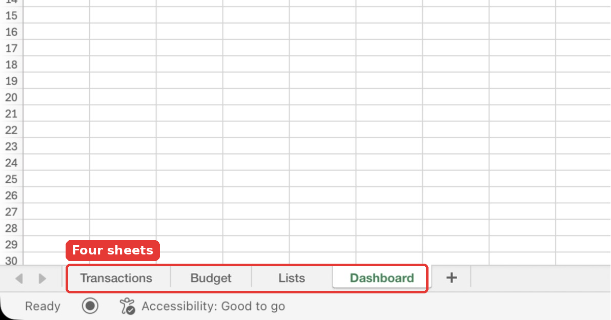
Keeping your raw data, settings and dashboard on separate sheets is the single best habit for any Excel tracker. It keeps the dashboard clean and makes the formulas easy to follow.
Tip: Set the zoom to 150% (View → Zoom) on each sheet while you build. Bigger text makes formulas easier to read and mistakes easier to spot. Excel remembers the zoom per sheet.
Step 2: Add the Column Headers on the Transactions Sheet
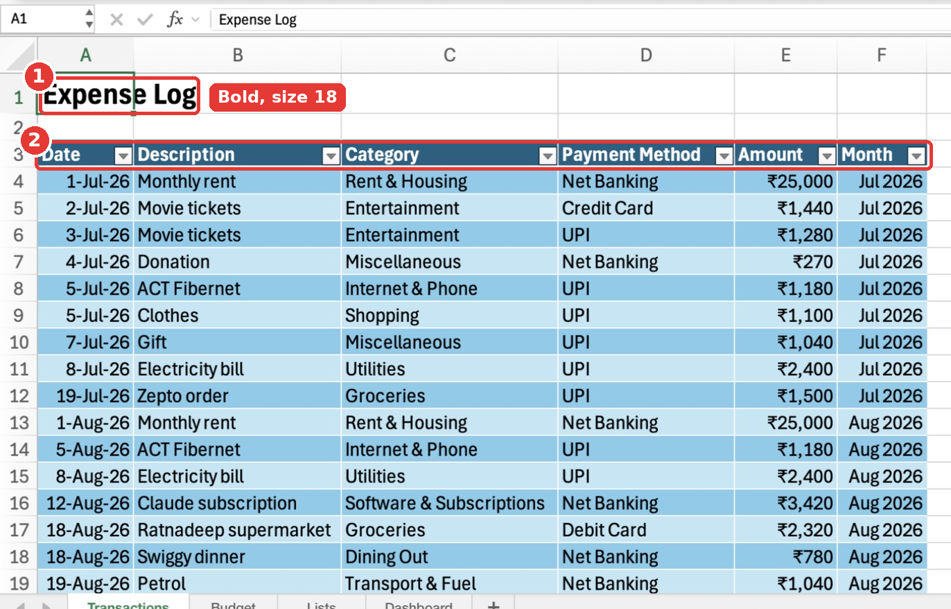
Click the Transactions tab. In cell A1, type Expense Log. Leave row 2 empty, and type these headers in row 3:
| Cell | Header |
|---|---|
| A3 | Date |
| B3 | Description |
| C3 | Category |
| D3 | Payment Method |
| E3 | Amount |
| F3 | Month |
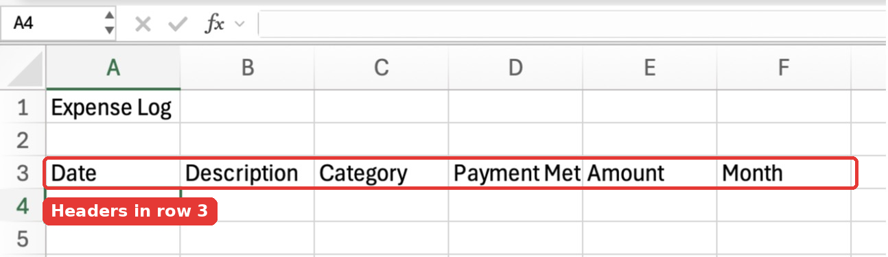
The first five columns are what you type for every expense. The Month column is a helper column that Excel fills in for you. The dashboard uses it to group expenses by month.
Step 3: Enter Your Expenses
Starting from row 4, type one expense per row. Type dates like 1-Oct-2026 so Excel recognises them as real dates (they will line up on the right side of the cell). Type amounts as plain numbers without the ₹ symbol, for example 25000. We will add the currency format in a later step.
For this tutorial, I entered 35 sample expenses from July to October 2026, covering rent, groceries, bills, subscriptions and so on.
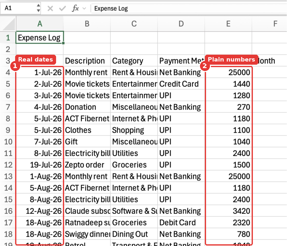
Notice that Excel shows the dates as 1-Jul-26 even though I typed 1-Jul-2026. That is just Excel’s default display. The full date is stored behind the scenes, so you don’t need to change anything.
Tip: Spell each category exactly the same way every time. “Groceries” and “Grocery” are two different categories for Excel. Don’t worry, in Step 10 we will add dropdowns so you never have to type a category again.
Step 4: Add the Month Helper Formula
Click cell F4 and type this formula:
=IF(A4="","",DATE(YEAR(A4),MONTH(A4),1))Here is what it does, piece by piece:
YEAR(A4)andMONTH(A4)pull the year and month out of the date in A4.DATE(year, month, 1)builds a new date for the 1st of that month. So 18-Aug-2026 becomes 1-Aug-2026, and every August expense gets the same Month value.IF(A4="","",…)keeps the cell empty when there is no date, so you don’t get odd results on blank rows.
Now copy the formula down. Select F4:F38 (you can type F4:F38 in the Name Box at the top-left and press Enter), then press Cmd + D on Mac or Ctrl + D on Windows to fill down.
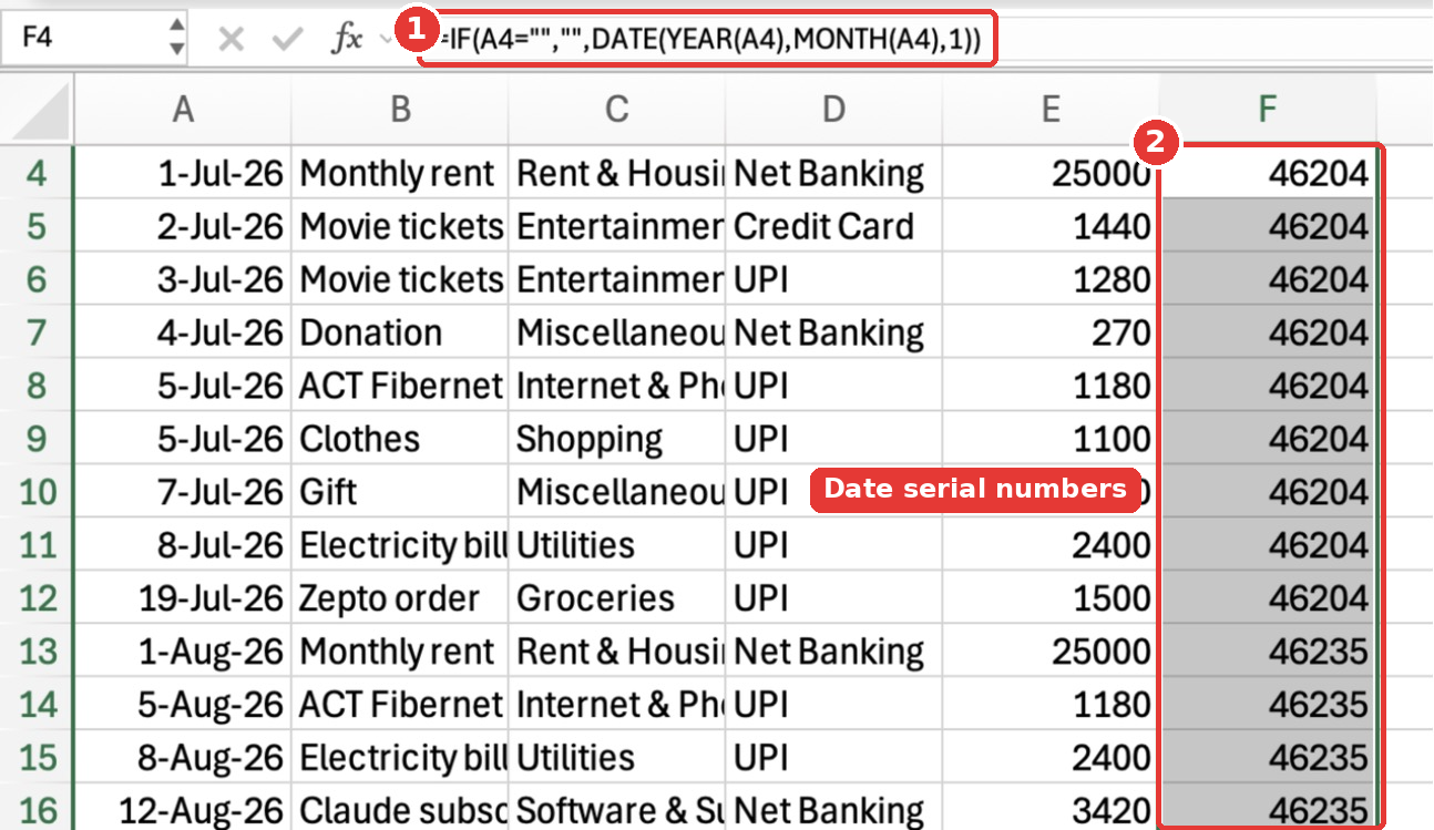
Don’t panic when you see numbers like 46204. That is how Excel stores dates internally (46204 is 1-Jul-2026). Let’s format them so they look like months.
Step 5: Format the Month and Amount Columns
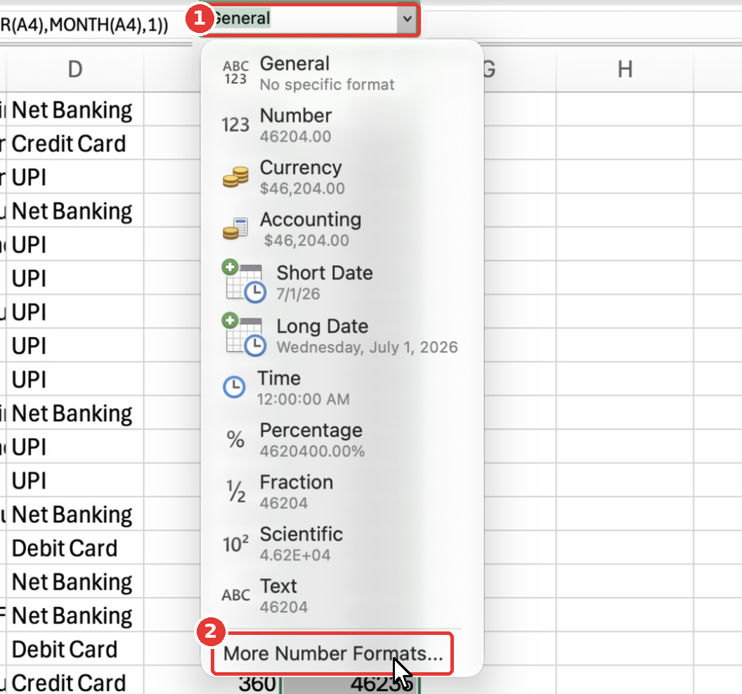
With F4:F38 still selected, open the number format dropdown on the Home tab and choose More Number Formats… at the bottom of the list. If your Excel window is narrow, the dropdown may be hidden inside a Number button, so click that first. On Windows, you can also press Ctrl + 1; on Mac, Cmd + 1.
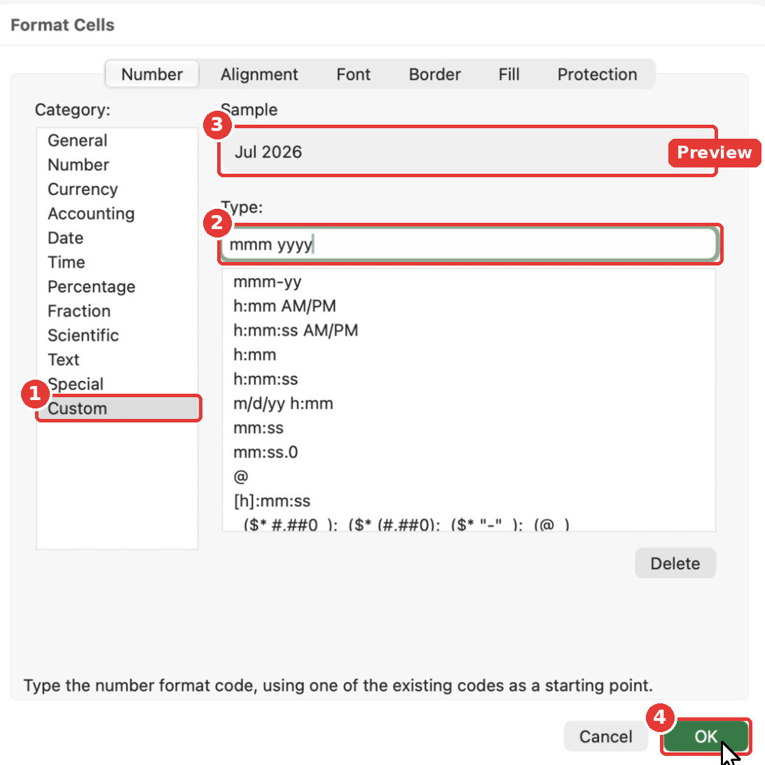
In the Format Cells dialog, pick Custom from the Category list, type mmm yyyy in the Type box and click OK. The Sample preview shows “Jul 2026”.
Now do the same for the Amount column. Select E4:E500 (formatting extra rows now saves time later), open Format Cells → Custom again, and type this format code:
"₹"#,##0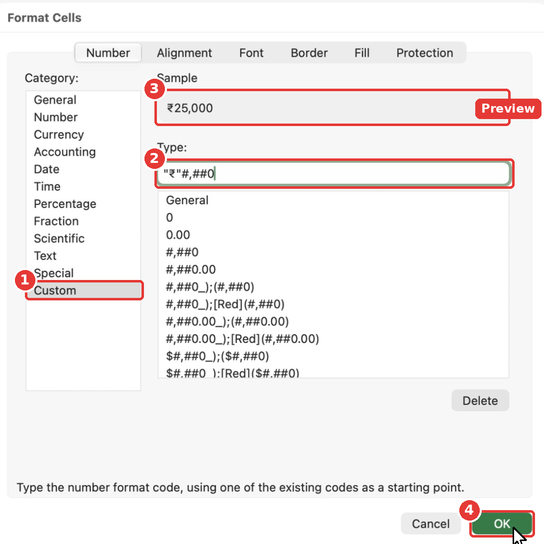
The part inside the quotes is shown as it is, and #,##0 adds thousands separators with no decimals. If you use another currency, replace ₹ with $, € or £.
Want lakh-style grouping (₹1,00,000)? Use this custom format instead: [>=10000000]"₹"##\,##\,##\,##0;[>=100000]"₹"##\,##\,##0;"₹"##,##0
Step 6: Convert the Expense Log Into an Excel Table
This is the step most beginners skip, and it is the reason their trackers break. An Excel Table grows automatically when you add a new row, copies your Month formula to the new row on its own, and lets every dashboard formula refer to columns by name.
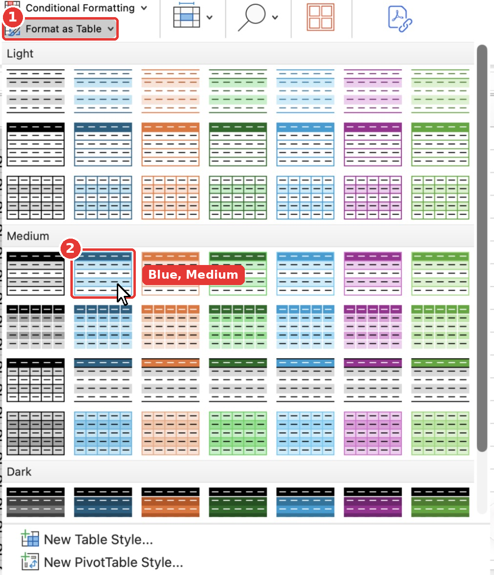
- Select A3:F38 (the headers plus all the data).
- On the Home tab, click Format as Table and pick a style. I used a blue Medium style.
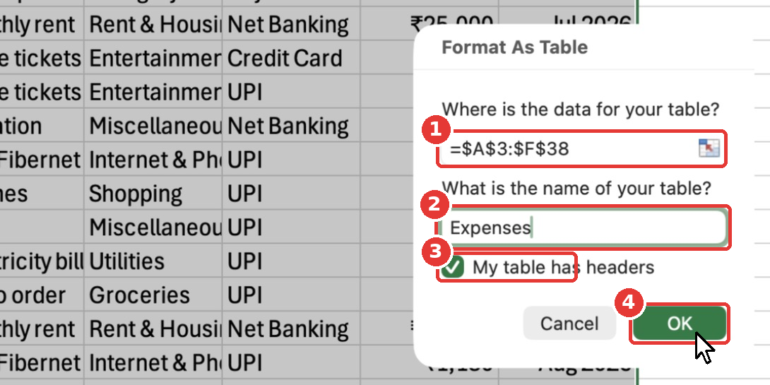
- In the Format As Table dialog, check that the range is
=$A$3:$F$38and that My table has headers is ticked. - Change the table name to
Expenses. (On Windows, you rename the table after creating it, in the Table Name box on the Table Design tab.) - Click OK.
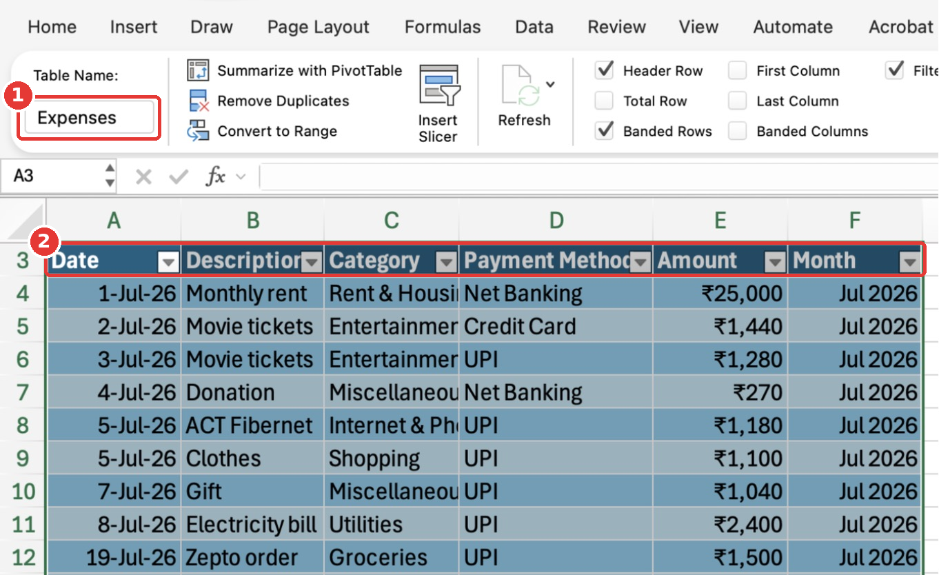
You now have filter buttons on every header and banded rows. The new Table tab shows the table name Expenses. We will use this name in every dashboard formula.
Step 7: Auto-Fit the Columns and Style the Title
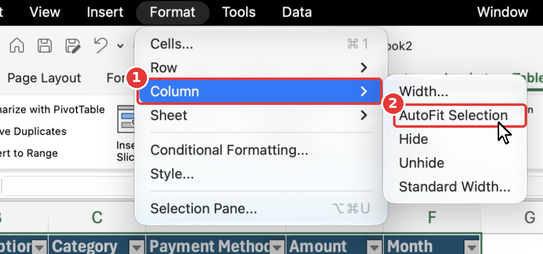
Some text is cut off, so let’s fix the column widths. With the table still selected, go to Format → Column → AutoFit Selection on Mac. On Windows, it is Home → Format → AutoFit Column Width. You can also double-click the border between two column letters.
Finally, click A1, make it Bold (Cmd + B / Ctrl + B) and set the font size to 18. Your Transactions sheet is ready.
Step 8: Build the Lists Sheet
The Lists sheet holds the values your dropdowns will use. Click the Lists tab and type:
- A1:
Payment Methods, thenUPI,Credit Card,Debit Card,CashandNet Bankingin A2 to A6. - B1:
Months, then1-Jan-2026,1-Feb-2026and so on until1-Dec-2026in B2 to B13.
Select B2:B13 and apply the same mmm yyyy custom format from Step 5. Make the headers bold and auto-fit the columns.
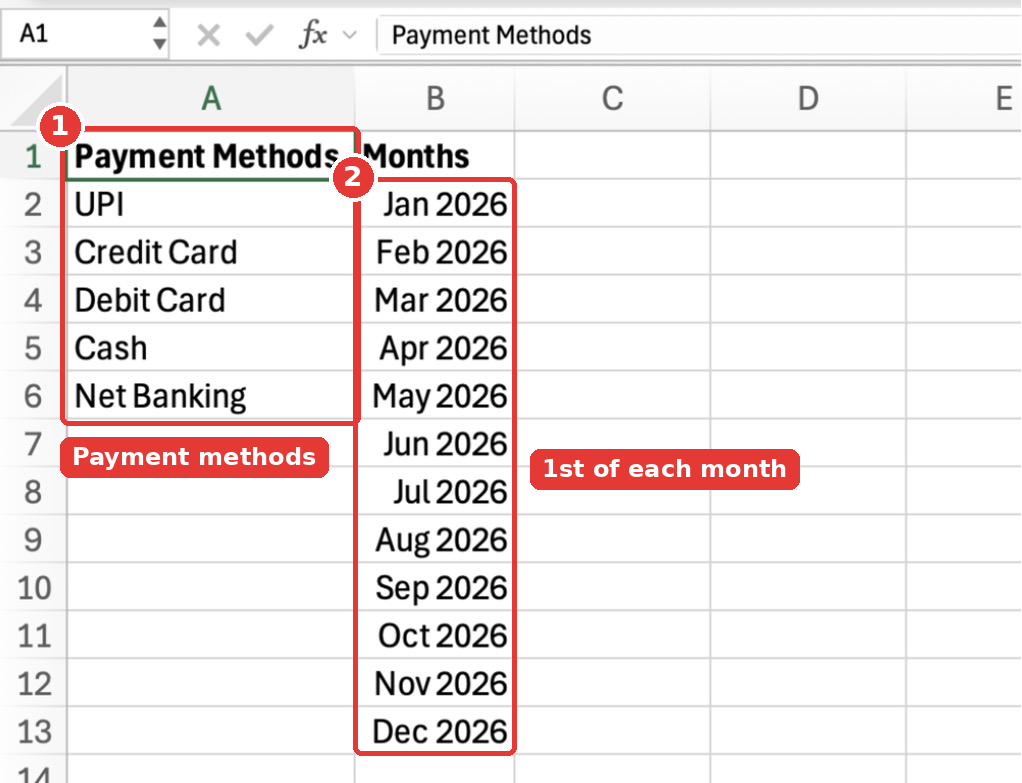
Important: The months must be the 1st of each month. That is exactly what the Month helper formula produces, so the two will match perfectly.
Step 9: Build the Budget Sheet
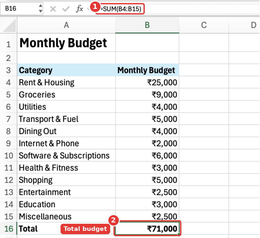
Click the Budget tab. In A1, type Monthly Budget. In row 3, type the headers Category and Monthly Budget. Then list your categories in A4:A15 with a budget amount next to each one:
| Category | Monthly Budget |
|---|---|
| Rent & Housing | 25000 |
| Groceries | 9000 |
| Utilities | 4000 |
| Transport & Fuel | 5000 |
| Dining Out | 4000 |
| Internet & Phone | 2000 |
| Software & Subscriptions | 6000 |
| Health & Fitness | 3000 |
| Shopping | 5000 |
| Entertainment | 2500 |
| Education | 3000 |
| Miscellaneous | 2500 |
In A16, type Total, and in B16 add up all the budgets:
=SUM(B4:B15)Apply the "₹"#,##0 format to B4:B16, make the title, headers and total row bold, and give the header row a light fill colour from the Fill Color button on the Home tab.
Step 10: Add Dropdown Lists for Category and Payment Method
Dropdowns stop typos and keep your data clean. Go back to the Transactions sheet and select the Category cells C4:C38.
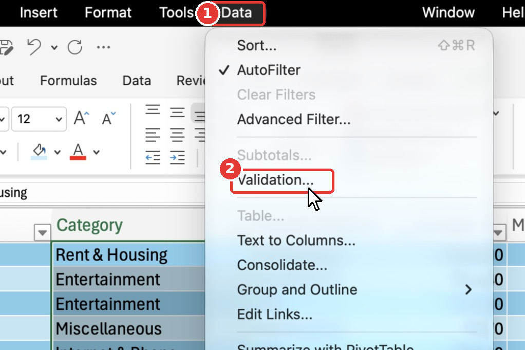
Open Data → Validation… from the menu bar on Mac. On Windows, go to the Data tab and click Data Validation.
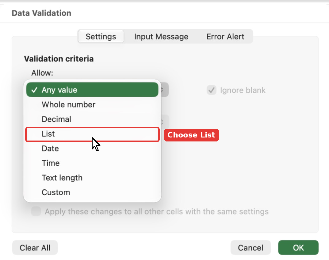
In the Settings tab, open the Allow dropdown and choose List.
In the Source box, type the reference to your categories and click OK:
=Budget!$A$4:$A$15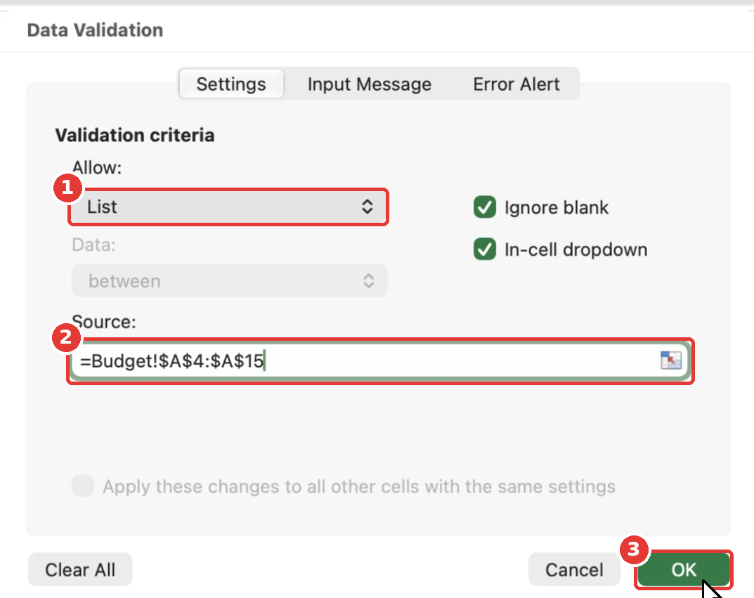
Repeat for the Payment Method column. Select D4:D38, open Data Validation, choose List and use this source:
=Lists!$A$2:$A$6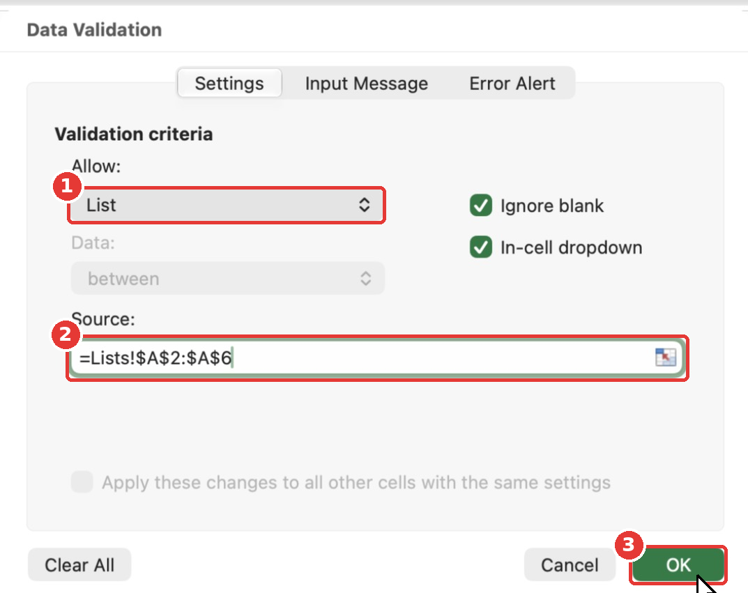
Now click any Category cell and you will see a small arrow. Click it to pick a category from the list.
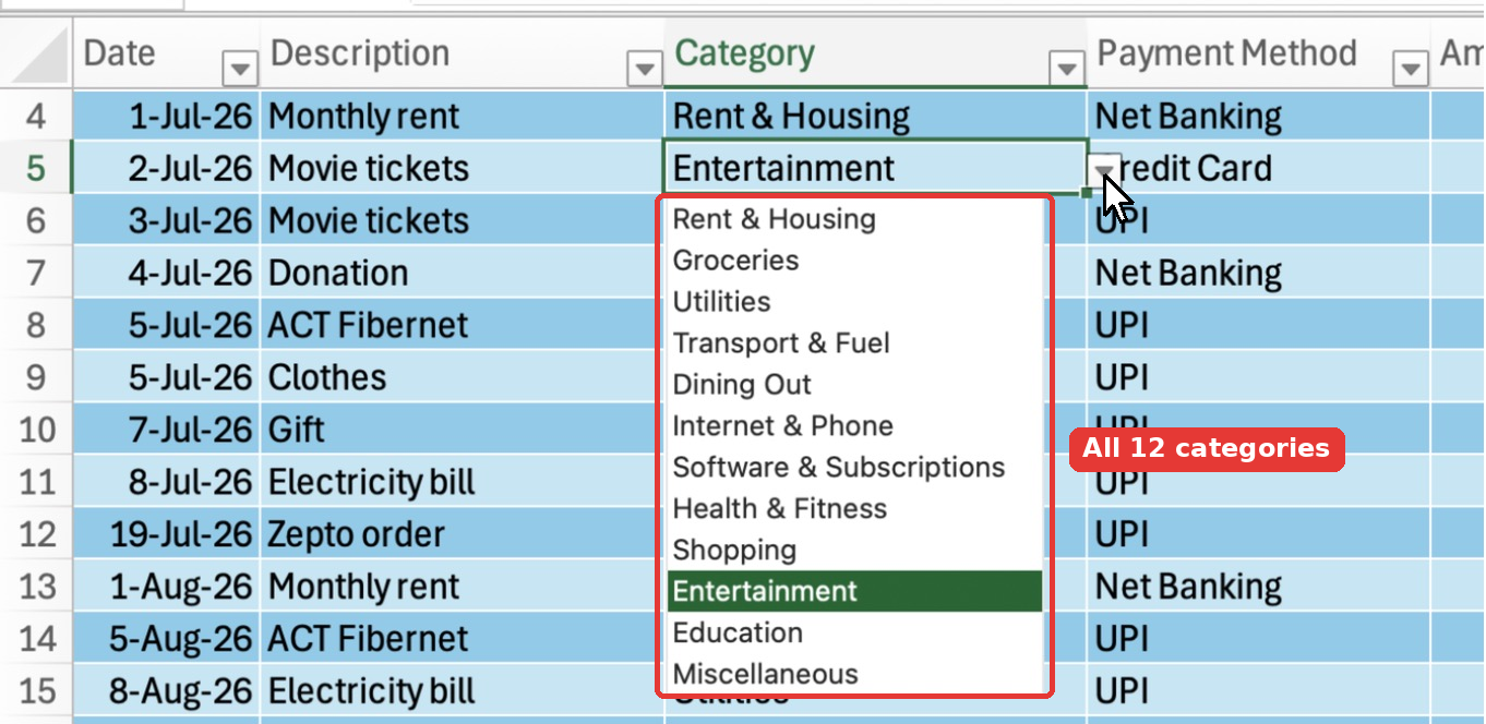
Because the column is part of an Excel Table, new rows you add at the bottom get the same dropdown automatically.
Step 11: Lay Out the Dashboard Sheet
Now for the fun part. Click the Dashboard tab and type the following:
| Cell | What to type |
|---|---|
| A1 | Expense Tracker Dashboard |
| A3 | Select month |
| B3 | 1-Oct-2026 |
| A5 | Total Spent |
| B5 | Monthly Budget |
| C5 | Remaining |
| D5 | Budget Used |
| E5 | Transactions |
B3 is your month selector. Every formula on this sheet will read the month from this one cell. Always enter the 1st of the month here, because that is how the Month helper column stores months.
Step 12: Add the Summary Card Formulas
Row 6 holds the five numbers that sit at the top of the dashboard. Type these formulas in A6 to E6:
| Cell | Formula | What it shows |
|---|---|---|
| A6 | =SUMIFS(Expenses[Amount],Expenses[Month],$B$3) | Total spent in the selected month |
| B6 | =Budget!B16 | Total monthly budget from the Budget sheet |
| C6 | =B6-A6 | How much budget is left |
| D6 | =IFERROR(A6/B6,0) | Percentage of the budget used |
| E6 | =COUNTIFS(Expenses[Month],$B$3) | Number of expenses in the month |
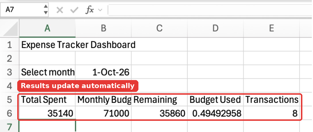
Don’t worry about the raw numbers like 35140 and 0.49492958 in the screenshot. They will look like ₹35,140 and 49% once we format them in Step 16.
Let’s understand the two important ones.
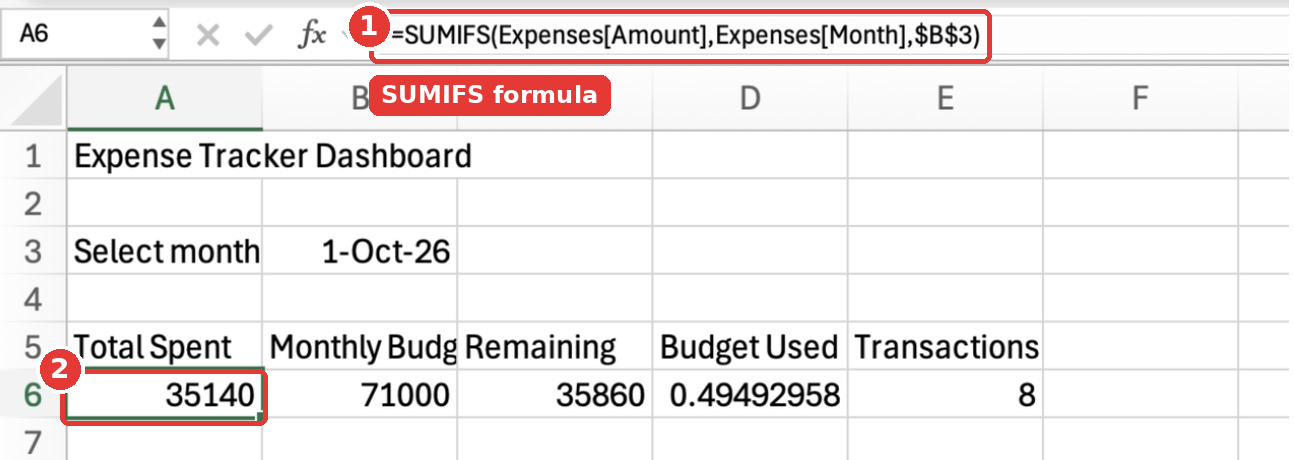
SUMIFS adds up numbers that match one or more conditions:
=SUMIFS(Expenses[Amount],Expenses[Month],$B$3)Expenses[Amount]is the column to add up: the Amount column of the Expenses table.Expenses[Month]is the column to check.$B$3is the value to match: the month you picked. The dollar signs lock the reference, so it doesn’t shift when you copy the formula.
In plain English: “Add up every Amount where the Month is October 2026.” Notice how readable Expenses[Amount] is compared to Transactions!$E$4:$E$38. That is the benefit of converting your data into a table in Step 6. And because the table grows, this formula picks up new expenses automatically.
COUNTIFS works the same way, but it counts rows instead of adding them:
=COUNTIFS(Expenses[Month],$B$3)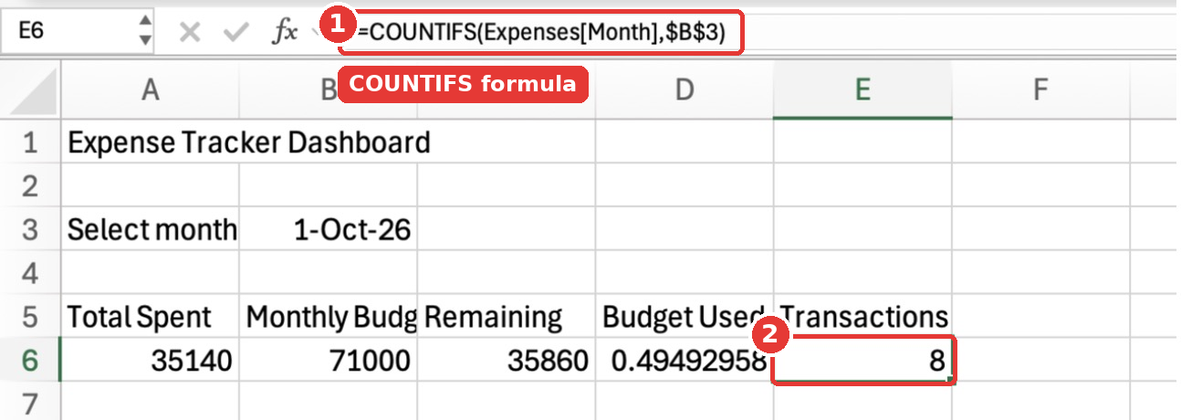
IFERROR in D6 is a safety net. If the budget is ever 0, dividing by it gives a #DIV/0! error. IFERROR shows 0 instead.
Step 13: Build the Spending by Category Table
This table compares your budget and actual spending for every category. In A8, type Spending by Category. In A9:E9, type the headers Category, Budget, Spent, Remaining and % Used.
Now type the formulas for the first category in row 10:
| Cell | Formula |
|---|---|
| A10 | =Budget!A4 |
| B10 | =Budget!B4 |
| C10 | =SUMIFS(Expenses[Amount],Expenses[Category],A10,Expenses[Month],$B$3) |
| D10 | =B10-C10 |
| E10 | =IFERROR(C10/B10,0) |
The formula in C10 is SUMIFS with two conditions: the Category must match the name in A10, and the Month must match the selected month. You can add up to 127 condition pairs in SUMIFS.
=SUMIFS(Expenses[Amount],Expenses[Category],A10,Expenses[Month],$B$3)Now fill these down for all 12 categories. Select A10:E21 and press Cmd + D (Mac) or Ctrl + D (Windows). Excel adjusts A4 to A5, A10 to A11 and so on, while $B$3 stays locked.
Finally, add a total row in row 22:
| Cell | Formula |
|---|---|
| A22 | Total |
| B22 | =SUM(B10:B21) |
| C22 | =SUM(C10:C21) |
| D22 | =SUM(D10:D21) |
| E22 | =IFERROR(C22/B22,0) |
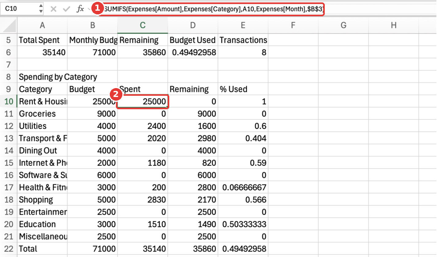
Quick check: The Spent total in C22 should match Total Spent in A6. If it doesn’t, some expenses have a category that is not in your Budget list (usually a spelling mistake).
Step 14: Build the Monthly Trend Table
This table shows your total spending for every month of the year. It ignores the month selector on purpose, because we want the whole year for the trend chart.
In G8, type Monthly Trend. In G9 and H9, type Month and Spent. Then in row 10:
| Cell | Formula |
|---|---|
| G10 | =Lists!B2 |
| H10 | =SUMIFS(Expenses[Amount],Expenses[Month],G10) |
Select G10:H21 and fill down with Cmd + D / Ctrl + D to get all 12 months.
Watch out for AutoComplete: When I typed “Month” in G9, Excel suggested “Monthly Trend” from the cell above and completed it when I pressed Tab. If that happens to you, press Delete to remove the suggestion before pressing Enter.
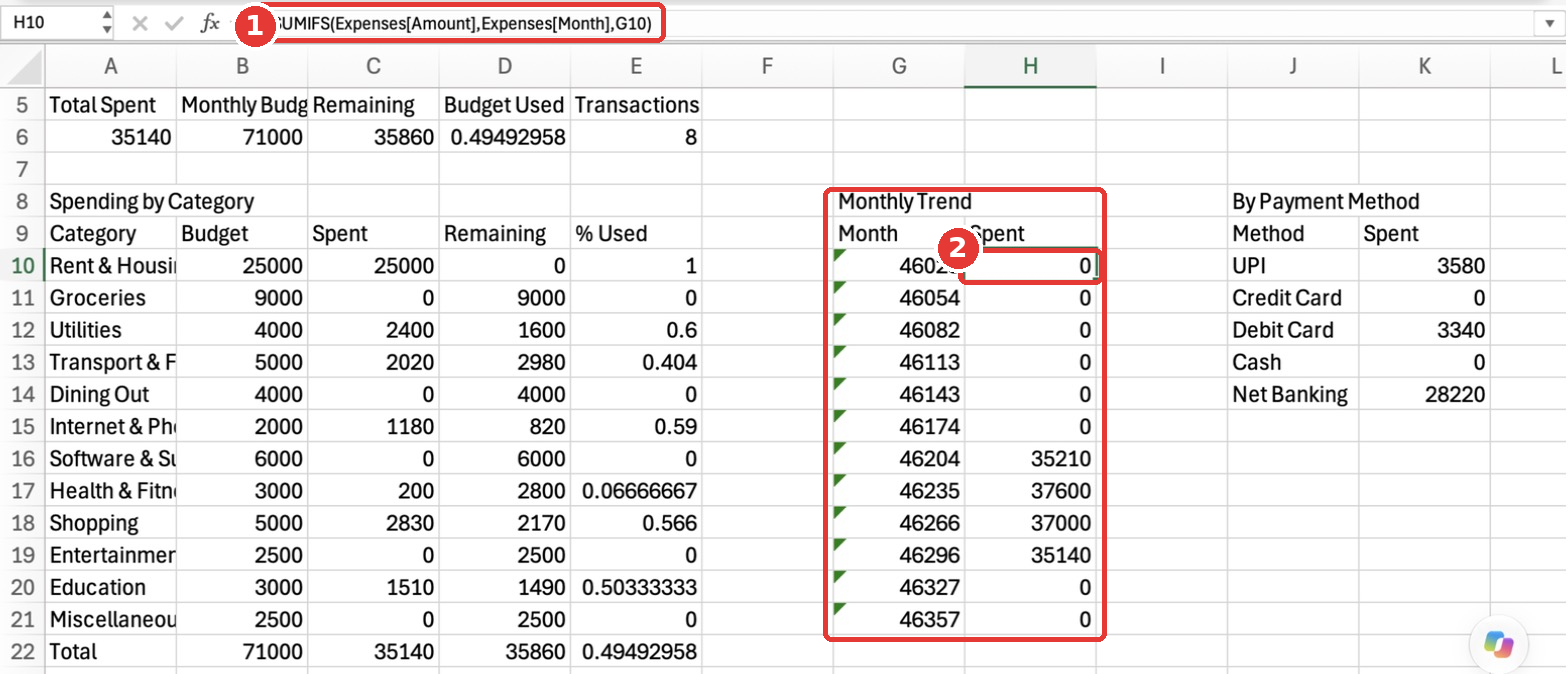
For now, the Month column shows numbers like 46023, and Excel may add small green triangles in the corner of those cells. Both are normal. The numbers turn into month names in Step 16, and you can safely ignore the green triangles.
Step 15: Build the Payment Method Table
This table shows how you paid for things in the selected month. In J8, type By Payment Method, and in J9 and K9, type Method and Spent. Then in row 10:
| Cell | Formula |
|---|---|
| J10 | =Lists!A2 |
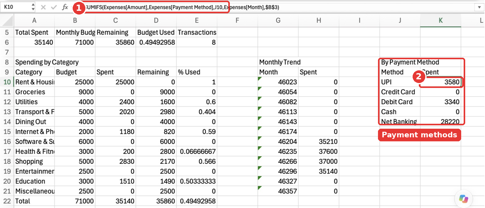
| K10 | =SUMIFS(Expenses[Amount],Expenses[Payment Method],J10,Expenses[Month],$B$3) |
Select J10:K14 and fill down. Notice that the column name has a space in it, Expenses[Payment Method], and that is perfectly fine inside the square brackets.
Step 16: Format the Dashboard Numbers
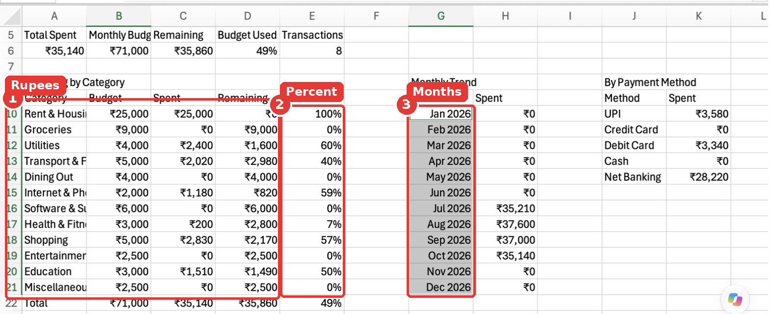
Here is a time-saving trick. You can select several ranges at once by typing them in the Name Box separated by commas. Click the Name Box, type this and press Enter:
A6:C6,B10:D22,H10:H21,K10:K14Now apply the "₹"#,##0 custom format once, and all the money cells are formatted together. Repeat the trick for the other two formats:
- Percentages: select
D6,E10:E22and use the custom format0%. - Months: select
B3,G10:G21and use the custom formatmmm yyyy.
Step 17: Turn B3 Into a Month Selector Dropdown
Right now, you have to type a date in B3 to change the month. Let’s make it a dropdown. Select B3, open Data Validation (Data tab → Data Validation), choose List and enter this source:
=Lists!$B$2:$B$13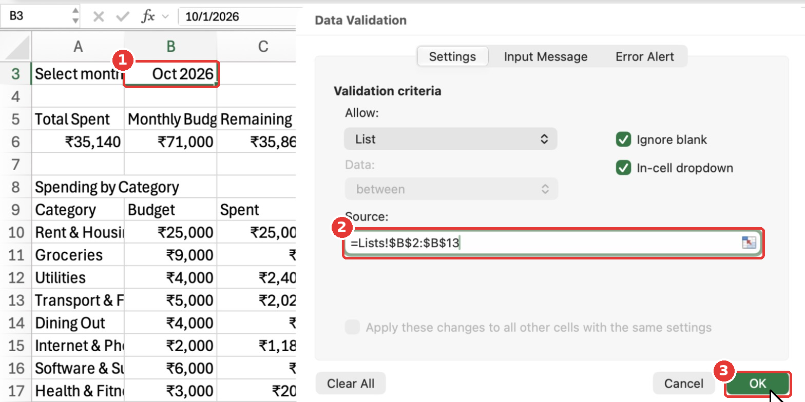
Click OK. B3 now shows a small arrow, and you can pick any month from January to December 2026.
Step 18: Style the Dashboard
A little formatting makes the dashboard much easier to read. Here is what I did:
- Title (A1): Bold, font size 20.
- Labels and headers (A1, A3, B3, A5:E5, A8, G8, J8, A9:E9, G9:H9, J9:K9, A22:E22): Bold. Use the Name Box trick to select them all at once.
- Header rows (A5:E5, A9:E9, G9:H9, J9:K9): Light blue fill from the Fill Color button.
- Month selector (B3): Bold with a light orange fill, so people know it is the one cell they should change.
- Summary values (A6:E6): Bold, font size 16, so they stand out like cards.
- Column widths: Select A5:K22 and use Format → Column → AutoFit Selection.
Step 19: Add Progress Bars With Data Bars
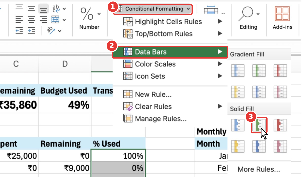
Data bars turn the % Used column into mini progress bars. Select E10:E21 (not the total row), then go to Home → Conditional Formatting → Data Bars and pick a Solid Fill colour. I used green.
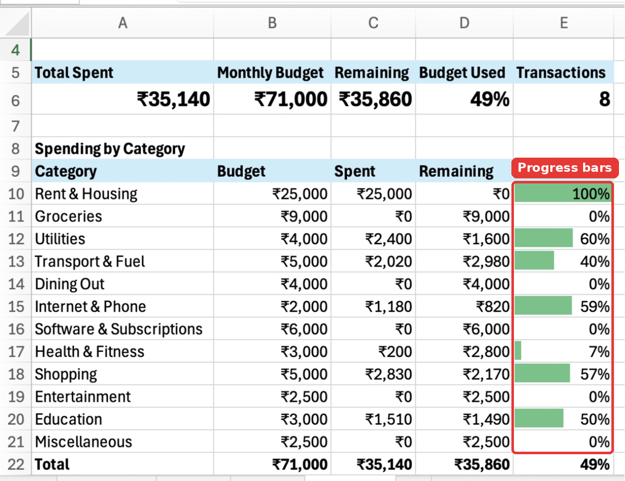
You can now see at a glance which categories are close to their limit.
Step 20: Highlight Over-Budget Categories in Red
When you spend more than the budget, the Remaining value goes negative. Let’s make those cells turn red automatically. Select D10:D21, then go to Home → Conditional Formatting → Highlight Cells Rules → Less Than…
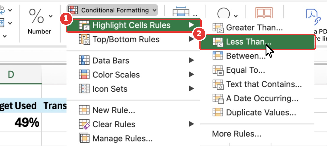
Type 0 in the value box, keep Light Red Fill with Dark Red Text and click OK.
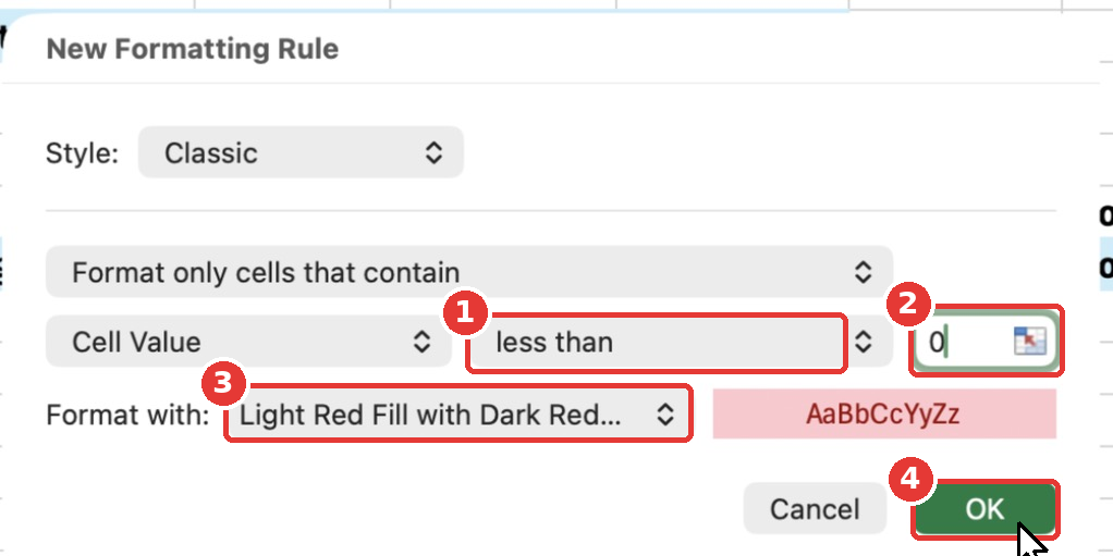
In my sample data, no category has gone over budget yet, so nothing is red. Add a big expense to any category and watch its Remaining cell turn red instantly.
Step 21: Create a Budget vs Spent Bar Chart
Select A9:C21 (Category, Budget and Spent, including the headers). Then go to the Insert tab and click Recommended Charts.
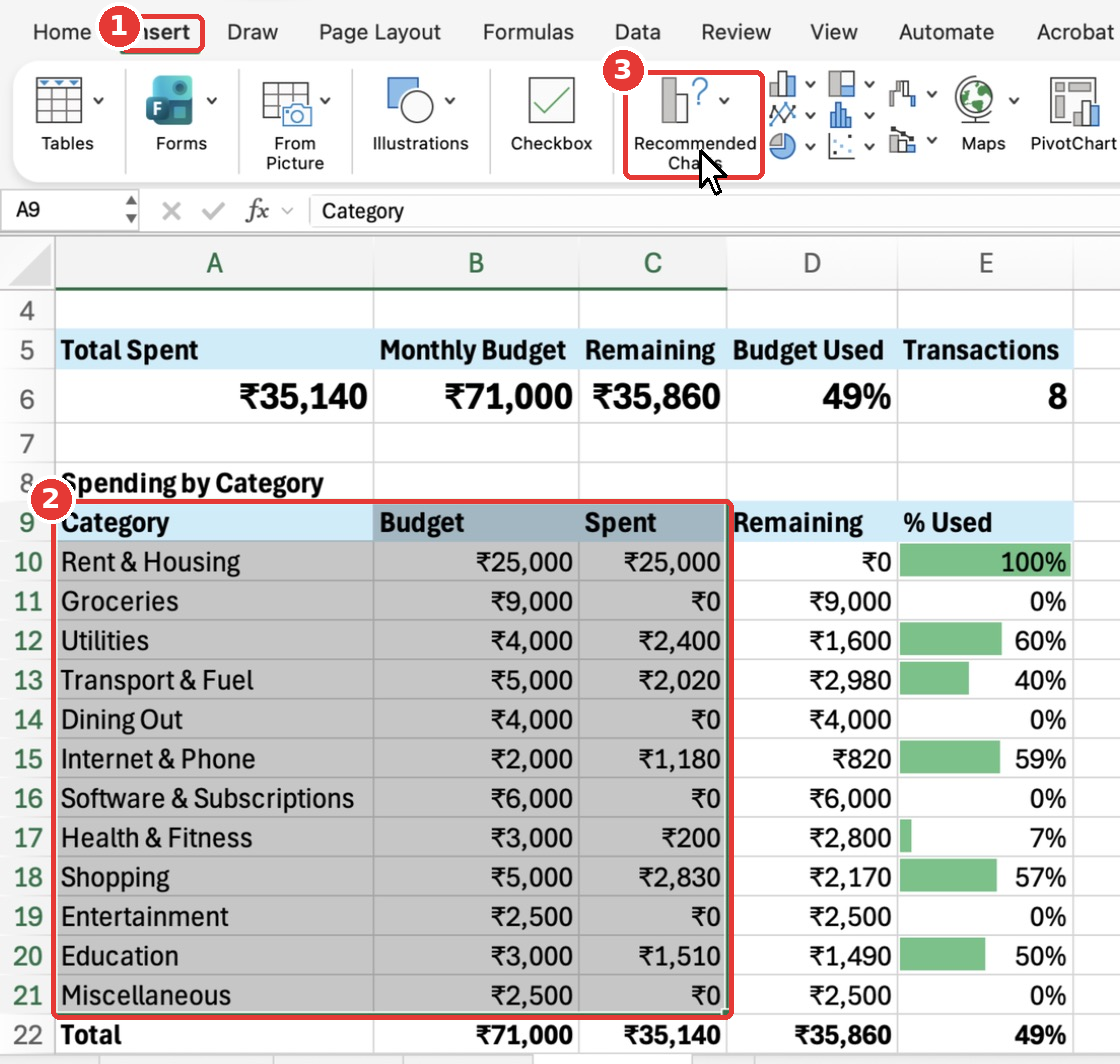
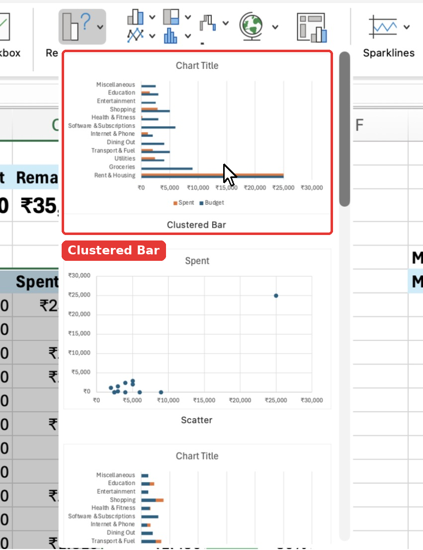
Excel suggests a few charts. Pick Clustered Bar. Horizontal bars work better than columns here because the category names are long.
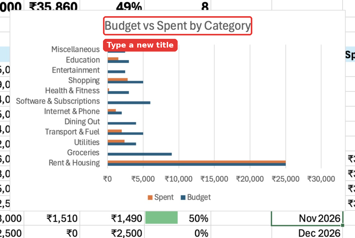
Click the chart title, select the text and type Budget vs Spent by Category.
To move the chart below the tables, click the chart border to select the whole chart, press Cmd + X / Ctrl + X, click cell A24 and press Cmd + V / Ctrl + V. You can also simply drag it.
Step 22: Create a “Where the Money Went” Doughnut Chart
A doughnut chart shows each category’s share of your spending. This time you need two columns that are not next to each other: Category and Spent.
Type A9:A21,C9:C21 in the Name Box and press Enter. (You can also select A9:A21, then hold Cmd on Mac or Ctrl on Windows and select C9:C21.)
Go to Insert, click the Pie chart button and choose Doughnut.
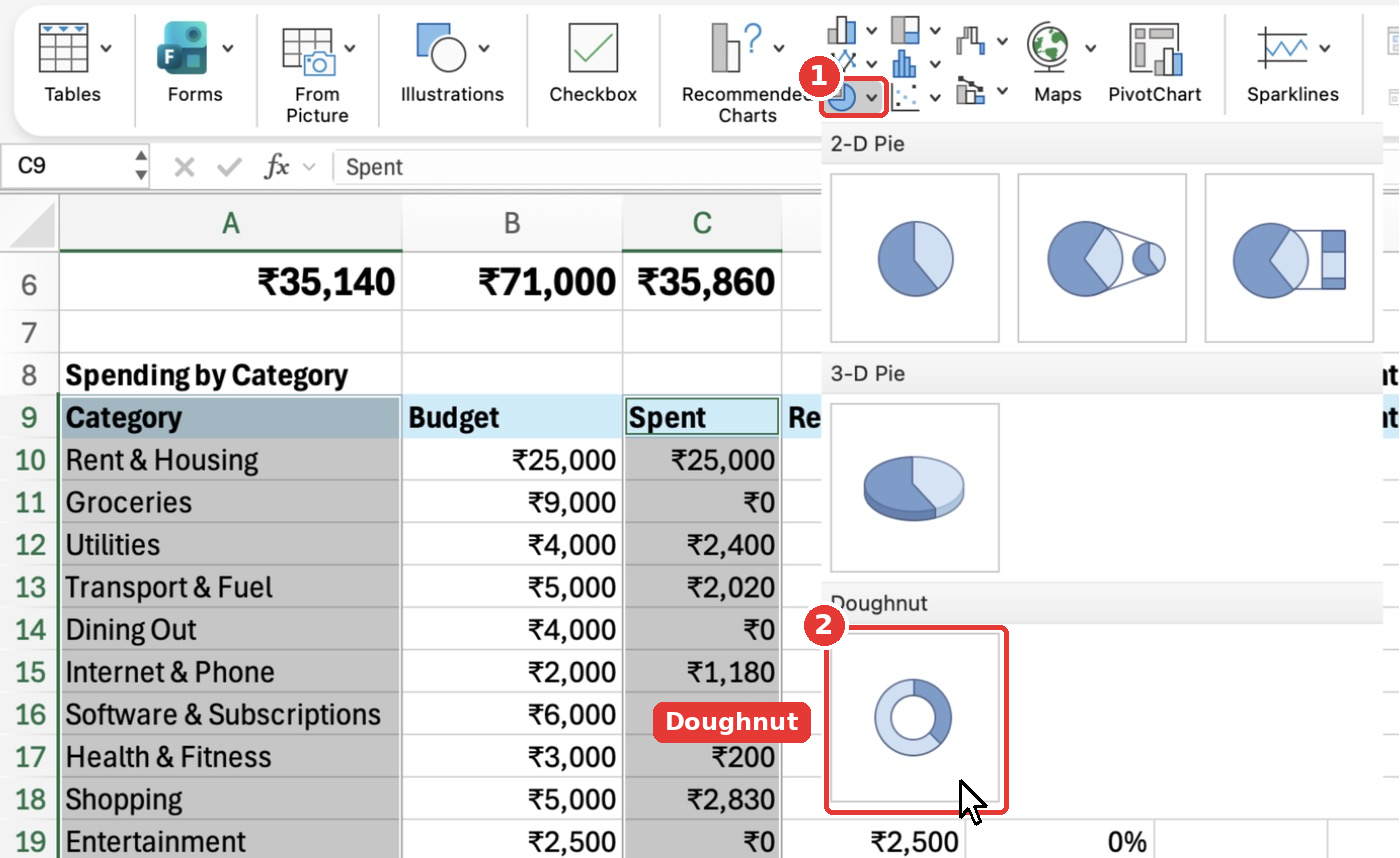
Change the title to Where the Money Went and move the chart next to the bar chart, at cell F24.
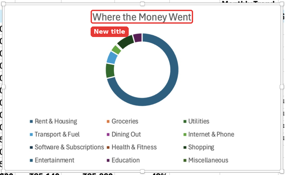
Step 23: Create a Monthly Spending Trend Line Chart
Select G9:H21 (the Monthly Trend table). Go to Insert, click the Line chart button and choose Line with Markers.
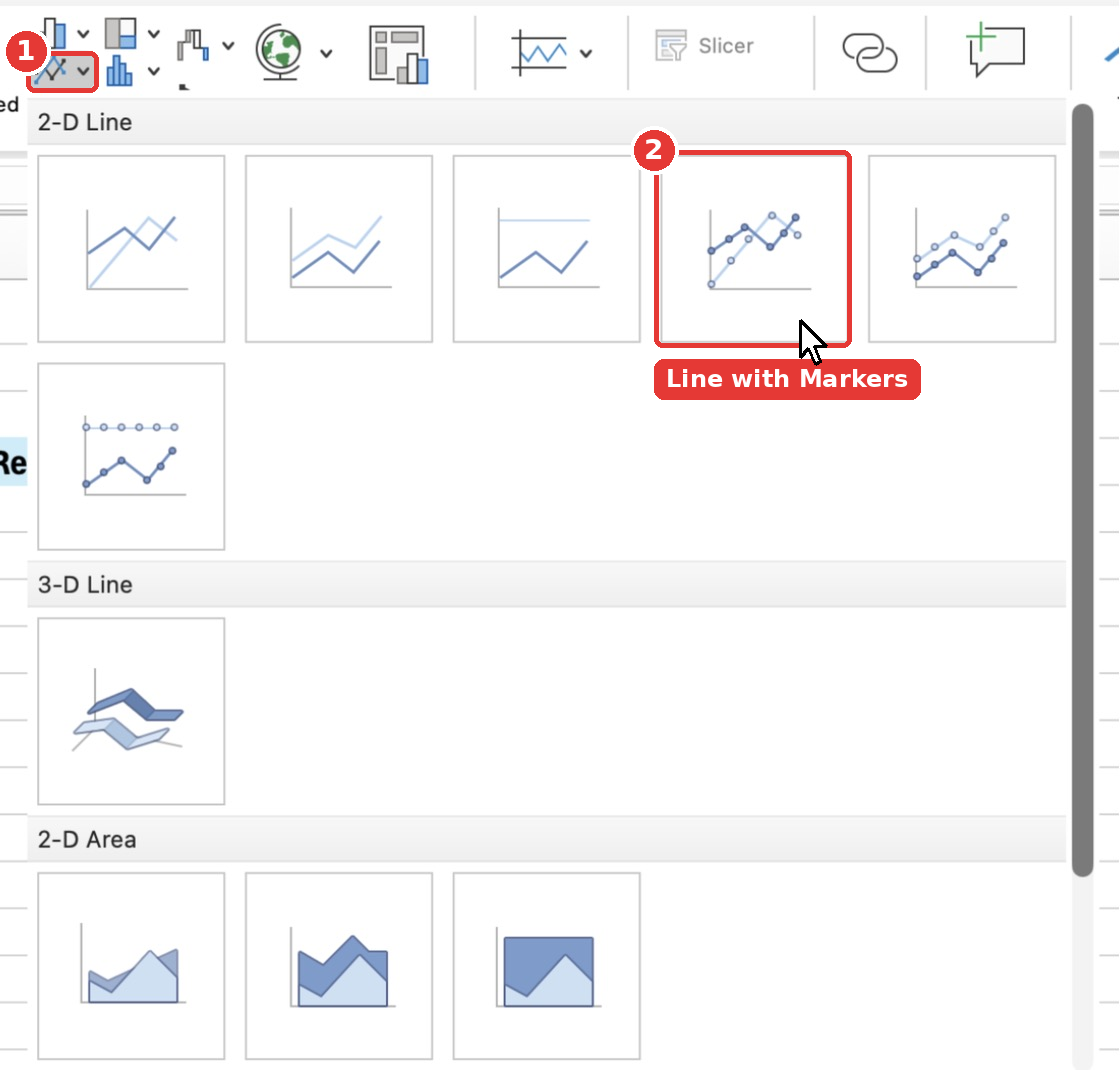
Change the title to Monthly Spending Trend and move it next to the doughnut chart, at cell J24.
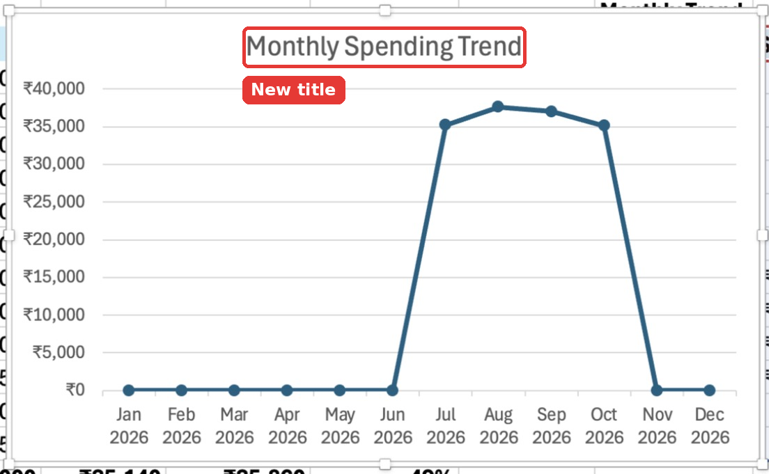
The line is flat at ₹0 for months with no data yet. As you log expenses through the year, the line fills up.
Step 24: Final Polish
Two small touches make it feel like a real dashboard:
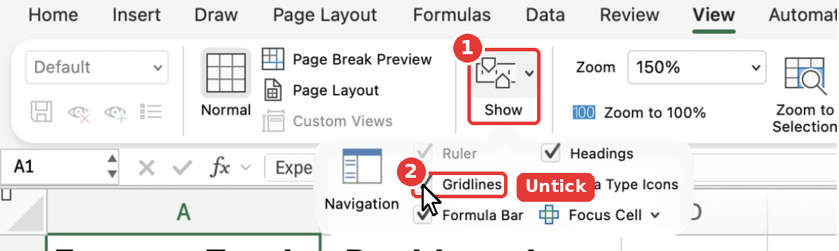
- Hide the gridlines: On the View tab, open Show and untick Gridlines. On Windows, untick Gridlines directly on the View tab.
- Arrange the charts in a neat row below the tables, and set the zoom (I used 75%) so the whole dashboard fits on one screen. If any column shows
#####after zooming out, the column is too narrow: widen it with Format → Column → Width.
Here is the finished dashboard:
Step 25: How to Use Your Dashboard Every Month
Switch months: Click B3 and pick a month from the dropdown.
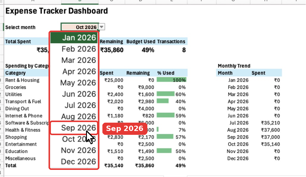
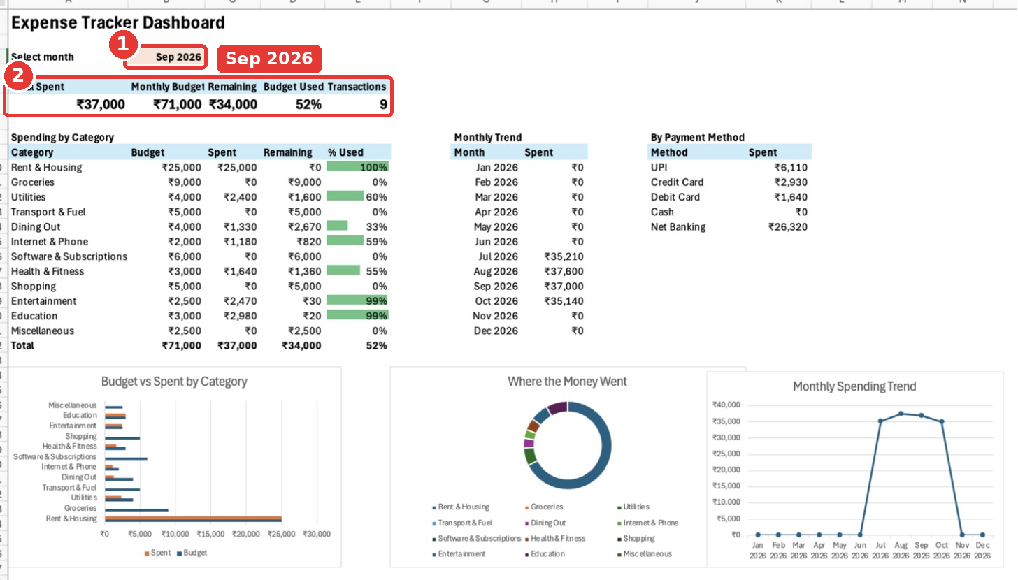
Every number, table and chart updates instantly. Here is September 2026: ₹37,000 spent, 9 transactions, and Entertainment and Education at 99% of budget.
Add a new expense: Go to the Transactions sheet and type in the first empty row directly below the table. The table expands on its own, the Month formula fills in automatically, the dropdowns are already there, and the dashboard updates.
Add a new category: On the Budget sheet, insert a new row above Miscellaneous (right-click the row number → Insert) so the dropdown range grows with it. Then insert a matching row in the dashboard’s category table and fill the formulas down.
Start a new year: Change the dates in Lists!B2:B13 to the new year (1-Jan-2027 and so on). Your old expenses stay in the table, and the dashboard shows whichever month you pick.
All Formulas at a Glance
Here is every formula used in this tracker, in one place. You can also press Ctrl + ` (the key left of 1) or click Formulas → Show Formulas to see them all on the sheet.
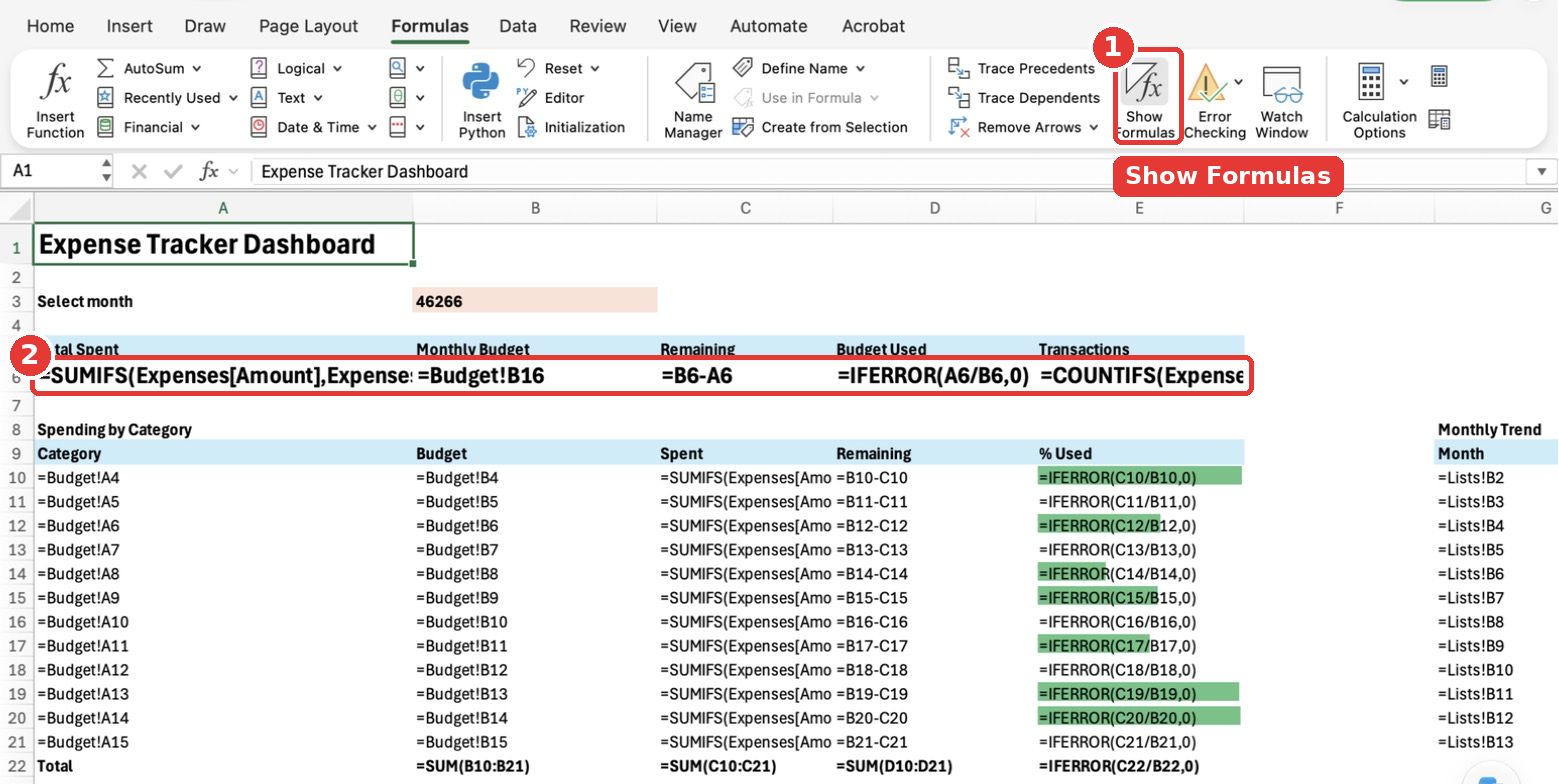
In this view, B3 shows 46266 instead of Oct 2026, because Show Formulas displays the raw value stored in each cell. Click Show Formulas again to switch back to the normal view.
| Sheet & cell | Formula | Purpose |
|---|---|---|
| Transactions F4 | =IF(A4="","",DATE(YEAR(A4),MONTH(A4),1)) | Converts each date to the 1st of its month |
| Budget B16 | =SUM(B4:B15) | Total monthly budget |
| Dashboard A6 | =SUMIFS(Expenses[Amount],Expenses[Month],$B$3) | Total spent in the selected month |
| Dashboard B6 | =Budget!B16 | Total budget |
| Dashboard C6 | =B6-A6 | Remaining budget |
| Dashboard D6 | =IFERROR(A6/B6,0) | % of budget used |
| Dashboard E6 | =COUNTIFS(Expenses[Month],$B$3) | Number of transactions |
| Dashboard A10 | =Budget!A4 | Category name |
| Dashboard B10 | =Budget!B4 | Category budget |
| Dashboard C10 | =SUMIFS(Expenses[Amount],Expenses[Category],A10,Expenses[Month],$B$3) | Spent per category this month |
| Dashboard D10 | =B10-C10 | Remaining per category |
| Dashboard E10 | =IFERROR(C10/B10,0) | % used per category |
| Dashboard B22:D22 | =SUM(B10:B21) and so on | Category totals |
| Dashboard G10 | =Lists!B2 | Month for the trend table |
| Dashboard H10 | =SUMIFS(Expenses[Amount],Expenses[Month],G10) | Spent per month |
| Dashboard J10 | =Lists!A2 | Payment method name |
| Dashboard K10 | =SUMIFS(Expenses[Amount],Expenses[Payment Method],J10,Expenses[Month],$B$3) | Spent per payment method |
Troubleshooting
The dashboard shows ₹0 for everything. Your dates are probably stored as text. Real dates line up on the right side of the cell. Retype one date as 1-Oct-2026 and see if it moves to the right. Also check that B3 contains the 1st of a month.
I get a #NAME? error. The formula can’t find the table. Click anywhere in the expense log, open the Table tab (Windows: Table Design) and check that the table name is exactly Expenses.
A category shows ₹0 even though I have expenses in it. The spelling in the Transactions sheet doesn’t match the Budget sheet. Use the dropdown from Step 10 to fix it.
The Spent total doesn’t match Total Spent. Some expenses use a category that isn’t in your Budget list. Filter the Category column on the Transactions sheet to find it.
The dropdown arrow doesn’t appear. Open Data Validation again and make sure In-cell dropdown is ticked.
Wrapping Up
That’s it! You built a complete expense tracker dashboard in Excel from a blank workbook, using an Excel Table, dropdown lists, SUMIFS, COUNTIFS, conditional formatting and three charts. More importantly, you now understand how every piece works, so you can change it to fit your own life: add categories, track income, or build a yearly summary.
Got stuck on any step, or want me to cover a version with income and savings? Drop your question in the comments and I will help you out.
 © 2026 UsableWP. A project by Naresh Devineni.