Best Practices for the Footer
General Best practices
There are only two best practices I want to recommend, irrespective of the type of website.
Please keep it simple and do not overdo it.
Long theory short, It is important that we make the information in the footer easily scannable and findable.
Let me ask you something.
Imagine scrolling down to the bottom of a company’s website you’re considering for engagement.
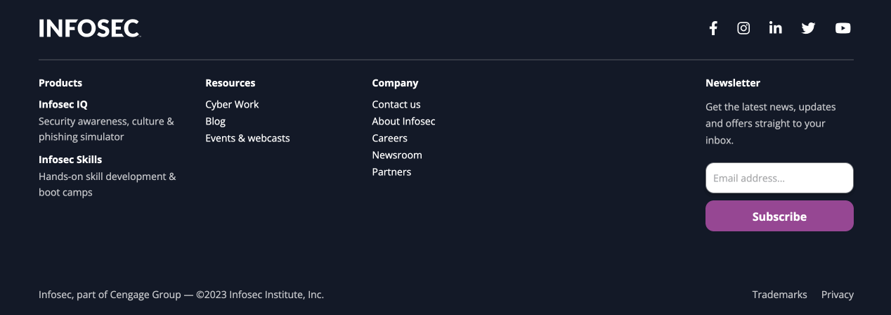
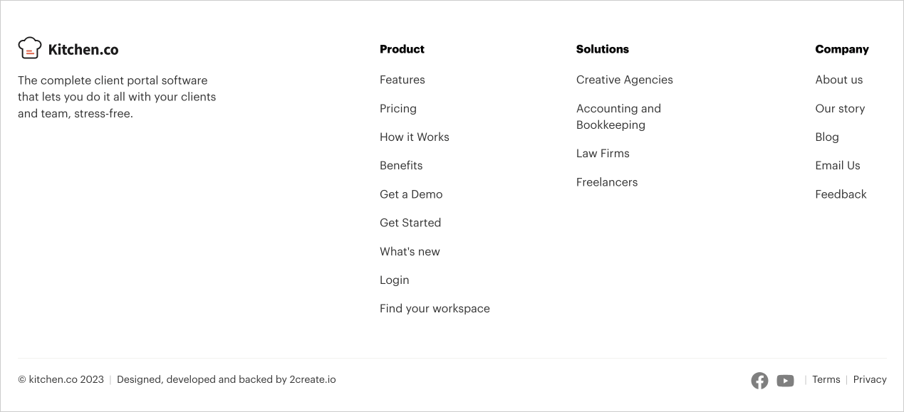
Which one of these footers would you find most helpful for moving forward – Is it this footer?
Or this?
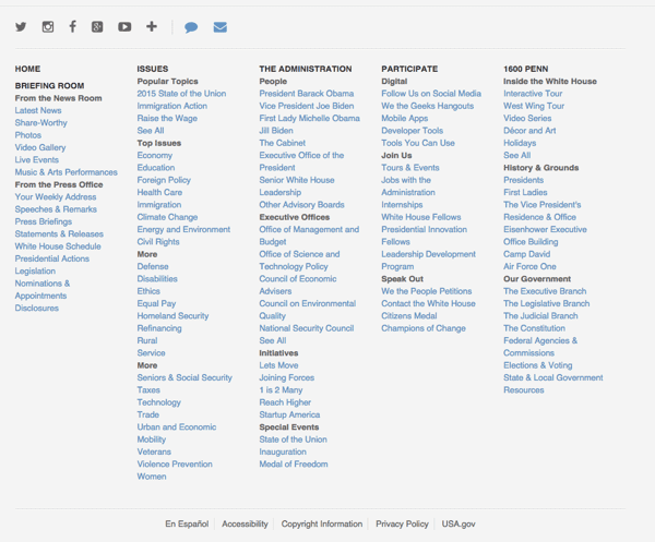
The second footer is too cluttered, making it difficult to scan for something we need even if we put in the time.
It makes me feel like I am searching for a needle in a haystack.
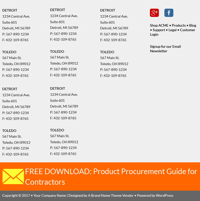
Similarly, why must someone list complete contact information for ten separate locations?
The solution here is to create a separate page called “Locations”.
There is no point in repeating the location information on every page.
Instead, we can use that space to organize the footer properly and promote the brand
The most effective footers tend to have the following elements:
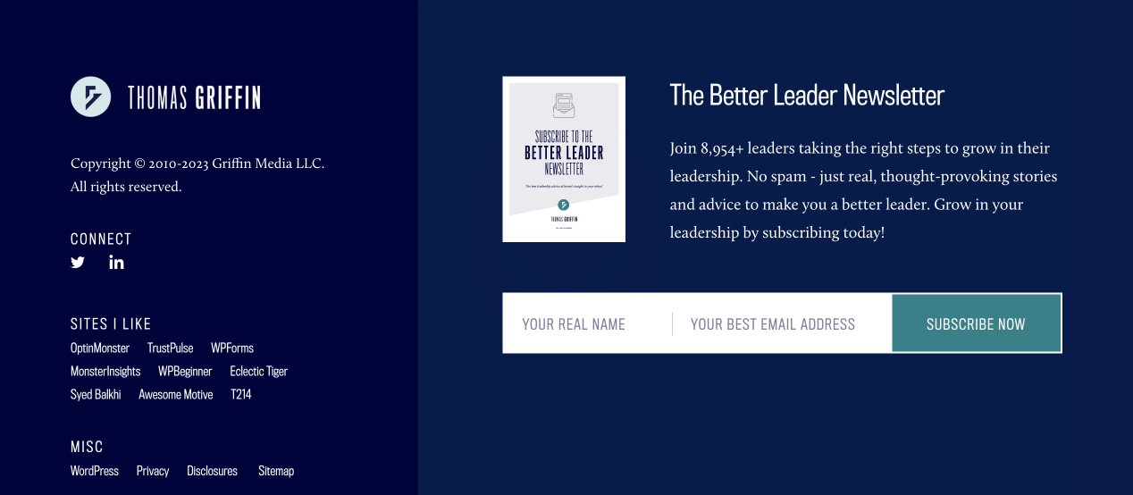
Branding
As I said in the previous lesson, the footer will help us condition the users to our benefit.
And every business wants the users to remember their brand, right?
The footer area of our site gives us one last chance to make one final brand impression.
So, make it a priority to display your website logo in it.
Here is a creative example of what I meant:
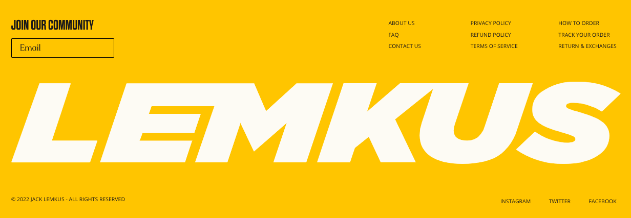
A much simpler yet good example:
This is not applicable if establishing a brand is not your priority.
Navigation links
Along with the logo, use the footer to place a set of well-organized links to other sections of your site.
You can achieve this by putting related links in multiple columns with clear headings for quick scanning and easy navigation.
This gives a bit of SEO benefit too.
But as I said in the last lesson, don’t put your entire sitemap in it.
Copyright info and legal links
These are a must in the footer to protect your content, product, and services.
More specific best practices
Now let’s quickly see some best practices depending on the type of website.
If your website is blog focused:
Listing your popular or most recent blog posts in the footer is recommended.
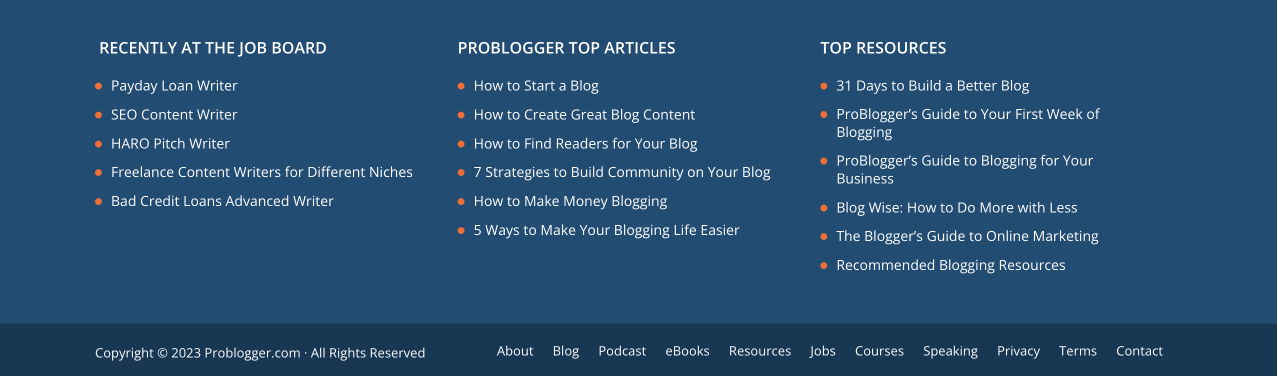
For example, the Problogger site uses the footer to display its top articles on every page.
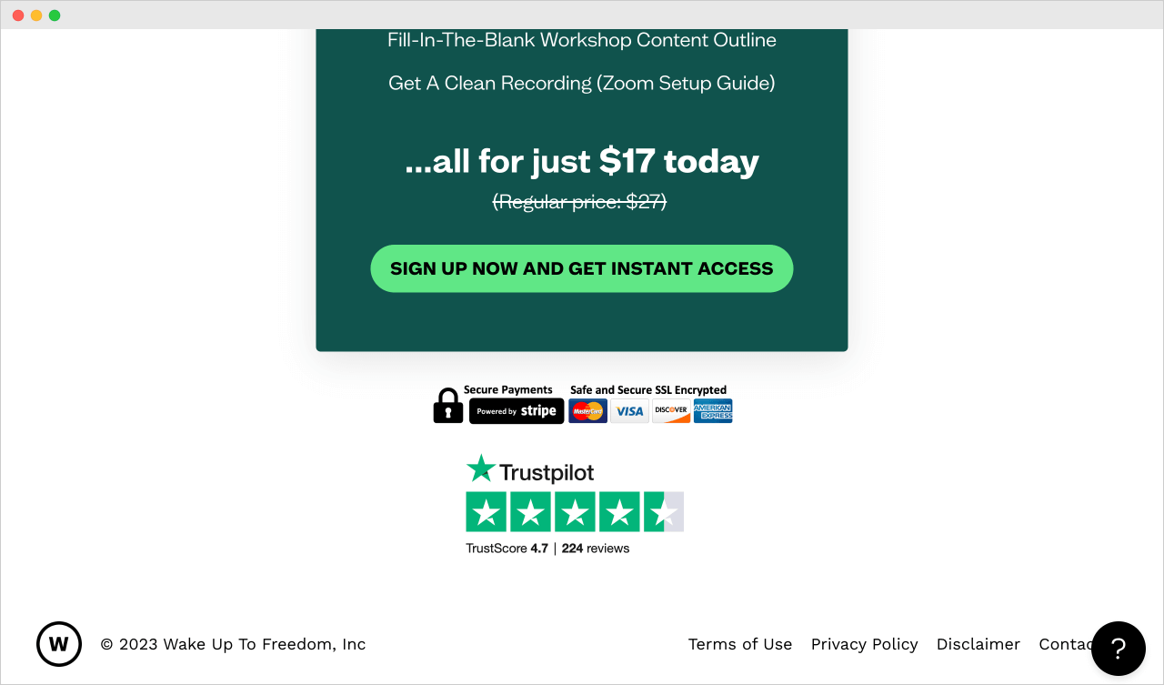
If you are advertising a product or service with a landing page
Make sure to include a call-t0-action button in the footer without distractions.
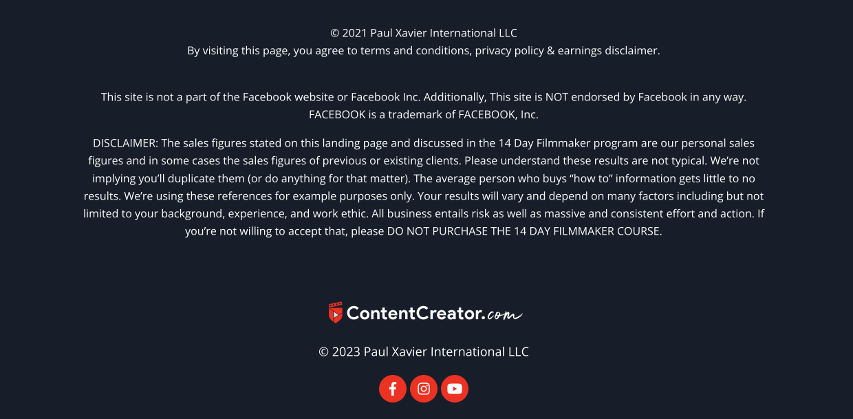
If you’re running an affiliate marketing website or a website that sells online courses
It is recommended to put a disclaimer in the footer to set realistic expectations for the customers of your website:
Task-based footer
A task-based footer is designed to guide users toward taking specific actions or completing certain tasks related to the website.
For example, if you want to build an email list to promote your products and services, include a newsletter section that stands out.
Contextual footer
Just because the footer is a global part, it doesn’t mean it has
to be the same on every website page.
For example, when someone reaches the footer on my portfolio website, I encourage them to chat with me with a simple call to action button.
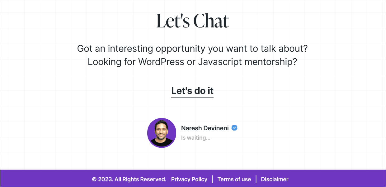
This will help me get some messages from my potential clients, and some of them will get converted into my actual clients too.
But on the same portfolio website, I also sell online workshops.
And when someone visits the landing page for one of the online workshops, I use a different footer with a different message and call-to-action button.
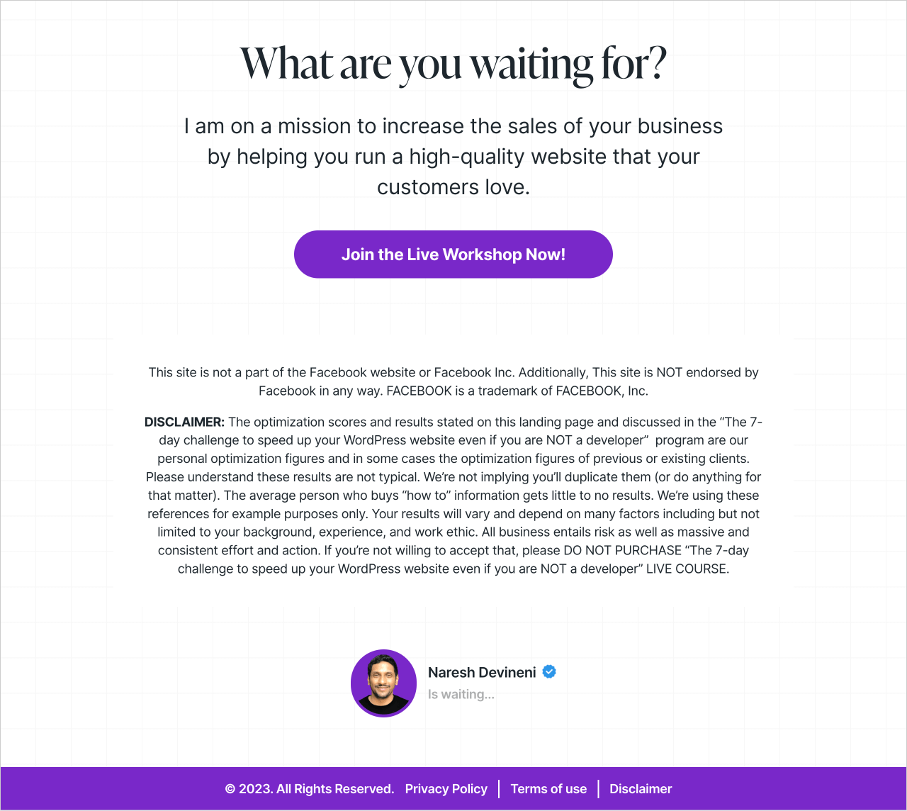
This is because the purpose of this landing is different.
I don’t want people to send me messages. I want people to register for the workshop with some realistic expectations.
So, I replaced the “Let’s Chat” section with:
- “What are you waiting for” encouraging the users to register for the workshop
- Additionally, I added a “Disclaimer” section to set the user expectations before they join the workshop.
That’s the purpose of contextual footers.
Having said all this…
Feel free to get creative and break the rules
The best practices exist to give you the best possible results.
But it doesn’t mean you have to follow them.
You could set your own rules and still win.
In the next lesson, we will learn how to set the layout and build the content for our footer.
 © 2026 UsableWP. A project by Naresh Devineni.