Elementor Tutorial: An In-depth guide (2020 – Free Version)
Welcome to the Elementor tutorial and let me tell you something!
Hands down, Elementor is the best WordPress page builder plugin I have ever worked with.

I know that’s a bold statement considering the likes of other page builders like Beaver Builder, Divi, etc.


But I stick to my statement.
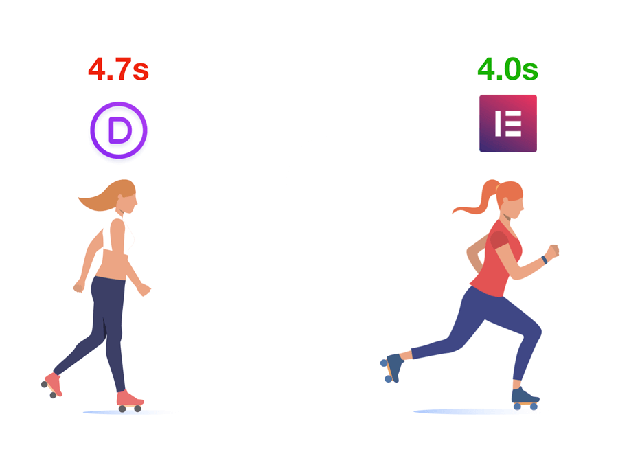
For example, I have created the same design using both Elementor and Divi page builder and guess what, the page built with Elementor loads 0.7s faster than the page that is built with Divi.
When it comes to pricing, Elementor is super affordable and comes with a free version.
Trust me, for the same features, you have to put 199$ for Beaver builder and 89$ for Divi builder. But Elementor is just 49$ and it’s super fast.

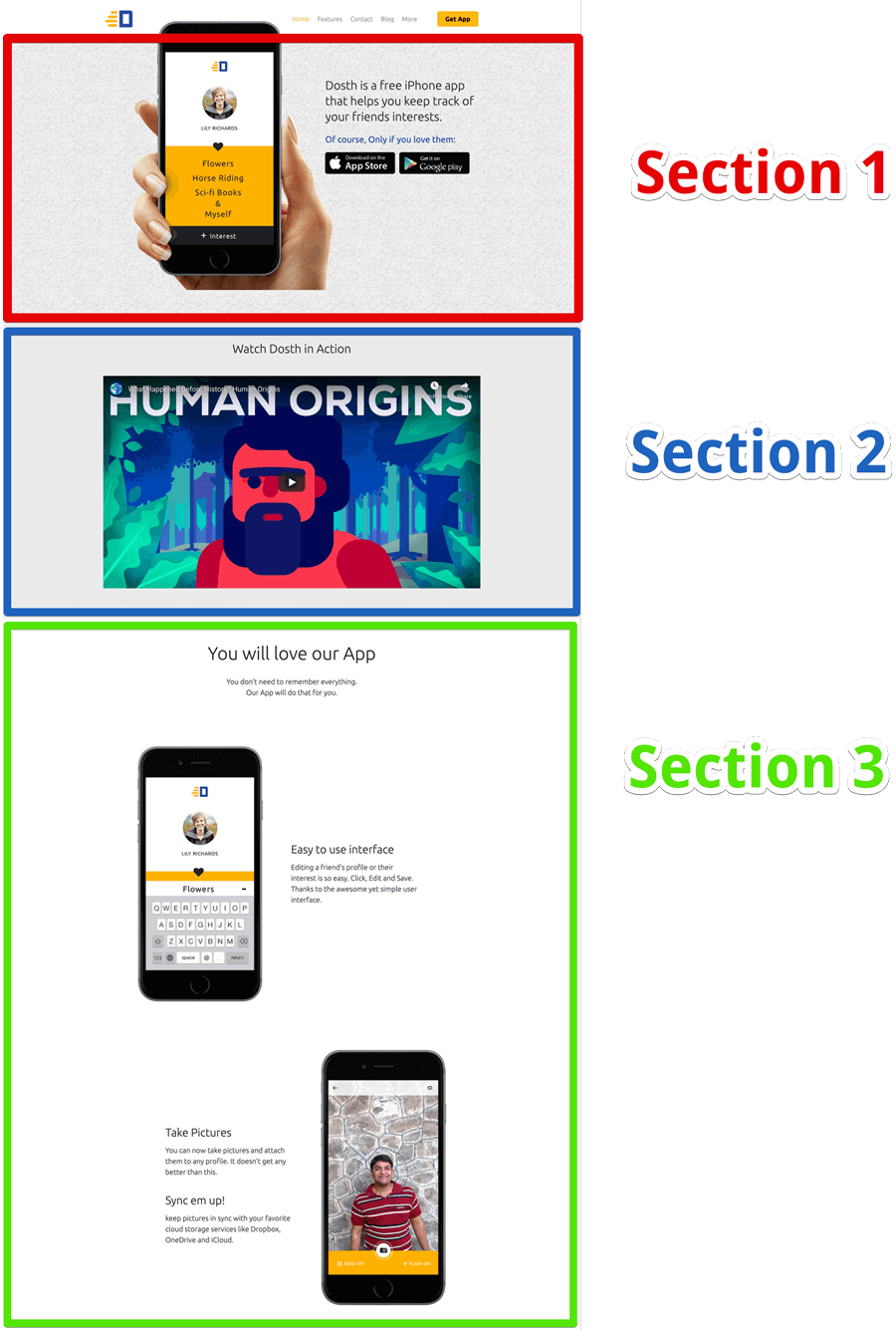
Anyway, in this in-depth Elementor tutorial, you’ll learn how to build and design the following page content of a WordPress Homepage.
As you can see, Elementor is a page builder that you’ll use when you don’t need a WordPress developer to build your website.
Simply put, it helps you build complex page designs without having to touch HTML, CSS or PHP. So, you don’t really have to know these technologies in order to build a beautiful looking page.
Another good thing is, it’s a freemium plugin. That means it comes with both free and pro versions.
You can install the free version of the plugin just like any other free plugin in WordPress and use it build the page content with limited options.
The free version has some of the most important elements that are required to build a neat looking page content. So, you can always get away just using the free version.
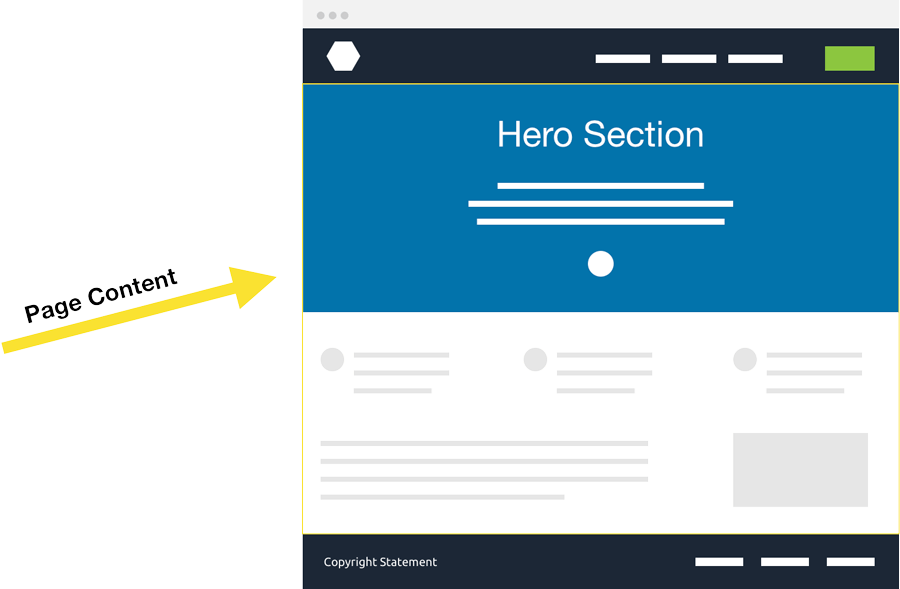
Focus, I am stretching the word “Page Content” but not the entire page.
When it comes to the pro version, not only you’ll get more advanced elements to build the page content, but you can also build the entire page including the page content, Page Header, Page Footer, Blog, and Blog Post with dynamic data.
And, the possibilities are endless.
Anyway, For the purposes of this Elementor tutorial, I’ll be completely focusing on the free version. So, let’s get started.
Table of Contents (Steps for learning Elementor)
- How to install Elementor ( free version )
- Enable Elementor for a page or a post
- Configure fonts and color scheme using global page options
- How to access default page options
- Understanding the building blocks of a page built with Elementor
-
The Practical Walkthrough
- How to Create a Full-Width Section With Multiple Columns
- How to add a background image to a section
- How to drag-and-drop elements into a section
- How to set up an Element inside Elementor
- How to deal with Images
- How to deal with text content and its typography
- How to create a nested section with two-column layout
- How to deal with spacing around the elements
- How to reduce the content width of a section
- How to fix weird gaps
- How to fix spacing issues using margin and padding
- How to use negative margin to overlap elements
- How to align the column’s content to the center
- How to preview and fix responsive issues on mobile and tablet
- How to duplicate, delete elements and sections to build-out new sections
- How to add youtube video
- Introducing Elementor “Templates” for re-using the Elementor sections
Step 1 How to install Elementor ( free version )
We can install Elementor for WordPress just like any other free WordPress plugin.
So let’s go to:
Admin Dashboard -> Plugins -> Add new
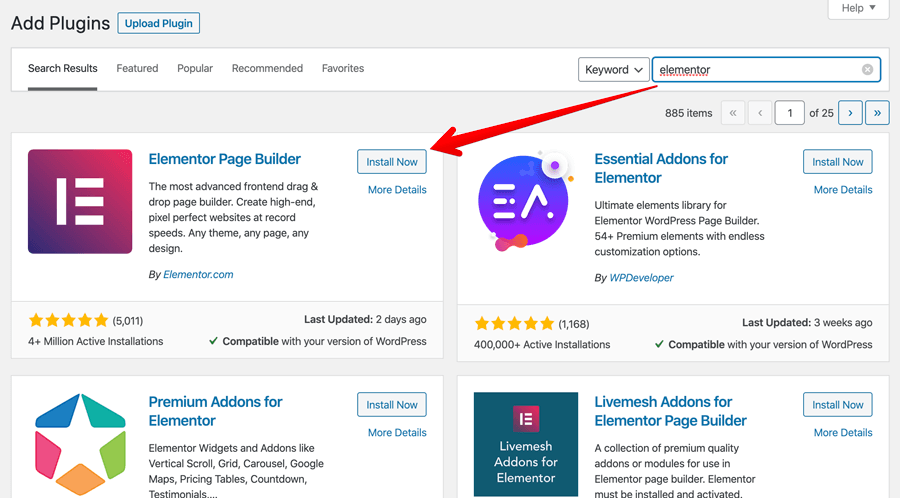
Search for Elementor and Install the plugin by clicking on the “Install Now” button followed by the “Activate” button.
Once the plugin is installed, Elementor will take us to the welcome screen of the plugin.
Next, let’s enable the Elememtor page builder for a page.
For this purposes of this guide, I have installed Astra Theme and created three pages already.
Step 2 Enable Elementor for a page or a post
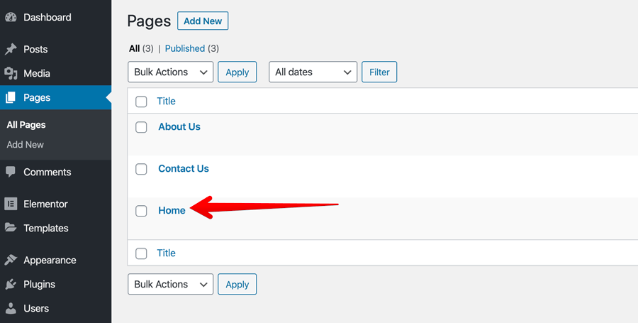
You can use Elementor on both new and existing pages/posts. So, feel free to go with any kind of page or post.
I want to build the content of the “Home”, So, I am gonna go to:
Pages -> All Pages -> Home
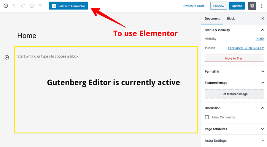
Once we are on the edit screen of the page, you will notice that Gutenberg Editor is currently active.
To switch to the Elementor page builder, we have to click on the “Edit With Elementor” button. This works for a blog post too.
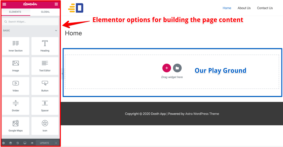
Once we click the button, as you can see, The Elementor interface loads up as a different screen altogether.
On the left-hand side of the screen, we have Elementor options and page Elements which will help us build the page content.
On the right-hand side of the screen, we have our playground where you can drag-and-drop Elementor Widgets aka Elementor Elements to build the page content.
Now, I am not going to bore you down by explaining each and every option inside the Elementor interface. I will introduce them as we progress through this Elementor tutorial piece by piece.
Step 3 Configure fonts and color scheme using global page options
To maintain and convey the branding of the site, two things must be consistent across all over the site.
- Fonts and their sizes for body text and headings
- The color scheme of the site
Elementor allows us to achieve this with something called “Global Options” and once we set this for one page built with Elementor, they are the default for every other Elementor page.
And if you want to override these settings for a particular page, you can still do that :)
So, the options we are about to configure are global, which means they get applied to all the pages on the site that are built with Elementor.
1.How to configure Google Fonts in Elementor
The first thing I want to do is to set up the fonts of the page. I want the entire page content to use “Ubuntu” Google Font.
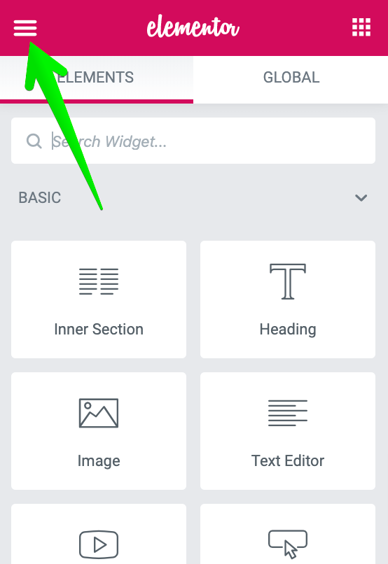
To achieve this, on the Elementor interface, click the “three bars” icon that is located on the top-left hand corner of the screen to access the “Global” Elementor options.
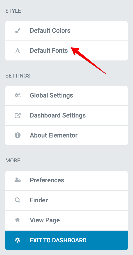
Next, under the “Style” section, click on “Default Fonts”.
Then, under “Default Fonts”, go with “Ubuntu” or any other Google Font that you like for:
- Primary Headline
- Secondary Headline
- Body Text
- Accent Text
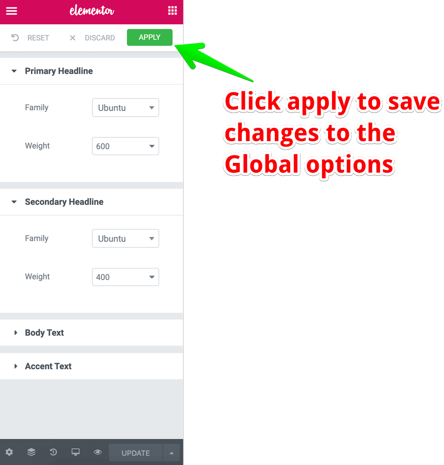
You can go with any font combination that you like. I really love “Ubuntu”, so I went ahead with that.
Anyway, once you have set up the fonts, click the “Apply” button to save the changes.
In case you messed it up, don’t worry :)
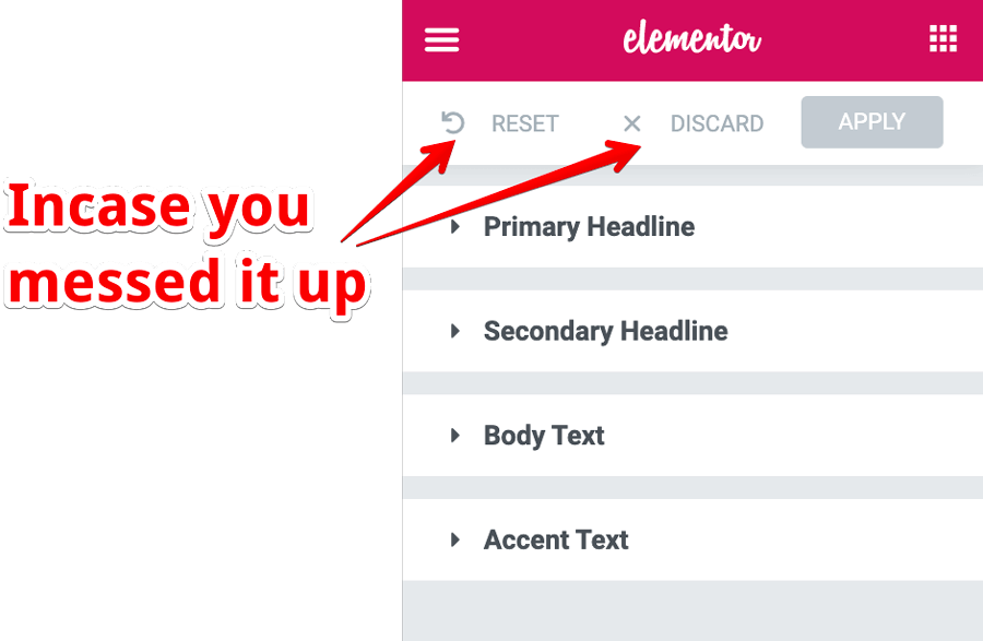
Use the “Reset” button to reset to the default Elementor settings.
If you made some changes and if you want to go back to the most recent changes, discard the currently unsaved changes by clicking on the “Discard” button.
2.How to set up the Color Scheme in Elementor
Next, let’s set up the color scheme of the page.
To do this, go back to the “Global Options” by clicking the “three bars” icon and this time, click on the “Default Colors” and use the following color scheme if you like it:
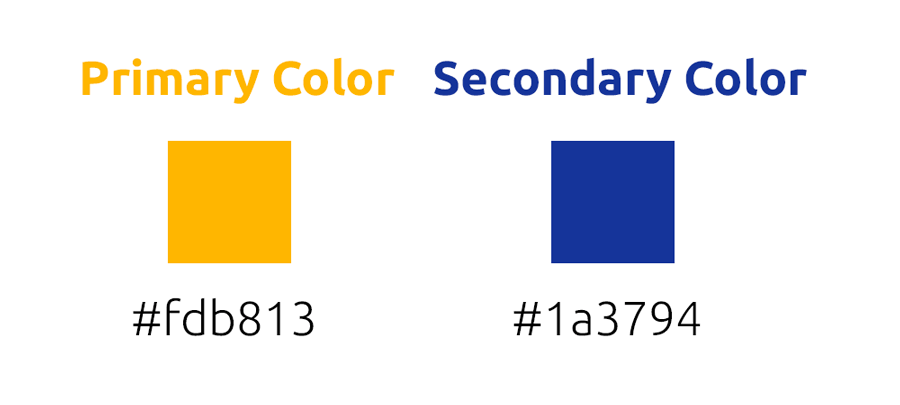
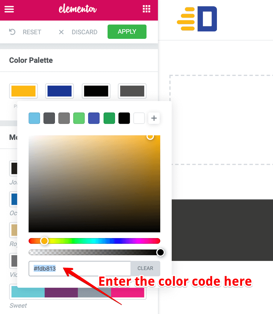
As you can see, I have picked up the color scheme from the Logo. To change the color, just click on the color boxes.
Once you are done playing, please don’t forget to “Apply” the changes.
Finally, exit out of the “Global Options” section of the Elementor interface by either clicking the “Back Arrow” icon or the “Apps” icon.
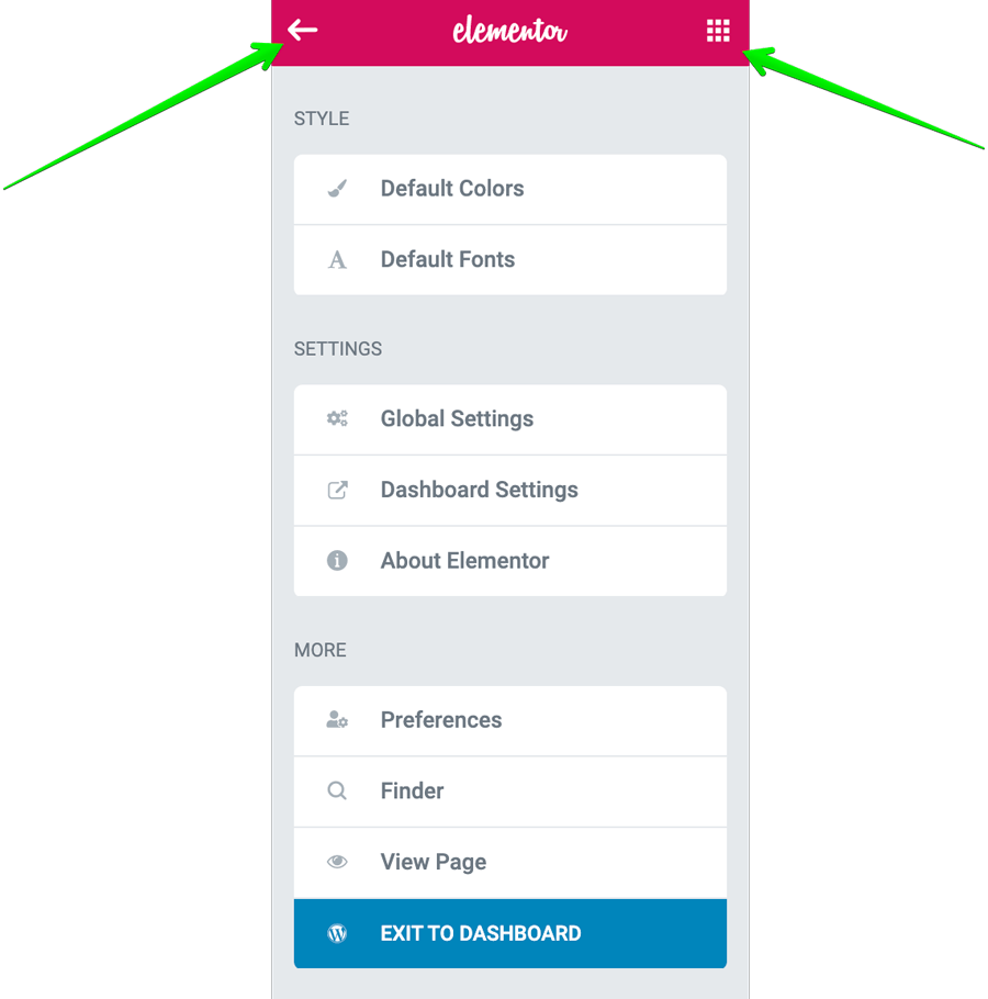
Ufff, now that we are done with the Global Options, this saves us a lot of time once we start building the page content. And, We will look into the other options if we need them later.
So, Next, let’s configure the page options such as page title which are personal to the page we are building right now.
Step 4 How to access default page options
Every page will have a Title, publish status, featured images, etc.
Simply put, the settings that you see on a default WordPress page/post when we are not using Elementor for a page/post.
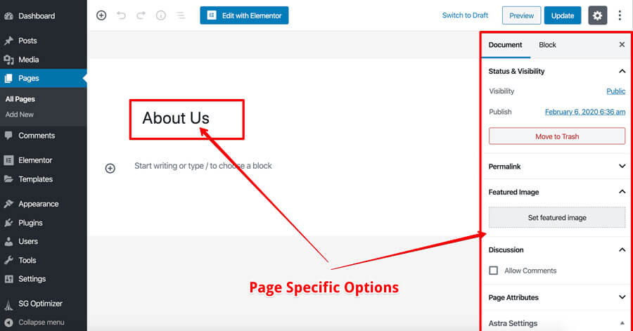
But once we start building the page with Elementor, you can no longer access this screen.
We can see this screen only when we are not editing the page with Elementor.
So, we can access the above options in two ways once we are inside the Elementor interface.
1.By exiting out of the Elementor Interface
You can exit out of the Elementor interface by clicking the “three bars” icon at the top left-hand corner of the screen and then clicking on the “Exit to Dashboard” button.
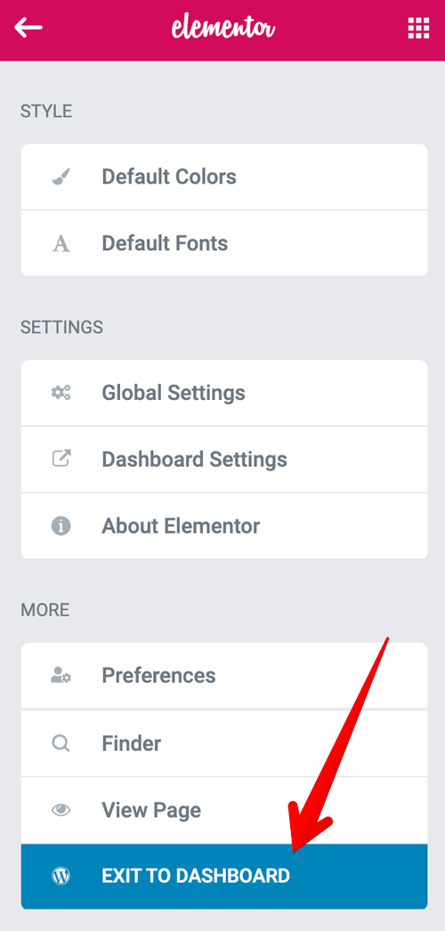
Unlike what the label on the button says, it will take you back to the default page “edit” screen where you can see all the settings related to this page.
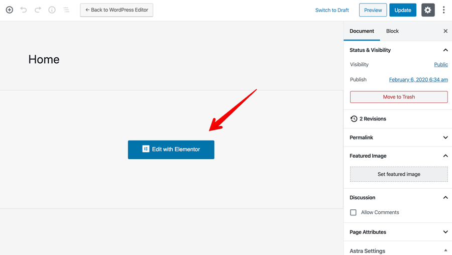
You can see all the options on the right-hand side of the screen.
Also, if you notice, now instead of the Gutenberg editor, you’ll see “edit with Elementor” button in the center of the screen indicating us that:
“Hey! You are adding content to this page using Elementor”.
If for some reason you don’t want to use the Elementor page builder for this page, you can switch back to the default Gutenberg editor by clicking on the “Back to WordPress editor” button.
Caution: Think and take the decision
Once you have built the page with Elementor or any other page builder, although you can switch back to the default Gutenberg editor, the transition is not going to be smooth.
While sometimes you can restore the content like images and text, the beautiful layout that you have built using the page builder will be gone.
So, ask yourself a question the following question before you start building the page with any page builder:
“Do I really need to build this page using a Page Builder?”
If yes, prepare your mind to be flexible when something goes wrong.
I am not really trying to scare you off by saying this at the very early phase of the Elementor tutorial.
Even though Elementor is great, it’s still a third-party plugin that you are using to cut some costs and enjoy the freedom not depending on anyone.
And it’s still a third-party that might break your site in the future.
Having said that, let’s proceed forward by taking a look at the second if accessing some of those page-specific settings.
2.Settings panel inside the Elementor Interface for a page
To access the settings panel that is from Elementor, we have to click on the little “Gear Icon” located on the bottom left-hand corner of the Elementor interface.
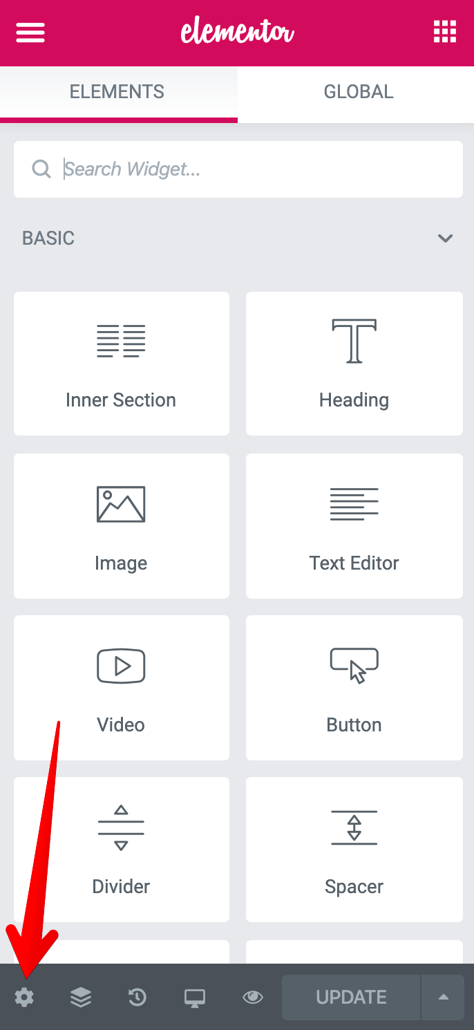
As you can see, the settings panel is divided into three sub-sections.
General Settings
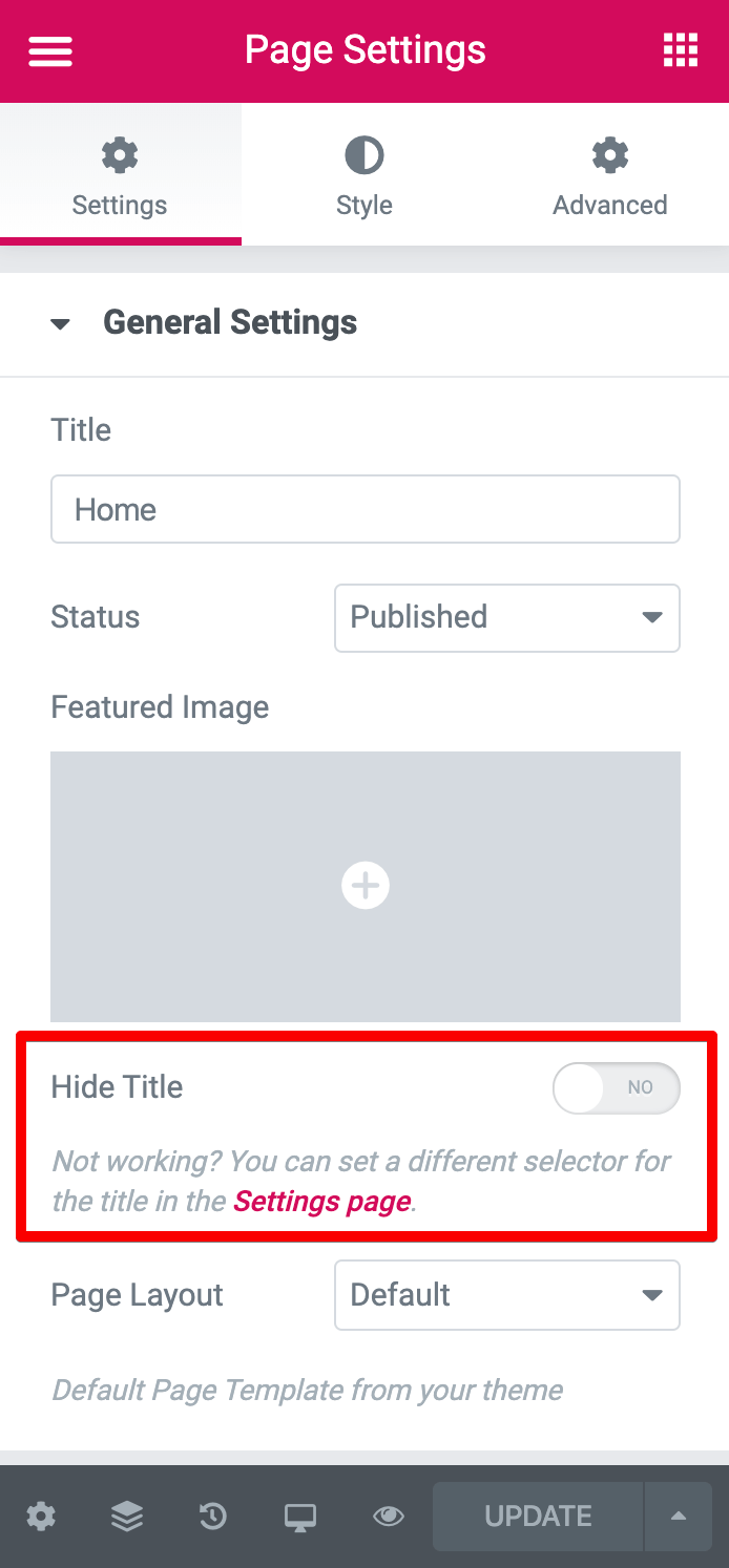
Under the Settings, we have general settings. Here, you can set the page title, featured and change the status of the page.
But this general settings section contains only few options related to the page.
To set up other options such as assigning a category or changing the slug of the page, you still have to exit out of the Elementor interface.
What I love about this general settings section is, there is an option to hide the page title.
This option is super helpful when it comes to building Homepage or Landing pages where we do not display page title.
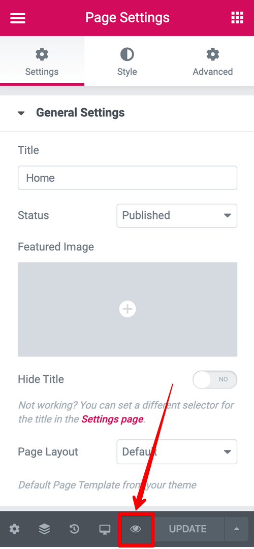
For example, we are building the Homepage of the site right now. And if we preview our page by clicking on the little “eye icon”, we can see the title “Home” on the frontend.

Usually, we must display the page title, otherwise, how would the visitors know what the page is about?
But when it comes to the Homepage, we don’t have to display the word “Home”, do we? Everybody knows that it is the Homepage.
So, let’s just set the “Hide Title” option to yes and now preview the page again.
The “title” of the page is now gone and this is exactly what we want, correct?
Next, when it comes to “Page Layout”, Elementor gives us three options.
- Default
- Elementor Canvas
- Elementor Full Width
The “Page Layout” setting allows us to the width of the page content. We call the page content as full-width page content when it occupies the entire browser width.
For example, this is full width:

See how the section with blue color and grey color background is occupying the entire width of the browser? That’s why we call it a full-width layout.
And this is a classic example of boxed width page( not full-width ):
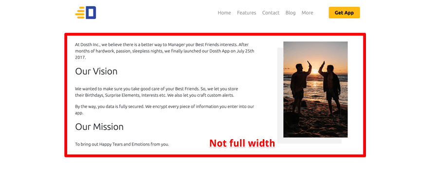
According to my experience with Elementor, the options “Default” and “Elementor Full Width” are completely dependent on the theme that is currently active.
Also, even if set the option “default”, we can still stretch a section to occupy the full width of the browser.
So, picking any of these layouts is the same and we can still get what we want when it comes to the width of the page content.
Introducing Elementor Canvas
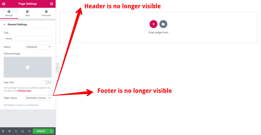
Special Mention: the Elementor Canvas is a special layout option.
If we set this option, Elementor hides the header and footer sections of the page completely and gives us the full canvas to play with.
This option is usually used when we are building landing pages with no default header and footer sections. We use this layout to re-create header and footer sections in a different way (mostly minimal).
For the purposes of this Elementor tutorial, Let’s just go ahead with the “default” page layout.
Style Settings
The second sub-section is “Style” and under this section, we have options for changing the background of the page along with the padding option.
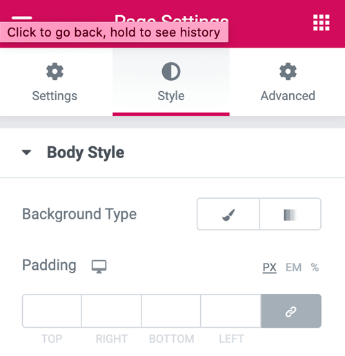
For this page, I want the white background color, and since that’s the default background-color for any browser, we don’t really have to set it using the Elementor.
And I don’t want any space around the page content, so I am not going to set the padding either.
I know that most of you don’t know what padding is when it comes to a web page, don’t worry, We will talk about padding as we progress through this Elementor tutorial.
Advanced Settings
And, finally, the last sub-section is dedicated for “Advanced Settings” and we can make use of the options inside this section only if we own Elementor Pro. Simply put, this is for people with Pro license only.
Since this Elementor tutorial is all about the free version, we don’t have to talk about this sub-section at all :)
Anyway, next, let’s start building the page content starting with understanding the backbone of an Elementor page, Sections of an Elementor page.
Step 5 Understanding the building blocks of a page built with Elementor
Introducing Sections
An Elementor Section is the foundational building block of a page built with Elementor.
Simply put, an Elementor section is the top-level container for the content that you’ll build and a page built with Elementor can contain any number of sections.
Another way to explain this is, you can drag-and-drop Elementor Elements only into a section. So every page that is built with Elementor will have at least one section.
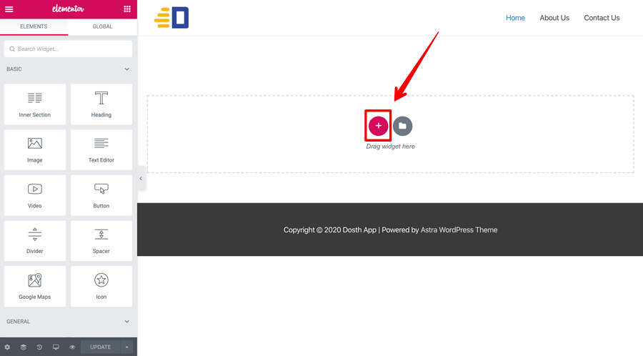
Now that you understand an Elementor Section, let’s create our first section by clicking on the “Plus icon” located at the center of the Elementor Interface.
This is the Elementor’s “Add New Section” button.
Introducing the Columns of a Section
And as soon as you click on the “Add New Section” button, you’ll be asked to select the column structure of the section.
It simply means “You have to divide the section into one or multiple columns. Please select the number of columns that fits the design.”
This also means that every section must contain at least a single column and we will be placing the Elementor Elements inside the columns of a section.
But, how many columns do we need inside a particular section?
For us to answer the question, we need to take a look at the design that we are building using the Elementor.
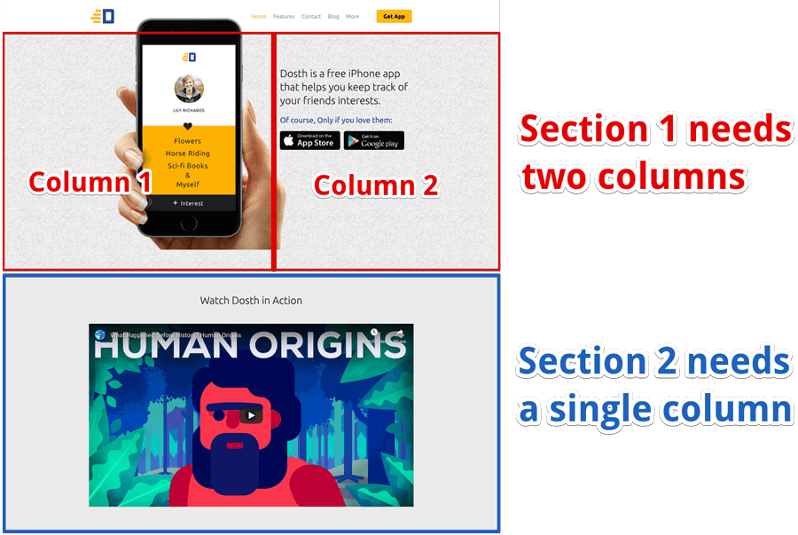
As you can see in the above picture, the first section we are about to build should be divided into two columns. We will be placing the hero-image inside the column on the left and text inside the column on the right.
When it comes to Section 2, we just need a single column to place the youtube video.
Anyway, now that we know we need two columns for the first section, click on the box with two columns.
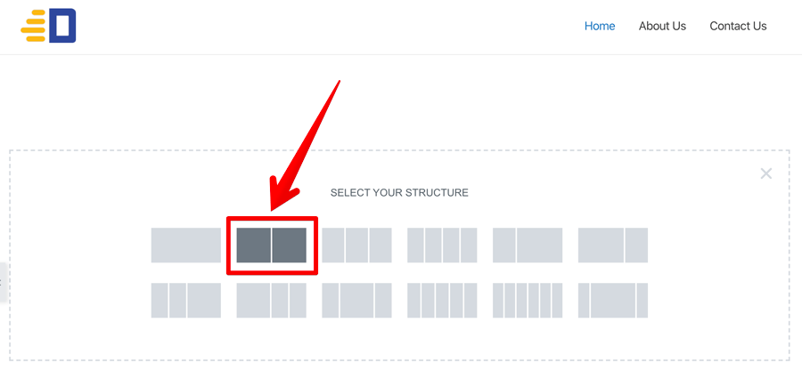
And as soon as you click on it, a new section with two columns is now created and is ready for placing the Elementor Elements.
Introducing Section specific options
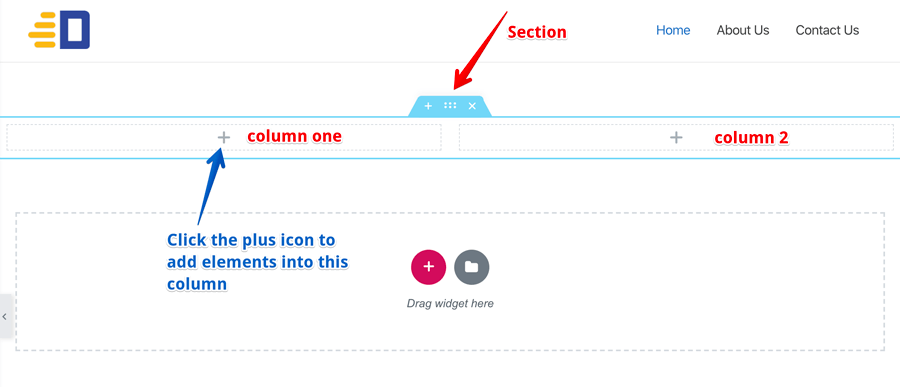
If you do not see the blue-bordered section with the action icons, hover your mouse anywhere inside the section to see it.
Now, let’s talk about the section specific action icons quickly.
- The “Plus icon” will create a new section on top of the current section.
- The “Dots Icon” will bring up the section specific options
- The “Cross Icon” will delete the section completely
So, be careful with the “Delete Section” action.
Anyway, in case you accidentally deleted a section, you can bring it back by going to the “History” panel.
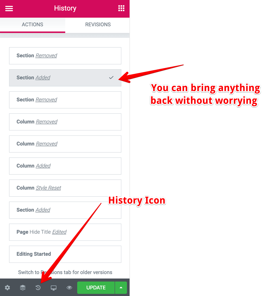
Once you open the “History” panel by clicking on the “History Icon”, you can clearly see your historic activity on the page with the clickable restore points and clicking on one of them will restore the page to that specific point in time.
So, all hope is not lost :P
Anyway, what if you want to add a third column?
Initially, we thought two columns are enough, but later, we have decided to have three columns instead of two. What do we do in this scenario?
Since we did not add any elements yet, we can delete the newly created section and re-create it by selecting a three-column structure this time.
But there is a smarter way to add or delete a column.
If you hover over a column, you’ll see the “Column Icon” popping up out of nowhere.

For example, I have hovered over the left-hand column and you can see the “Column Icon” showed up.
And if you click on that “Column Icon”, options related to that specific column will open up on the left-hand side. There, you can not find an option to add or delete the column.
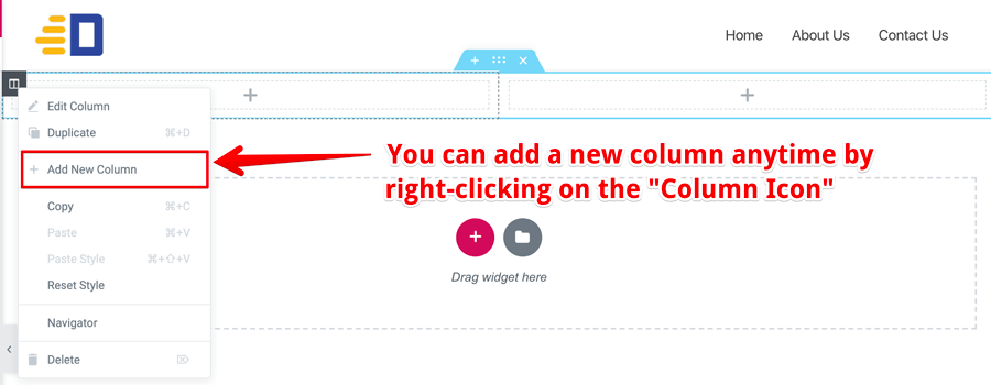
But if you instead right-click on that “Column Icon”, you’ll see a context menu popping out with options like “Duplicate”, “Add New Column”, “Delete Column”, etc.
Those labels are self-explanatory, right?
That’s pretty much how you add or delete a column inside Elementor.
Note: The right-clicking works for Elementor elements too. That’s the only way you can delete or duplicate an Elementor element.
Anyway, next, let’s start designing the first section of the page.
This time for real, I promise :P
Step 6 The Practical Walkthrough
We will be spending quite a lot of time building the first section of the page. If you understand this step correctly, you have gained good experience with the Elementor plugin. So, advanced congratulations <3
Anyway, here is the breakdown of what we are going to build in this step.
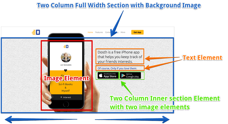
Remember: After each and every change you make inside Elementor, always click the “Update” button to save those changes and avoid the re-work that is caused by the internet or web server failure.
Elementor Tutorial: How to Create a Full-Width Section With Multiple Columns
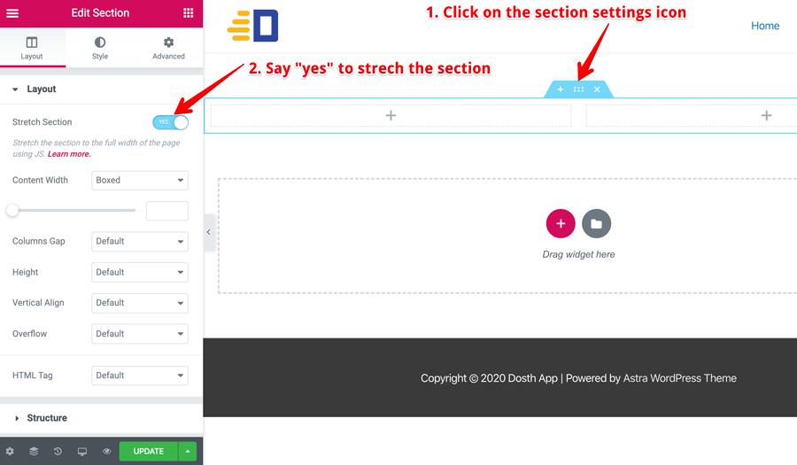
If you notice, the section specific settings are neatly divided into three logical tabs.
- Layout – All the options that deal with the layout of the section can be found here. For example, column and content widths can be set here.
- Style – All the options that deal with the aesthetics of the section can be found here. For example, we can add a background video or an image slideshow to the section.
- Advanced – All the options related to CSS properties like padding, margin, etc. can be found here. Simply put, spacing issues related to the section can be fixed using this tab.
So, to make our newly created section full-width, click on the “Section Settings” icon and then set the “Stretch Section” option to “yes”. This option is located under the “Layout” tab of the section specific settings.
Elementor Tutorial: How to add a background image to a section
To achieve this, click on the “Style” tab which is located right next to the “Layout” tab.
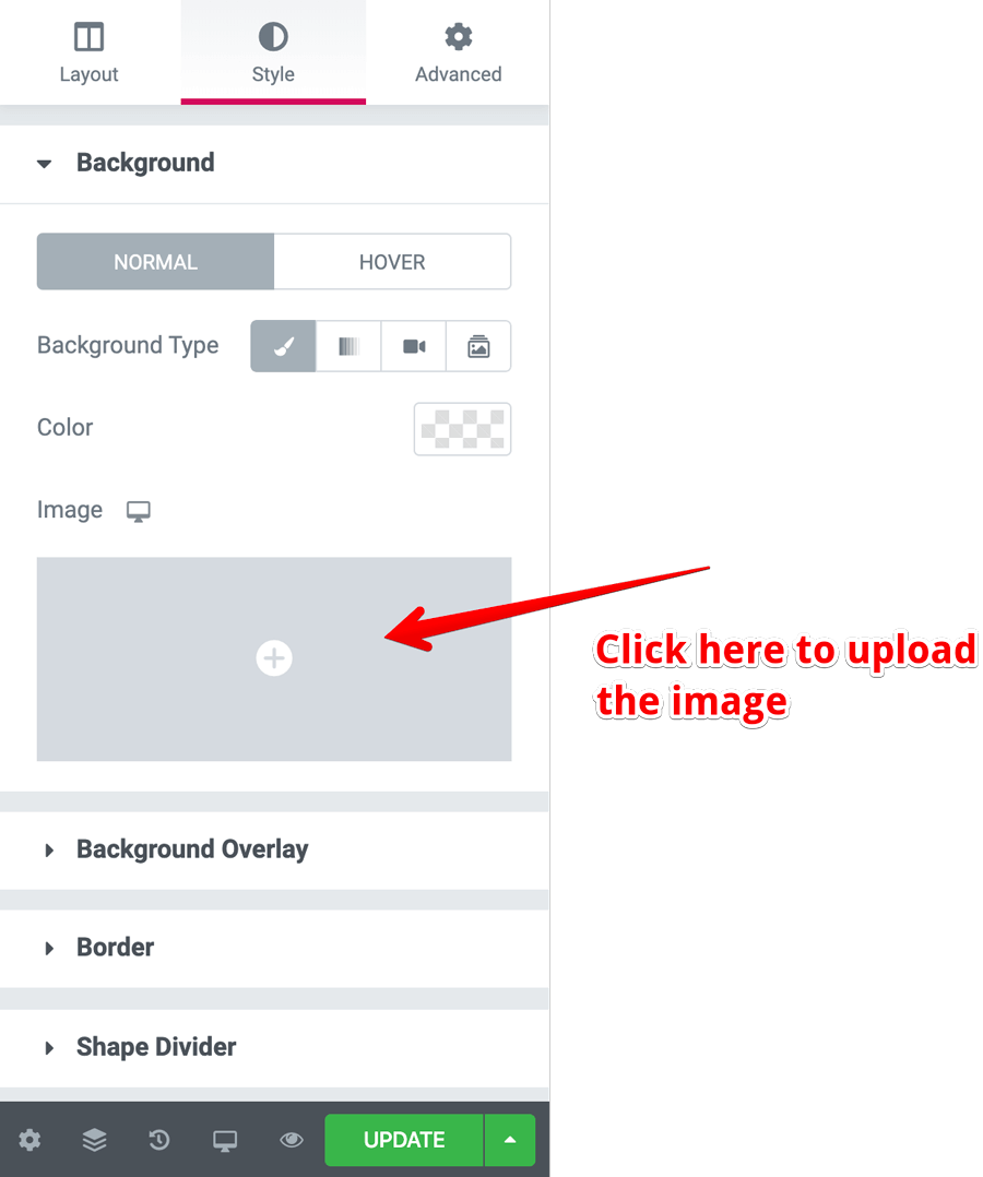
Next, under the Background section, choose “Classic” (paint-brush icon) for the “Background Type” option.
And finally, click on the “grey box with a plus icon” under the image option to upload the image. You can use this pattern if you want to :)

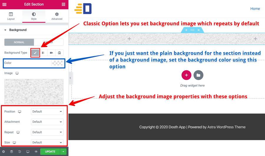
You are not limited to a background image, you can also set a background video with ease by clicking on the video icon.
This is why Elementor is powerful. It lets you add a complex feature like a background video with the click of a button.
And, sometimes you just want a plain background color for the section instead of a background image.
If that is the case, instead of setting up the “Background Type” option, pick the background color using the “Color” option located right underneath the “Background Type” option. Problem solved ;)
Also, if you notice the background image that I have provided, although it is a small image, it is a repeating pattern. So, it is looking like one big image once we have applied it as the background image to our full-width section.
And when you dealing this kind of repeating pattern backgrounds, you can leave all the background image properties to default just like the above screenshot. Makes sense?
Elementor Tutorial: How to drag-and-drop elements into a section
Now that we made the section full-width and added a background image, let’s start adding the content to the section.
Lets first add the following image to the left column.
Right now, we are inside the “section” specific settings and we can not see the Elementor Widgets aka Elements panel.
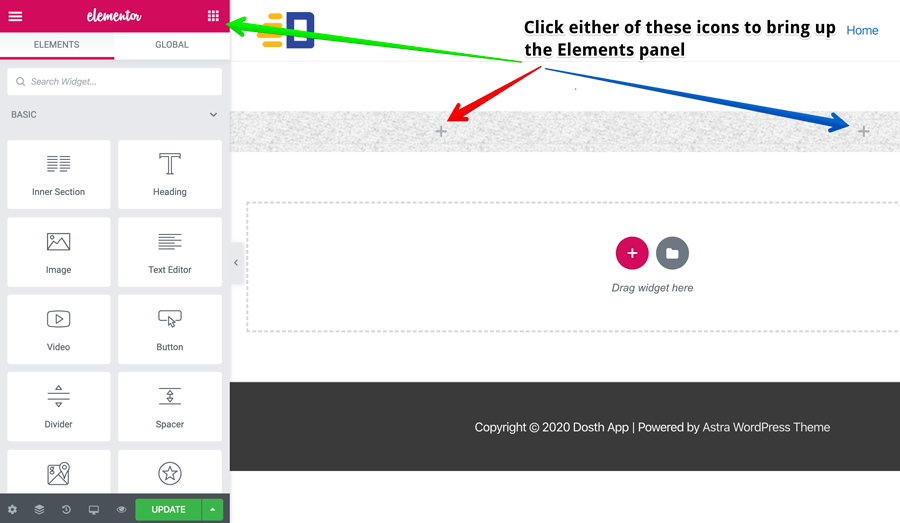
So, to switch to the Elements panel, either click the plus icon inside a column or click on the “App” icon located at the top left-hand corner of the screen. Clicking any one of these icons will bring up the “Elementor Elements” panel.
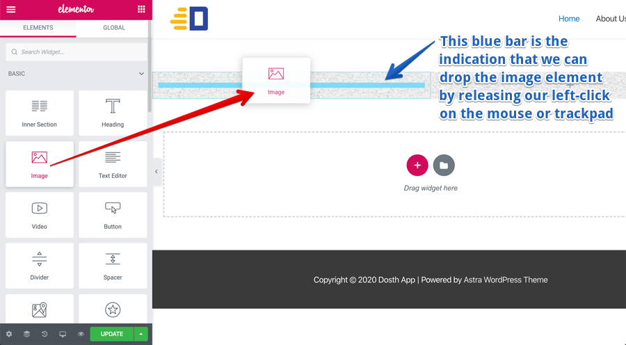
Now that we have access to the Elements, drag-and-drop the “Image” element into the left column of the first section.
Remember, you can only drop the elements into a column and you can drop the element as soon as you can see the blue color bar inside a column.
Elementor Tutorial: How to set up an Element inside Elementor
And as soon as you have placed an element inside the column, it gets selected and the options related to that specific element will open up on the left-hand side.
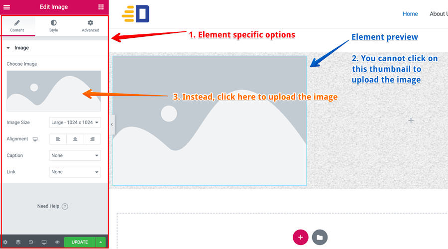
If for some reason, the element that you just dropped is not selected and its options do not open up, hover over the element and click the “pencil icon” to bring up its options.
Remember: This is true for all the elements inside Elementor, not just the Image Element.
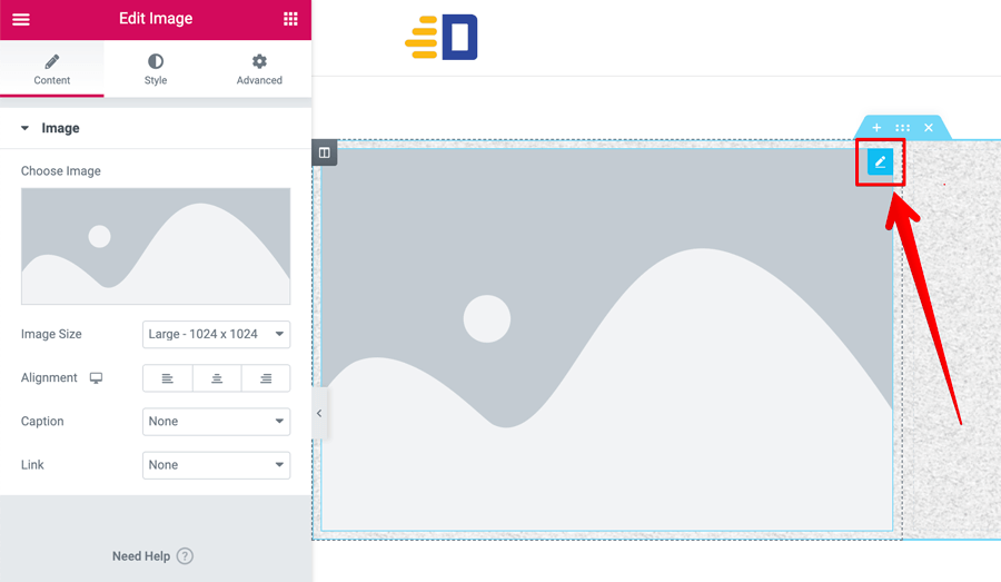
Also, If you notice, the options related to a particular element are divided into three logical tabs.
The Content Tab
As the name says, you can set up the content related to the element here.
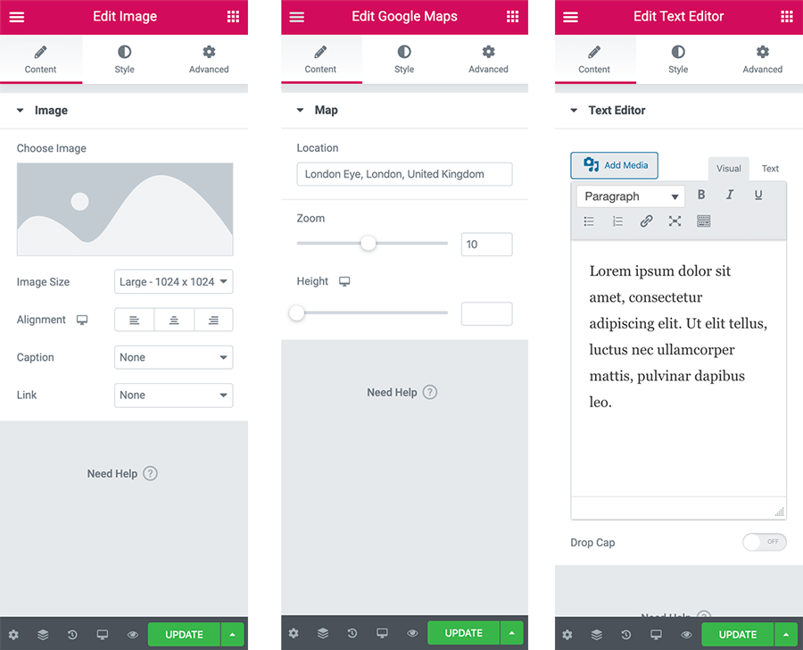
For example, if it’s an image element, you will upload an image. If it’s a “Google Map” element, you’ll specify the location. If it’s a text element, you’ll write content in it.
Simply put, based on the element selected, the options inside this tab will change.
Got it?
The Style Tab
Again as the name says, options that modify the styling of the element are located here.
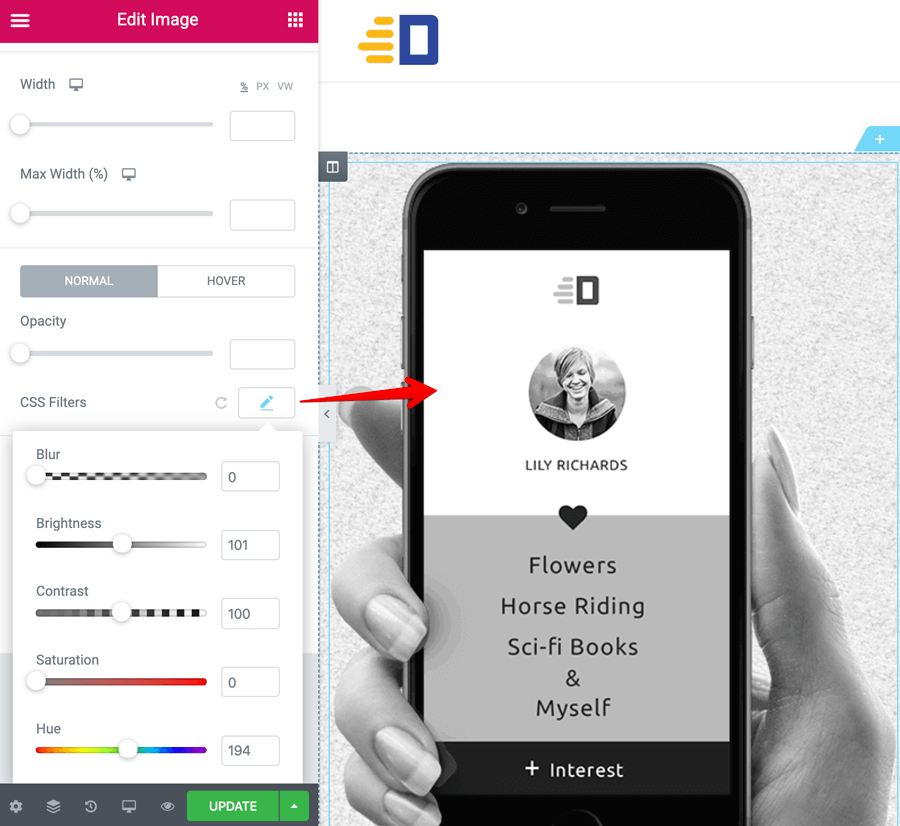
For example, if it’s an image element, using the “CSS Filters” option, you can turn an image into Black & white without modifying the original image and without using Photoshop.
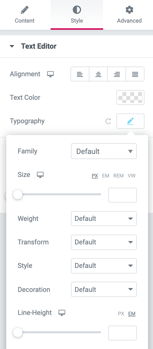
And if it’s a text element, you’ll find alignment and typography options inside this “Style” tab.
Again, these options will change based on the element.
You get the idea, right?
The Advanced Tab
And, lastly, most elements will have the same options inside the advanced tab.
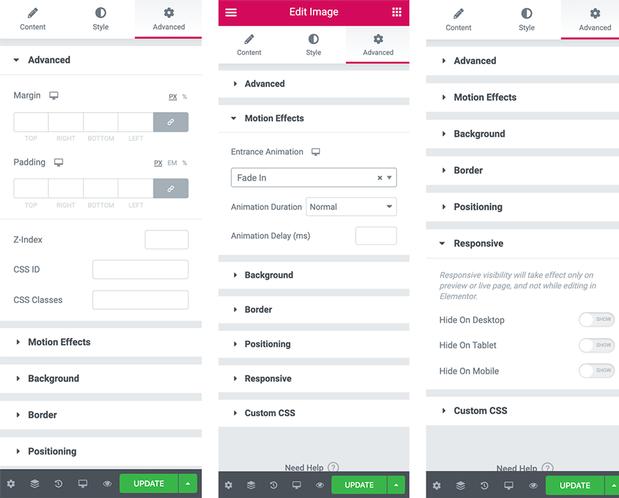
Inside this tab:
- you can adjust the spacing around the element using margin and padding
- add a background image or background color to the element using the “Background” option
- Add animations to the element using the “Motion Effects” option
- And finally, if you want to hide the element on a particular device, you can do it using the “Responsive” options.
That’s why we call this “Advanced Tab” and we will be spending quite a lot of time on this tab specifically when we are building pages with Elementor.
Elementor Tutorial: How to deal with Images
Anyway, now that you know how to set up an element and the options that are available to us to make most out of any element, let’s start using the elements to build the Hero section of the Homepage.
To recap, we have already created a section with two columns and dropped the image element inside the left column.

Let’s start by setting up the image element by uploading an image.
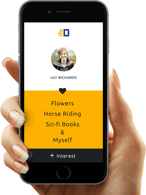
Choose the above image if you want to or feel free to go with any image you want and experiment with various options. That is the only way you’ll learn :)

Once the image is uploaded, you can adjust the other options like “Image Size” and “Alignment” to fit the design needs.
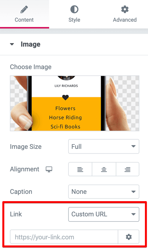
By using the “Link” option, you can link the image to a URL if you want to. What this does is, if you provide a URL, when the visitor clicks on the image, it will take the visitor to the provided URL.
I use this all the time. Clients always want to link images to the internal pages.
Next, by default, the image is aligned at the center of its container. I am ok with that, So, I didn’t touch the “Alignment” option at all.
The same goes for the caption. I don’t want to display any caption for this image. So, I have left it as it is.
Anyway, I have the set the image size to “full” to display the original image as is without getting cropped. Other image size options could crop the image leaving us with an undesired effect.
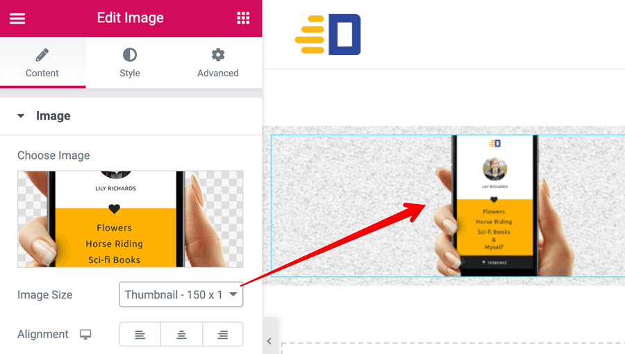
For example, the “thumbnail” image size will crop the image to 150x150px dimensions without considering the aspect ratio of the original image, making it look awkward.
Having said that, selecting the “full” image size only works if we follow the best standards of optimizing the image.
Pro tip: Do not upload oversized images
The first thing to consider when optimizing an image is the size of the container where the image is being placed.
The image dimensions shouldn’t cross the width of its container because we are not using those extra pixels in any way.
This reduces the image size and in turn, the entire page will load a bit faster.
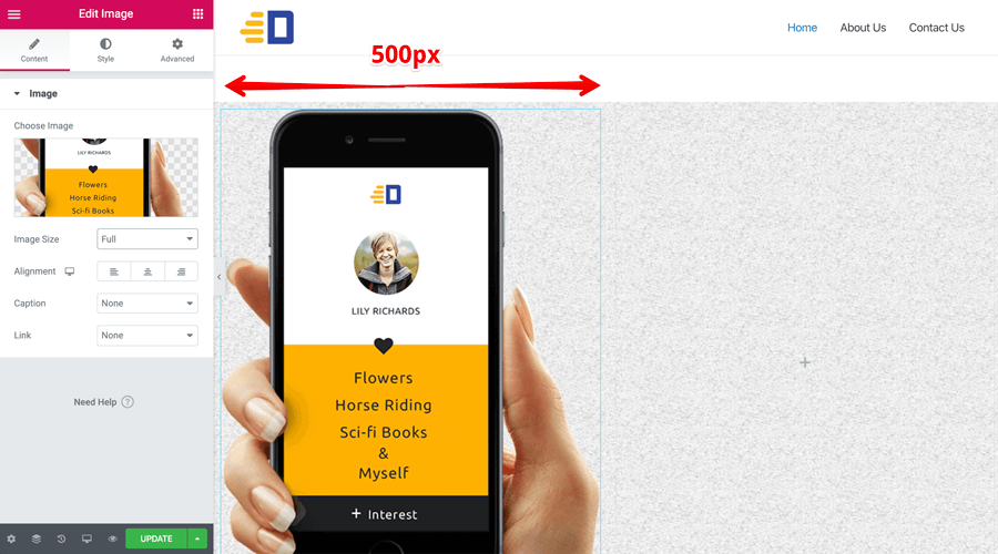
For instance, in our case, we have uploaded the above mobile image into the left-hand column and its width is 500px.
So, while maintaining the aspect ratio of the image, we have to upload an image that is no more than 500px in width and it should be further compressed with a service like Tinypng.
Always remember, Upload the image only once it is optimized for the web. I have written an in-depth article about how to optimize images before uploading them to WordPress. Please read it when you find the time. It is important.
Next, let’s deal with the right-hand column.
Elementor Tutorial: How to deal with text content and its typography
Introducing the “Heading” element to create headings of the page
Go ahead and drop the “Heading” element inside the right-hand column like this:
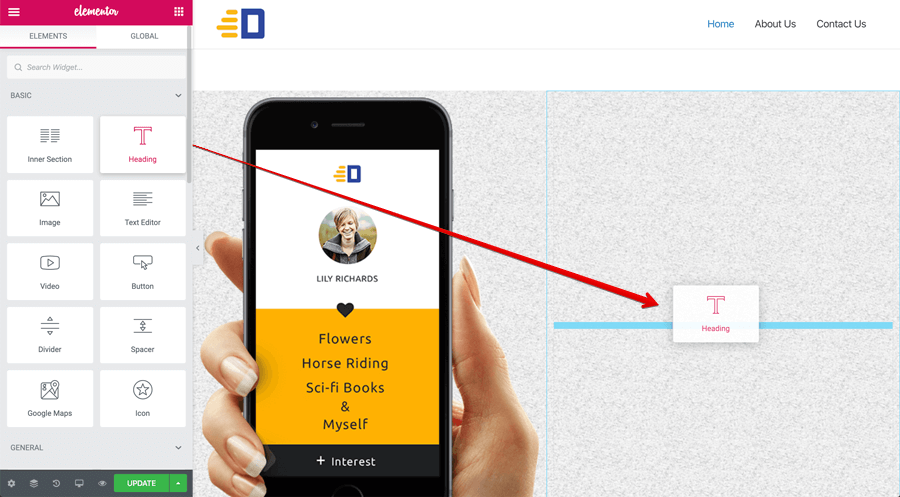
Now, the heading is in yellow color and the heading tag being used is H2 indicating that it is a second-level heading on the page.
In some scenarios, this is not correct from the SEO perspective. The first main headline of the page must be an H1 heading tag. So, we have to fix it by editing the heading element on the left-hand side.
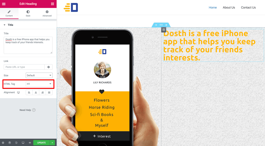
As you can see, I have changed the heading to the H1 tag and left the other options as is.
This is because I want the text to be aligned left and the “Alignment” option defaults to left. So, I didn’t have to specify it manually.
I don’t want to link this heading to any URL, so, I left it empty.
When it comes to the size of the heading, I want to have more control over, so I did not change the “Size” option from default. We will tackle this in a moment.
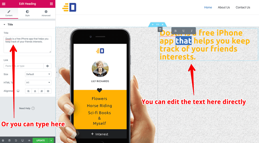
And finally, when it comes to editing the text of the heading, you can edit it two places.
- Using the “Title” field under the “Content” tab
- Edit the text directly by clicking inside the Heading element inside the preview (our playground)
Remember: This applies to all the Elementor elements that are text-based. Not just the Heading Element.
Anyway, next, let’s reduce the font size of the Heading and change it’s color to black. And where can we change the appearance ( style ) of a particular element?
“The Style Tab”
Correct!
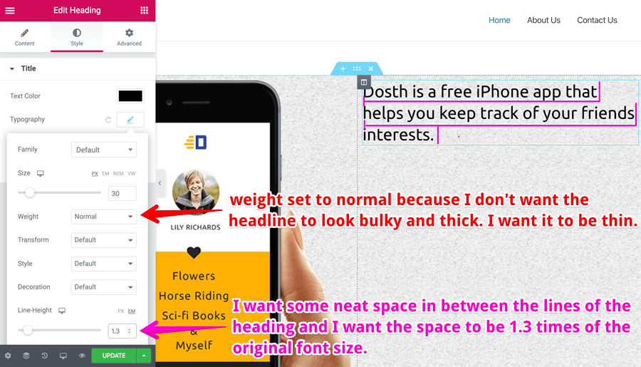
So, let’s switch to the “Style” tab and let’s change the color to black by clicking on the color box that is next to the “Text Color” option.
Next, let’s edit the typography by clicking on the “pencil icon” that is right next to it.
Always remember, if you see a pencil icon next to anything, that means you can edit it by clicking on that “pencil icon”. “Pencil icon” is the universal symbol for editing.
Anyway, I did not touch the “Family” option because we have already set up the default font-family to “Ubuntu” all over the page by using the “Default Fonts” panel at the very beginning of this Elementor tutorial.
This is a huge time saver.
For the size option, let’s go with 30px.
I don’t want the heading to be bold, so I made it thin by choosing “Normal” weight.
And finally, for the line-height, I have specified 1.3 because I want some neat space in between the lines of the heading.
The greater the number than 1, the greater the gap between the lines. To learn more about line-height, please visit the following link:
https://smad.jmu.edu/shen/webtype/lineheight.html
Anyway, it is a good idea for you to play around style options to fit your design thinking. It doesn’t hurt to experiment, is it?
Introducing the “Text Editor” element to create any type of text content other than headings
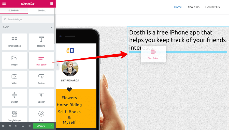
Next, let’s add a small paragraph right underneath the heading element by dragging and dropping the “Text editor” element.
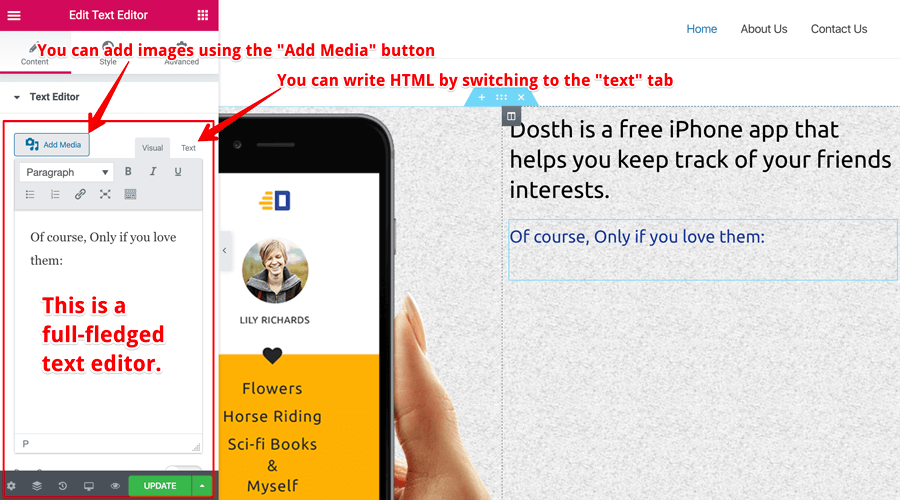
The “Text Editor” element helps us write rich text content by providing us with a full-fledged WYSIWYG editor (What You See Is What You Get Editor)
If you have any experience with WordPress classic editor, you’ll feel right at home.
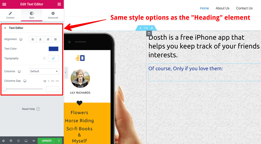
Again, you can adjust the style of the text by going to the “Style” tab. Since, both the Heading element and Text Editor element are text-based elements, you’ll find the same style and advanced options for both of them.
You get the idea, right?
And, that’s pretty much how you deal with text content inside the Elementor :)
Elementor Tutorial: How to create a nested section with two-column layout
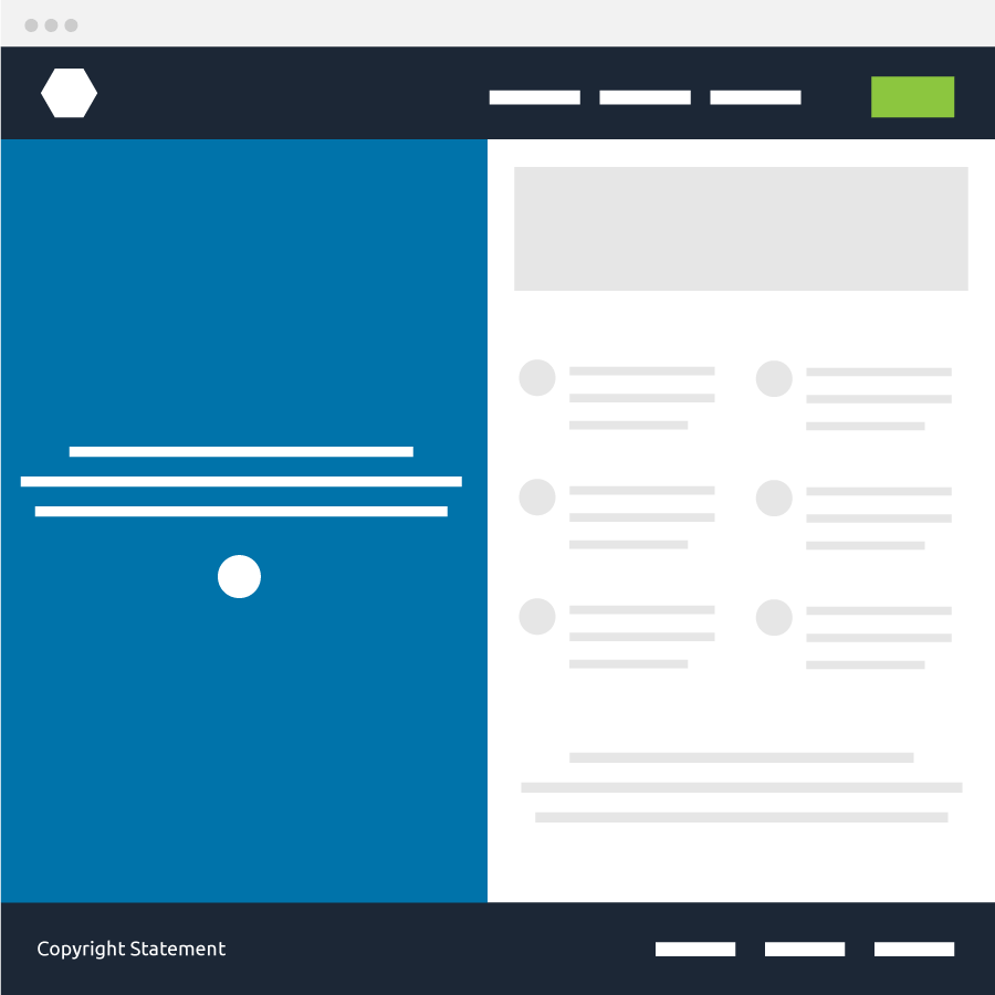
Sometimes you need to create a section inside another section and the first thing that you need to learn is how to recognize the need for an inner section.
For example, if you see the above wireframe of a web page, you can tell that it’s a two-column layout easily. But, can you see if there is an inner layout inside one of the columns?
“Yep! There is a nested two-column layout inside the second column”
Correct! Here is the breakdown if you didn’t get it. It’s ok, sometimes, your eye needs some training because you are just getting started out :)
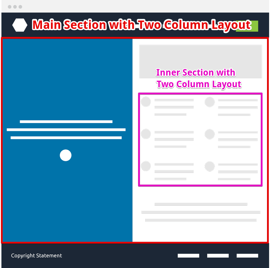
The thing is, once you realize the requirement, you can start looking for a correct Elementor element to achieve the job.
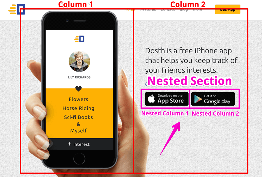
Our design of the Hero section has a similar requirement too. We need to line-up two image elements side by side and the best way to achieve that is by creating an inner section inside our right-hand column.
And it’s easy to create an inner section using Elementor.
All you have to do is use the “Inner Section” element. So let’s just drop it right underneath the paragraph:
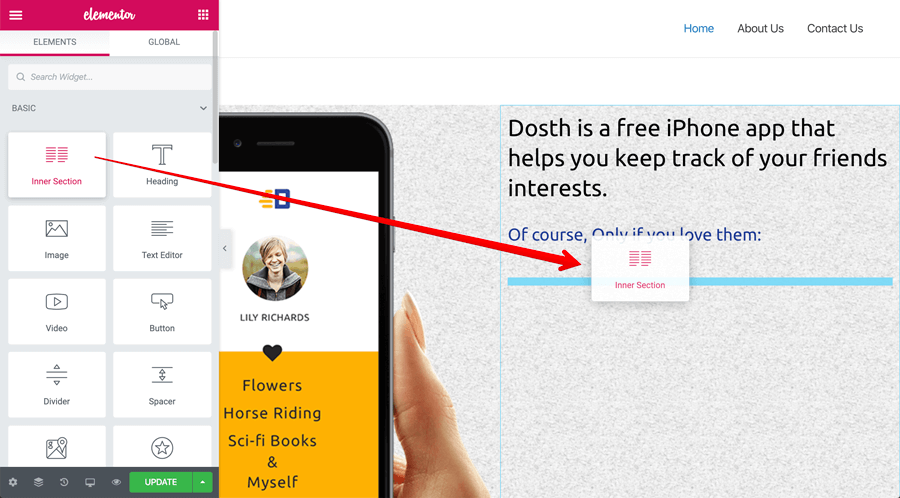
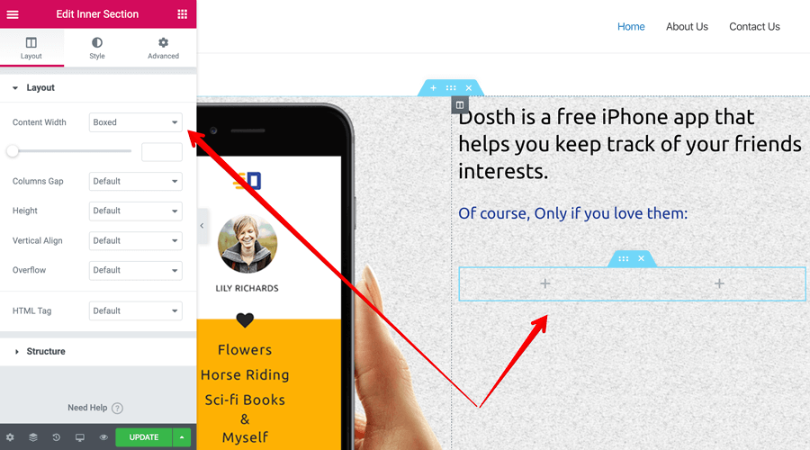
And as you can see, the “Inner Section” element functions exactly like the outer section with one minor difference.
The “Inner Section” element doesn’t have a “Stretch” option at all and It makes sense because we don’t really need to stretch an inner-section to occupy the full width of the screen. We use the outer section for that, right?
So, Except for the “Strech” option, all other options are the same for both outer and inner sections.
And, that’s pretty much you create an inner-section inside Elementor. Easy, right?
Anyway, let’s quickly add the two app download buttons inside the newly created “Inner Section” using the “Image” element. Use the following images if you want to:


And here is the output after setting up the image elements:
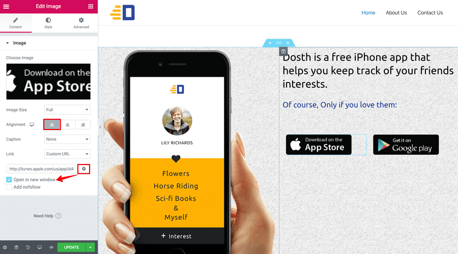
If you remember, the images are by default aligned to the center of the column they are placed in. But I want the images to be aligned to the left side this time. So, using the “Alignment” option, I aligned both of them to the left.
Next, using the “Link” option, I linked them to their respective app stores so that the visitors can download the apps by clicking on the image buttons.
Finally, I want these to open up in a new tab, so I clicked the little gear icon and selected the “Open in new window” option.
That’s pretty much how you create a section and add elements to it inside the Elementor.
However, if we now compare the hero section with the original mockup, there are quite a few spacing issues. Let’s fix them next.
Elementor Tutorial: How to deal with spacing around the elements
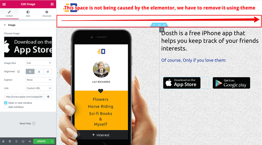
The first thing that I want to clean up is the space at the top of our hero section. Although we were successfully able to hide the title of the page using Elementor, because of the way “Title” is being outputted from the active Theme, some empty space still exists.
If you are using Astra theme or any other theme and you see an empty space like that, exit out of the Elementor interface by using the “Exit to Dashboard” button from the global options to access the default “edit” screen of a page.
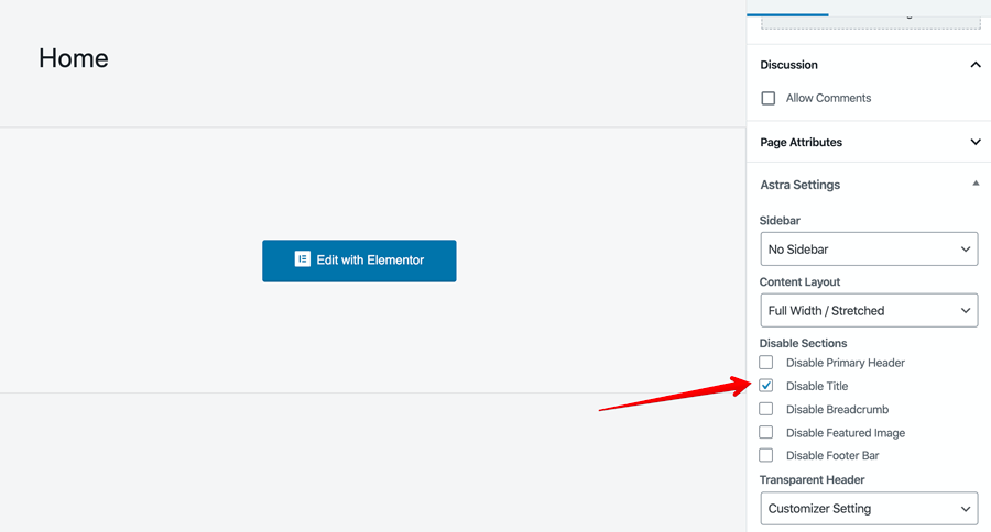
Then, try to find an option to hide the title. For example, in the case of the Astra theme, it provides an option for just this purpose. This will remove the space for sure because the option is being provided by the theme itself.
So, it’s reliable.
Anyway, now that space at the top is removed, the next thing I want to do is, reduce the “Content Width”. I want the primary headline to wrap into three small lines instead of two big lines.
Elementor Tutorial: How to reduce the content width of a section
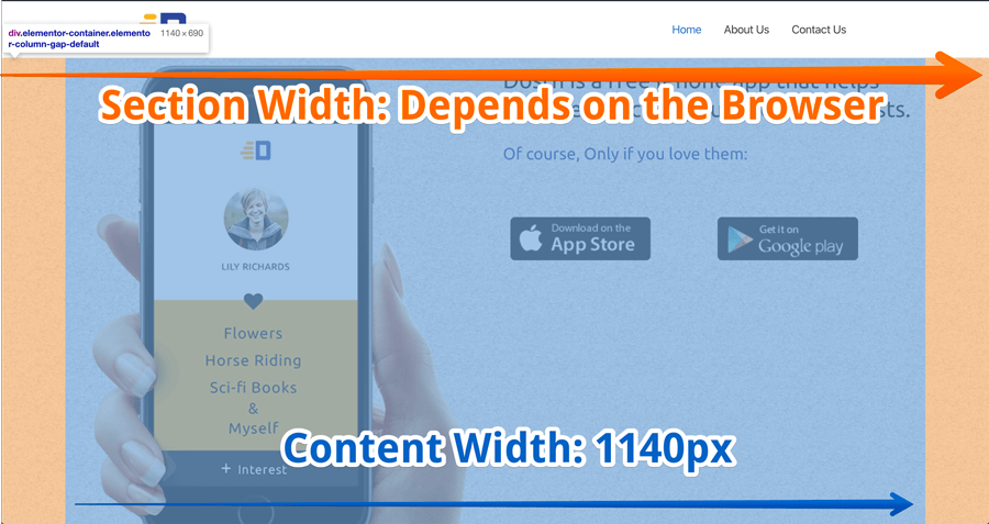
Now don’t get confused with “Content Width” for the entire “Section Width”.
Because we have stretched the section to be full width, the section width is the entire width of the browser. For example, for a 15inch laptop, the section width would be 1440px.
And, the “Content Width” is the width of the content inside that section. For example, in the above image, the blue color overlay is the content width.
Currently, the content width is 1140px because we have chosen “Boxed” as the value for the “Content Width” option for the section we are currently working on.
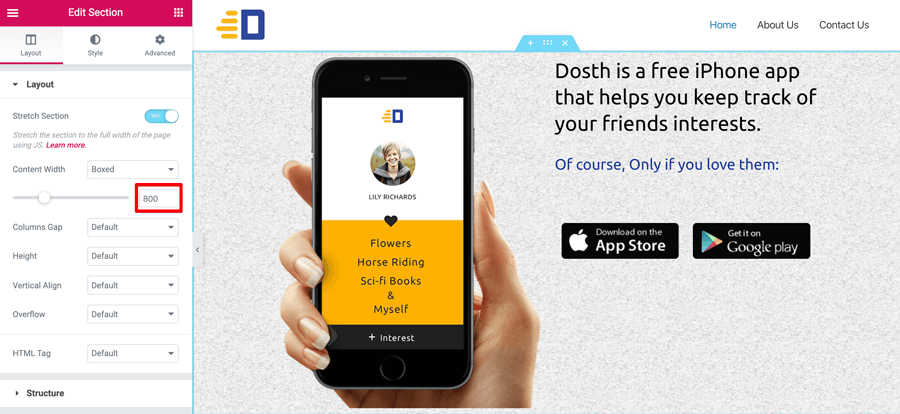
Recap: Content width is a “Section” specific option. So you have to click on a particular section to access its options.
If you notice, there is a slider option right-underneath the “Content Width” option and I have reduced it down to 800px to achieve the effect we are looking for. So here is the updated content width on the frontend.
It looks much better now, isn’t it?
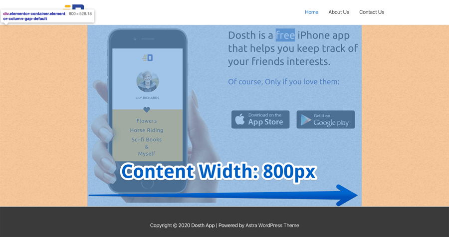
And, that’s pretty how much you fiddle with the width of the content inside a particular section.
Next, I want to reduce the gap on top of the app store image buttons. That is a weird gap, right?
Elementor Tutorial: How to fix weird gaps
Now, based on how you enter the text inside the “Text Editor” element, it might produce a weird gap some times.
In my case, I have copied the “Of course, Only if….” text directly from the following page:
http://dosth.usablewp.com/
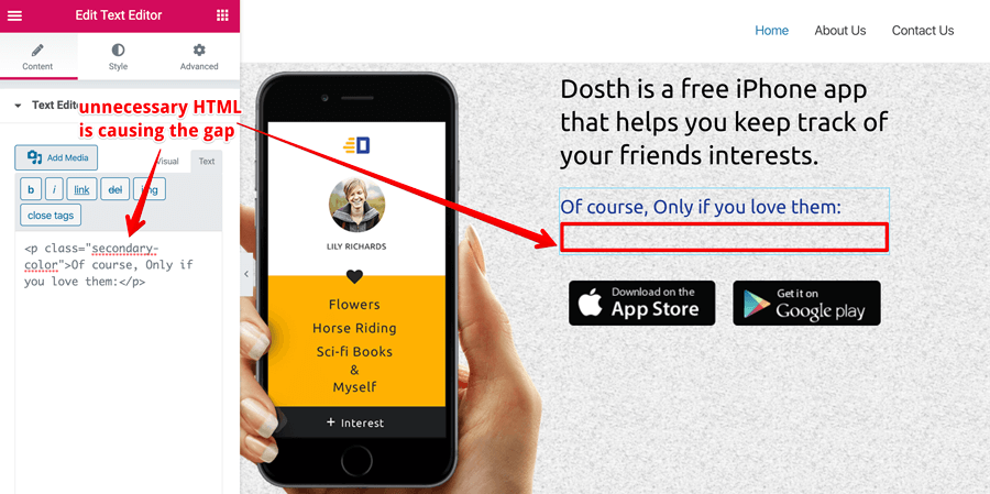
And Since I directly copied the text into the “Visual” tab of the “Text Editor”, it copied the HTML code around the text as well. This is the natural behavior of the “Visual” tab. You can see the HTML code if you switch to the “Text” tab.
So, it is a good idea to check the “text” tab for any unnecessary HTML code and remove it if there is any.
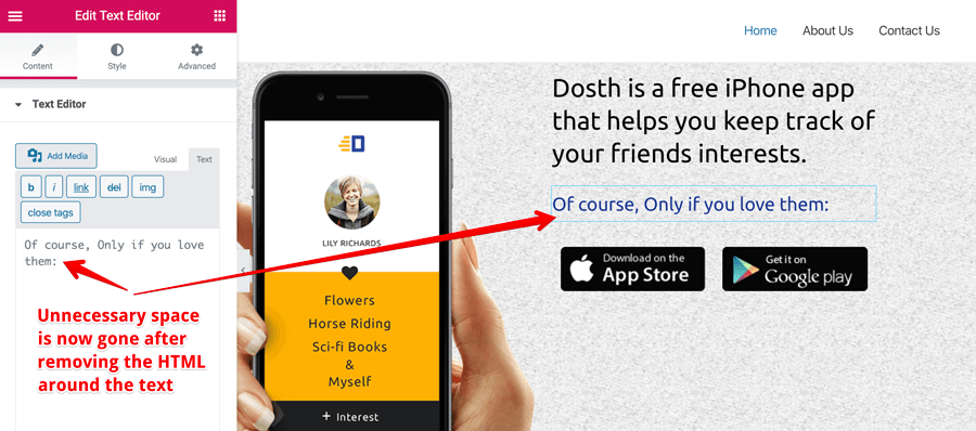
As you can see, The weird gap is now gone after removing the code around the “Of course, Only if….” inside the “text” tab of the text editor.
This happened a lot of times to my clients, So, I thought you should be aware of this situation.
We are almost there. Hold on!
If you notice the App download image buttons, they are not aligned to the left side of the “Of Course, Only if…” text.
We could have left it as is, but it is a design call :)
Anyway, to fix this, you need to understand the concept of the padding and margin.
If you know about them already please just to the next section of this tutorial.
But, in case, if you don’t know what margin and padding are, please read more about them here:
https://www.usablewp.com/margin-vs-padding/
I will wait until you come back with a better understanding of both margin and padding.
Back? Ready?
Elementor Tutorial: How to fix spacing issues using margin and padding
By default, Elementor adds 10px of padding to all the columns of a section.
This applies to the columns of the “Inner Section” element too.
For example, if you watch closely, there is indeed 20px of padding for both Column 1 and Column 2 of the Hero section.
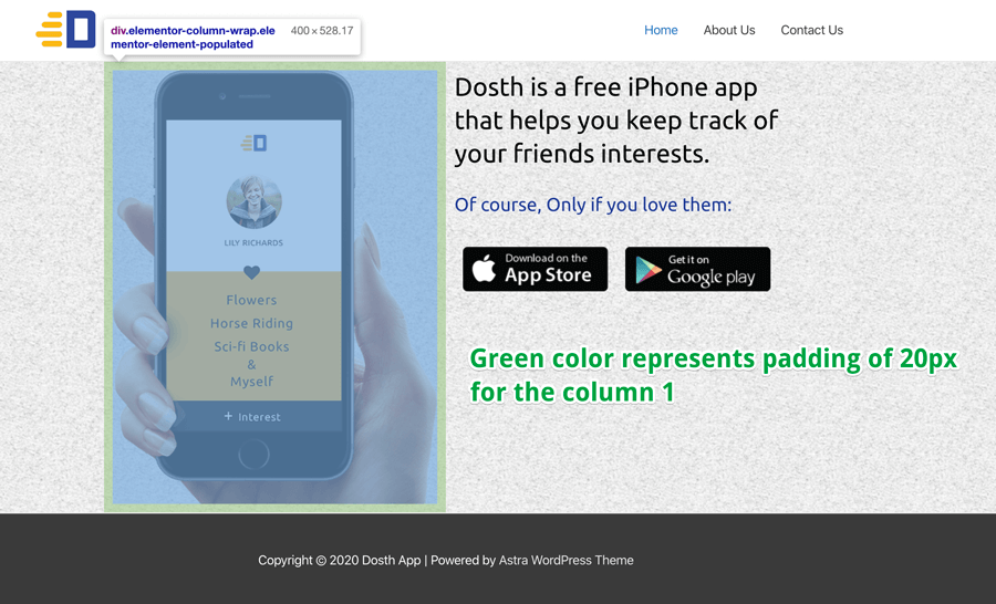
The green color area in the above image represents the 10px of padding for column 1. The same thing applies to column 2 as well.
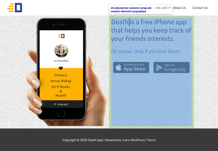
Generally speaking, Elementor adds this padding by default so that there is a gap between the contents of the column. But sometimes, this kind of padding comes in our way and makes the design look imbalanced.
The best example of this imbalance is the padding that is applied to columns of the “Inner Section” element with images.
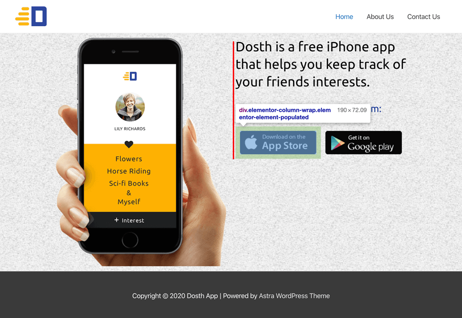
See Column 1 of the inner section? Because of the padding that is applied to this column, the image button is not aligning to the leftmost side of the Second column.
Common, let’s fix this by removing the padding-left from both the columns of the “inner section”.
In order to achieve this, first, we have to access the column 1 settings of the inner section element.
So, hover over the Column 1 and click on the “Column Icon” to access its settings.
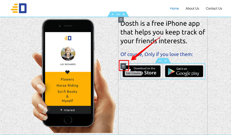
Next, under the column settings, go to the advanced tab to edit the Padding values.
Right now, we can not see any values because the default padding value of 10px is being applied to all the padding options.
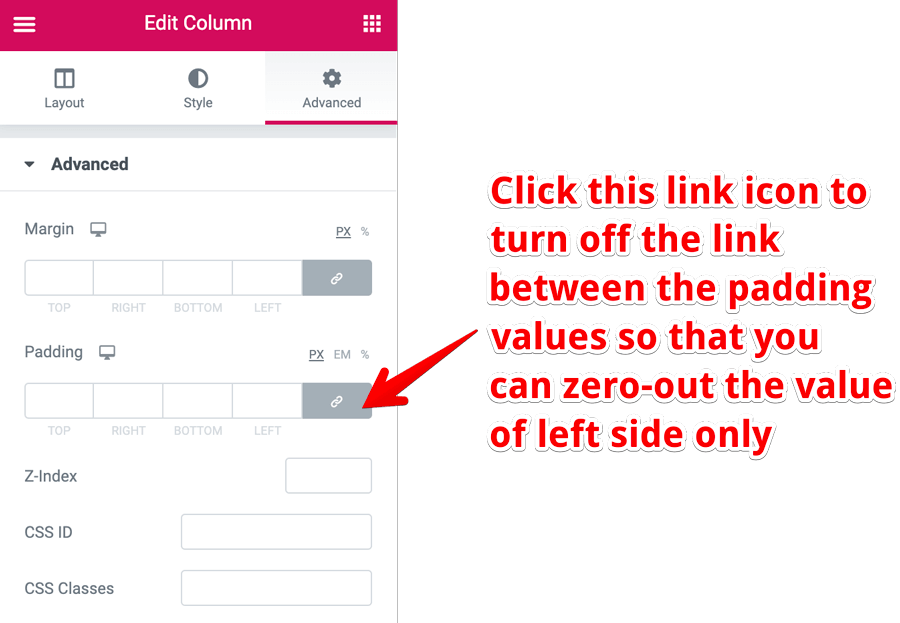
Also, if you notice, there is a “Link Icon” with a grey color background option next to the padding value boxes and currently, it is active.
That means if you put a value of 10 for padding “top” option, the value 10 will be automatically filled for right, bottom, and left options as well.
If you change the value to 20 for the bottom option, all the padding options will be changed to 20 as well.
But we don’t want this linked value behavior, do we?
According to our requirement, we want to change the value of the “left” padding option to 0 while keeping the other options to 10px.
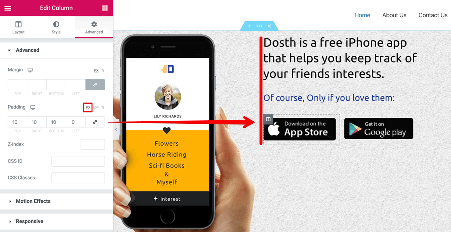
So, to achieve this, first click on the “Link Icon” to deactivate the behavior of the linked values.
As you can see, the grey color background is now removed from the “Link Icon” indicating that the behavior is currently in-active.
Also, at the same time, all the padding options are now filled with 0. So, change it to 10 for top, right and bottom padding options. And keep the 0 value of the “Left” padding option as is.
If you notice, I did not enter 10px. Instead, I entered number 10 only without “px” unit. This is because, by default, the pixel “PX” setting is the active unit of measurement for both margin and padding options.
If you want to use “%” or “EM” instead, you can click on them to make them active.
Anyway, now, repeat the same steps for the second column of the “Inner Section” element for “width” consistency purposes. You don’t want the “Google Play” button to appear bigger than the “App Store” button, do you?
Next, while you are here, remove the padding on all sides for the left column that is holding the iPhone image too.
Here is the output after making the above changes. Looking good, isn’t it?

We are now just two more steps away from completing the hero section.
Elementor Tutorial: How to use negative margin to overlap elements
See how the button in orange is overlapping with the Hero section above it? Without applying a negative margin that effect is not possible.
One of the most requested techniques when it comes to any page builder is “Overlapping Elements”. That means one element overlapping with another element by either sitting on top of it or underneath it.
Our Hero section’s iPhone overlapping with the header portion of the site is another good example of this.

To achieve this effect, we need to apply a Negative Margin to an element.
When we apply a negative margin to an element, the element gets pulled up in space. And when this element gets pulled up, it affects its surroundings in two ways.
- It overlaps with the element which is above it.
- All the elements which are underneath the pulled up element will be pulled up to.
“But which element are you talking about?”
“Is it for the whole Hero section? or is it for the Header?”
No, if we apply a negative margin to either of them, the entire Hero section will overlap with the header like this:

See? We can no longer see the logo or primary navigation of the site any longer. So, applying a negative margin to the wrong element makes other elements that are above it “inaccessible”. Keep this in mind.
The correct element to apply a negative margin is the iPhone image element because if you notice, the iPhone image is the only element that is overlapping with the header.
so, the overlapping effect can be achieved by applying a negative margin only to the iPhone image.
Anyway, click on the iPhone image element to open up its options and go to the “Advanced Tab” so that you can fiddle around with the options.
Next, a negative margin just means providing a negative margin value. So, put -50 (px) into the “top” margin option so that it pulls the iPhone image upwards without moving the header section or the entire Hero section.
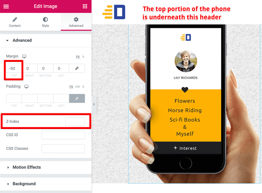
Ah! There is a problem. The top portion of the iPhone image is now underneath the header section and since the header section has a white color background color, the image looks cut off.
You can see the problem if the header section has a transparent background color like this:

The actual problem is, z-index of the elements. Since the header section is coming first on web page, it has a slightly higher z-index than the iPhone image. So, if we increase the z-index of the iPhone image to something higher than the header section, that will fix the cut-off problem.
Don’t worry. Elementor has got you covered with its z-index option which is underneath the margin option. So, all we have to do is experiment with a high number that brings the iPhone image to the top of the header instead of underneath it.
For the current scenario, bumping up the value of z-index to 99 did the trick. But it’s completely trial and error because page-builders work in a mysterious way.
So, if the value 99 doesn’t work for you, enter a higher number. The greater the number, the greater the chances of coming on top.
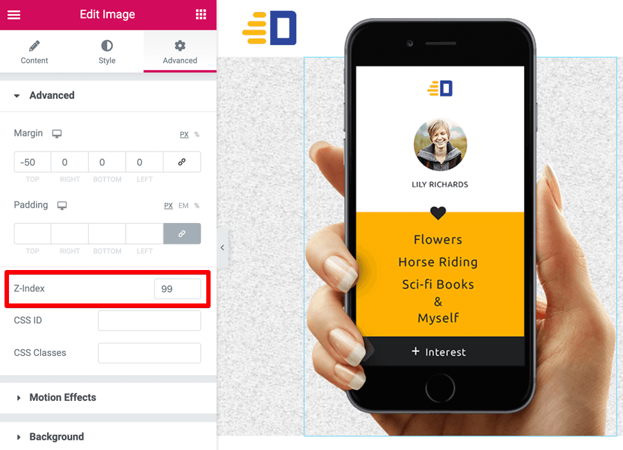
Get it?
Having said that, the Z-Index feature works a bit predictably when we are not working with page builders because there is no added complexity. Since this guide is not aimed at CSS developers, I am not going in-depth.
Anyway, one final adjustment that I want to make to the Hero section is centering the content inside the right-hand column with image buttons.
Elementor Tutorial: How to align the column’s content to the center
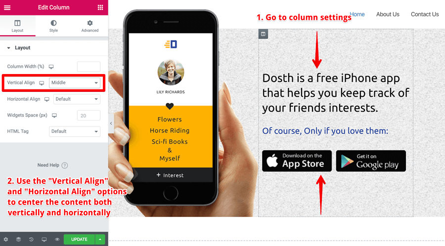
Centering a piece of content is extremely easy in Elementor.
Don’t use the padding or margin to achieve this. If you do so, you have to adjust the values again for mobile and tablet devices. So, it’s a big no when it comes to centering content.
Instead, based on the scenario, use “Horizontal Align” and “Vertical Align” options that Elementor provides us with.
So, all you have to do is to go to the settings of a particular column whose contents you want to center.
Then, under the “Layout” tab, choose “Middle” for the “Vertical Align” option.
That’s all :)
Please don’t forget to save the changes you made by clicking on the “Update” button.
For the purposes of our Hero Section, the “Vertical Align” option did the trick. But, this only centers the content vertically.
If you want to align the content horizontally too, choose “Middle” for the “Horizontal Align” option as well.
Here is the output of the completed Hero Section:

“Hey! But how does it look on mobile?”
Yeah! Good question. I almost forget.
Elementor Tutorial: How to preview and fix responsive issues on mobile and tablet
The Hero Section is looking great on the desktop, but what about tablet like iPad and mobile like iPhone?
We are living in the modern era of the internet. So our page should look great on all devices, right?
“But how do we check that?”
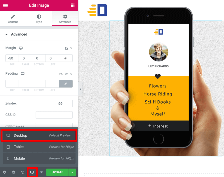
Did you notice the little “desktop icon” right next to “Preview Icon” icon?
If you click on it, a neat little popup will open up with device preview options. Clicking on one of the device options will let you preview how the page looks like on a particular device.
Not only that, you can enter device-specific values for all the options available for that particular element, column or section itself.
Common, click on the “Tablet” option to see if there are any problems on the tablet.
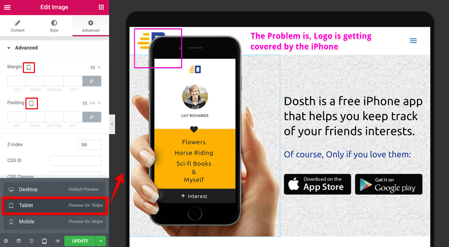
As you can see, as soon as I clicked on the “Tablet” option, Elementor is letting us preview the page inside a tablet mockup which is quite awesome in my opinion.
Also, all the “Desktop” icons inside the Elementor options panel are now replaced with “Tablet” icons. That means you can enter “tablet” only values without affecting the values that you have entered for the desktop.
For example, if you observe the above image, we are inside the iPhone “Image Element” settings and the “-50” negative margin that we have entered previously is now empty.
Now, it doesn’t mean that the negative margin is gone. You can still see the iPhone image overlapping with the header section.
The empty values inside the “Tablet” and “Mobile” view indicate that they have been inherited from the “Desktop” view but it’s just that you are free to enter a new set of values without affecting the “Desktop” view.
Get it?
Let me prove that. If you notice the screenshot, there is a problem. The iPhone image is now getting on top of the Logo of the site on tablets like iPad.
And, I have fixed it by adding a 70px of margin-left to the iPhone image.
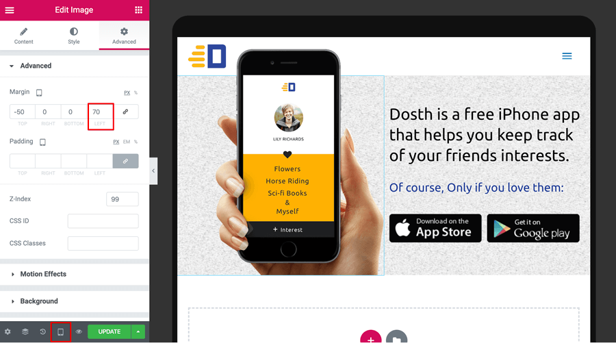
See how easy it is?
If you now switch to the “Desktop” view again, the old margin values are intact without getting affected by the values we entered for the “Tablet” view.
Isn’t that powerful and convenient at the same time? This is why I love Elementor.
Common, for one last time, let’s take a look at the “Mobile” view for any problems.
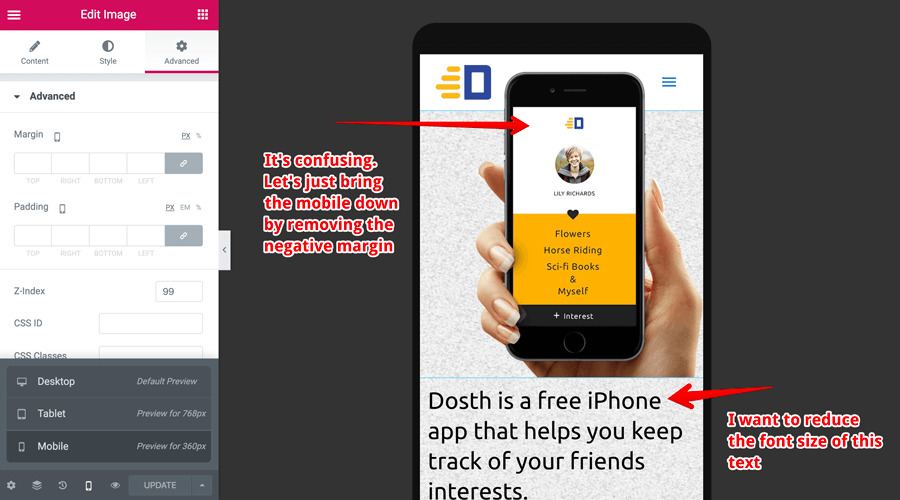
Surprise Surprise! You might have thought that the iPhone image will be overlapping with the Logo just like it did for the “Tablet” view before fixing it.
But that is not the case because, in Elementor, initially, “Tablet” and “Mobile” views are inheriting the set up from the “Desktop” view.
But if you set up an option from the “Tablet” view differently from the “Desktop” view, the “Mobile” view will inherit that option’s value from the “Tablet” view instead of “Desktop” view.
The margin option is the best example of this behavior. Previously, the margin value for the “Mobile” is being inherited from the “Desktop” view.
But since we have set up a different value for margin on the “Tablet” view, the “Mobile” view is now inheriting it from the “Tablet” view instead of the “Desktop” view.
Important: Always remember, the option that you have set for the “Desktop” view will have its impact on both “Tablet” and “Mobile” views unless a different value is set for that option.
But a value that is set on “Mobile” can not impact the “Tablet” or “Desktop” view. This is one of the basic principles of Inheritance being put to good use by Elementor.
Got it?
Anyway, although the Hero section looking OK on mobile, we can improve it by removing the negative margin from just the “Mobile” view and I also want to reduce the font size of the heading.
You already know how to do that, right? So, that is an exercise for you :)
Also, it is important for you to realize that the preview that you see for the “Tablet” and “Mobile” view is not 100% accurate.
Important: Elementor can not replicate the render of the real tablet and mobile devices. It can just mimic them. So, always test on real devices and then come back to Elementor to make the fixes.
So, I have checked it out on mobile and the result is good.
And, that’s pretty much how you fix responsive issues on tablets and mobiles.
Next, let’s check out how to build sections faster inside Elementor.
Elementor Tutorial: How to duplicate, delete elements and sections to build-out new sections
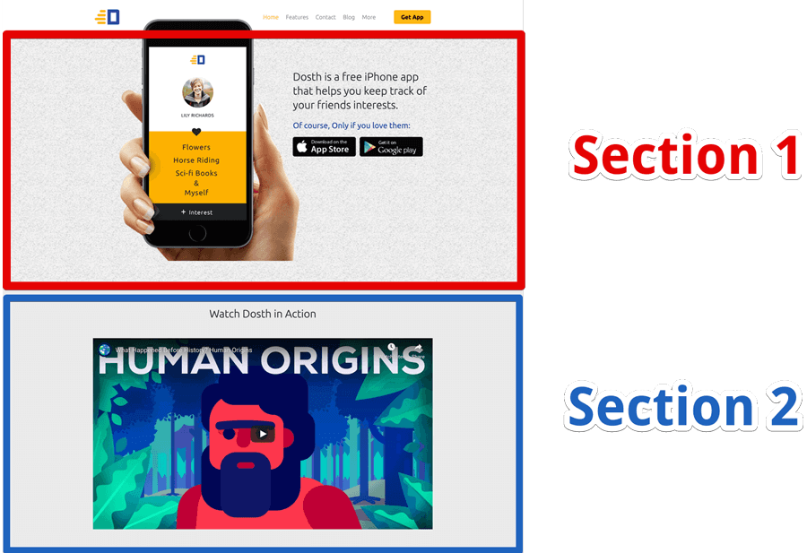
Now that we have spent a lot of time building out the Hero section of our Homepage, let’s reuse the section to build out the second section a bit faster.
I am duplicating the Hero Section because I want to re-use the same settings such as “Strech” and “Content Width ” for Section 2 as well.
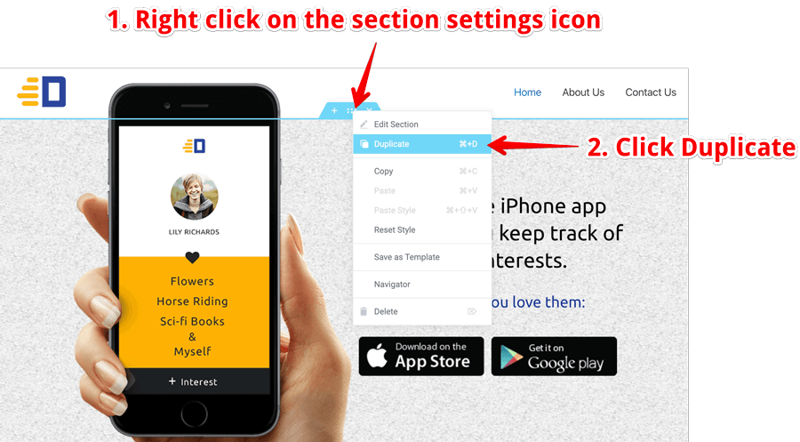
So to duplicate an Elementor Section, Right-click on the Section’s “settings” icon to bring out the context menu and then click on the “Duplicate” link.
You can also use the keyboard shortcut CMD +D on the mac or CTRL + D on the Windows to achieve the same thing. For these keyboard shortcuts to work, just click on the Section’s “Settings” icon and use the keyboard shortcut.
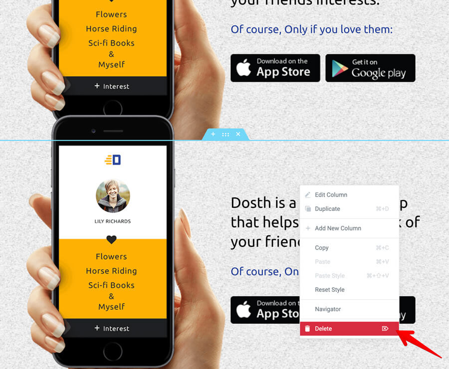
Next, let’s delete both the columns. To do this, right-click on the individual column and then click on the “Delete” link.
Remember: Deleting both the columns doesn’t make this section a column-less section. By default, every Elementor section contains at least one column no matter what we do.
After deleting the columns, drop the “Heading” element and then apply the “top, bottom” padding to the section.

Elementor Tutorial: How to add youtube video
Adding any kind of video inside Elementor is easy. Especially Youtube video.
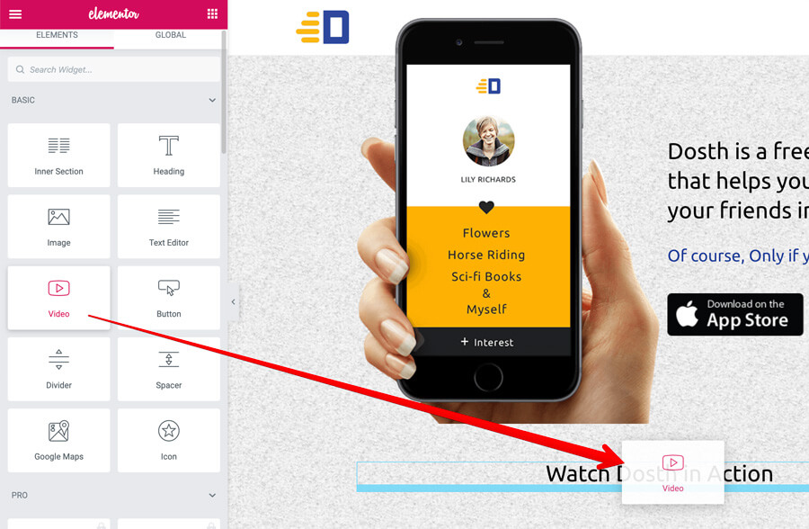
All you have to do is drop the video element and then paste the Video URL of your favorite video service like Youtube using the “Link” option under the “Video” element settings.
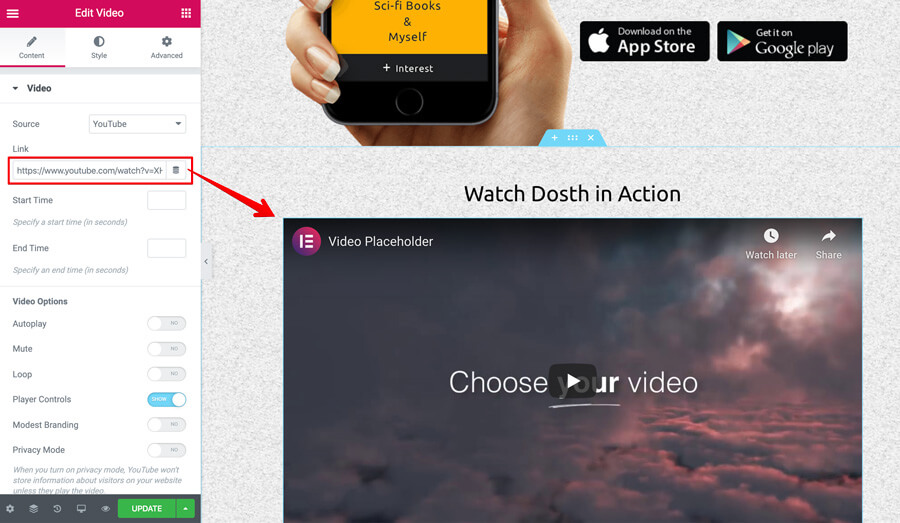
And, that’s pretty much how you can add kind of video. If it’s Youtube, add Youtube URL. If it’s Vimeo, add Vimeo URL.
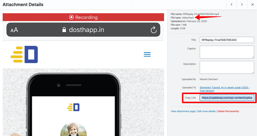
But if it’s a custom video, first upload the video to the Media Library and then grab its URL by clicking the video thumb. This action will bring up a popup and inside that Popup, you’ll find the custom video URL alongside the “Copy Link” option.
Easy Peezy, right?
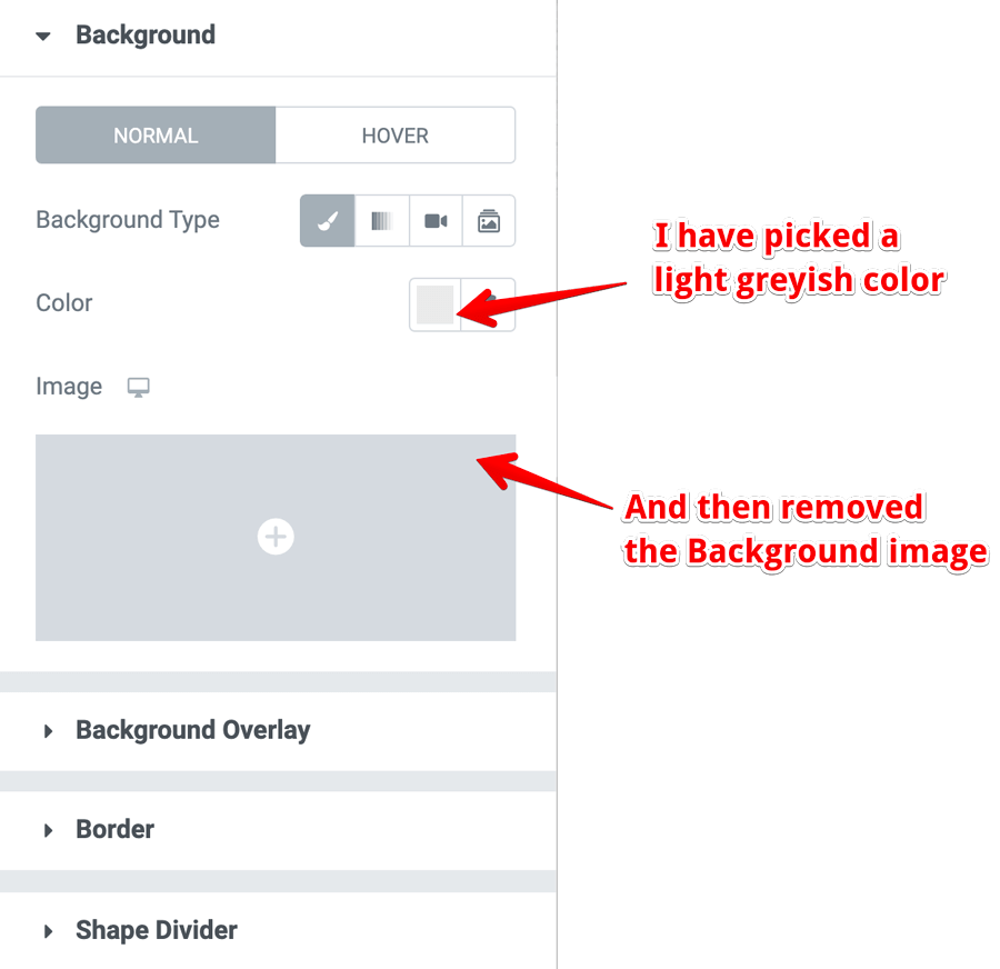
And, finally, I want to make one quick adjustment. For this video section, I want the background to be plain color instead of the textured background image.
How do we achieve that? Come on, consider this as an exercise and figure it out.
I will wait!
Done? Great!
For those who can’t figure it out, Go to the settings of the video section and under the “Style” tab, pick a solid background color for the “Color” option and then remove the background image completely.
P.S Don’t forget to update your changes.
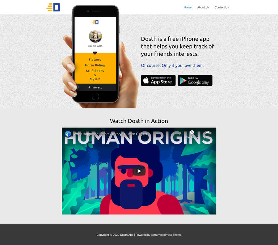
And this is how the final output of this entire Elementor tutorial looks like:
Step 7 Introducing Elementor “Templates” for re-using the Elementor sections
I have saved the best for the last.
In the last elementor tutorial, we have created a section with a video.
What if you want to re-use it on a different page or a different website all together?
This is where Elementor Templates come in. And, it’s really easy to create a template.
1. How to save a template
All you have to do is right-click on a particular Elementor “Section” and then click on the “Save as Template” link to save it.
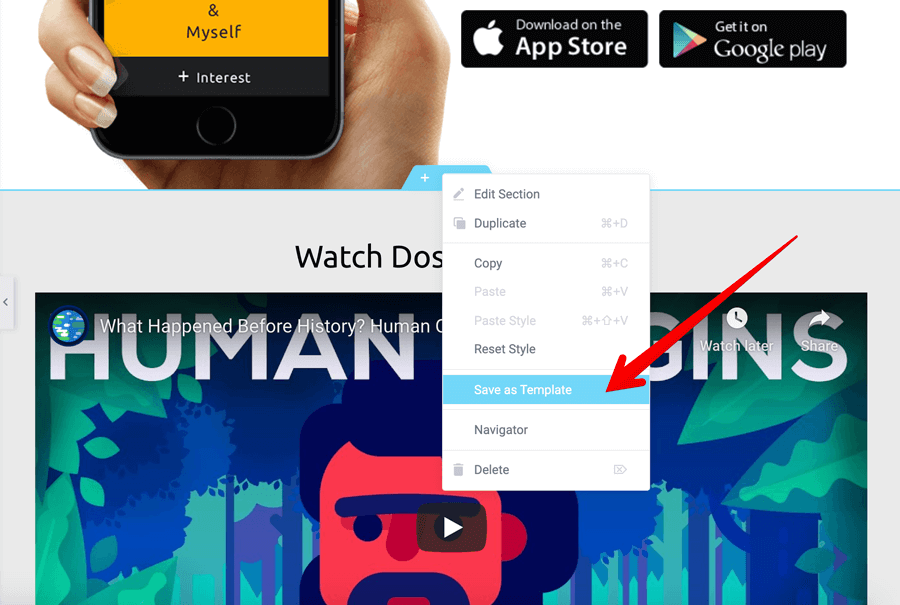
And as soon as you click on it, you’ll get a popup asking for the template name. Give a name that describes the template so that even others can understand what the template is for.
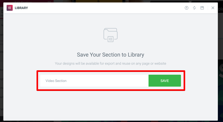
As you can see, Elementor ships with a Library where the templates that you have designed can be saved and used later. We will talk more about the Elementor Library in a moment.
For now, Just click on the “Save” button to save the template to the Library.
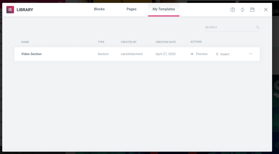
And that’s pretty much it. That’s exactly how you save a template.
As you can see in the above popup, once the template is saved, you can preview it and insert it on the same page too.
Anyway, we will use this template on a different page. So just close the popup and let’s create a new page to test this.
2. How to use a saved Elementor template on a different page of the same website
I went ahead and created a new page called “Features” and started editing it with Elementor.
I omitted to explain about the Library for a good reason.
The Elementor comes pre-loaded with a ton of good looking templates which might make you lazy.
Now that you know how to build and design a template all by yourself, it’s time to introduce the most important feature of the Elementor.
The Library.
So, how do access the library to insert and use a saved template?
Simple, the library has been right in front of our eyes the whole time.
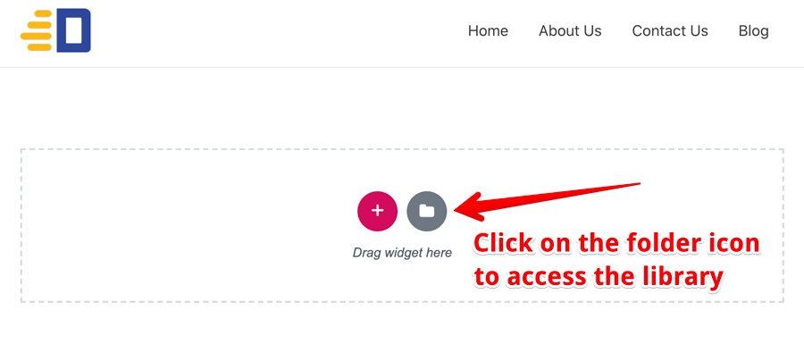
Right next to the “Add New Section” icon, there is a “Folder” icon and that is our ticket to the library.
And as soon as you click on it, you’ll get a popup asking you to choose a template.
Here, the templates we can that insert on to our page are divided into three tabs.
The template that we just saved is under the “My Templates” tab.
Go to it to insert the template by clicking the “Insert” button and then saying no to the confirmation “Import Document Settings”.
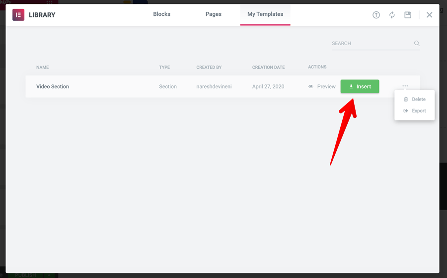
We are saying no to importing document settings because page those settings might differ from page to page and saying no is the safest option.
You can also say yes, but I would recommend experimenting with that option. I always say no and If I want the same settings as a previous page, I just change them manually.
It’s not like we are creating 100’s of pages this way, right?
Anyway, here is the output of the imported template:
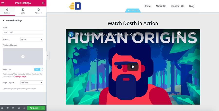
And If I preview it in the browser, It still looks same as it was on the Homepage.
Awesome isn’t it?
Now, let’s quickly talk about the other tabs from the “Library” popup.
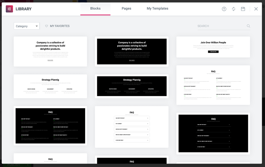
The Blocks tab will contain smaller sections of a page as templates. The template we saved previously will come under a page “block” technically.
Next comes the “Pages” tab, here you can find a whole bunch of good looking full-page designs as templates.
Isn’t that awesome?
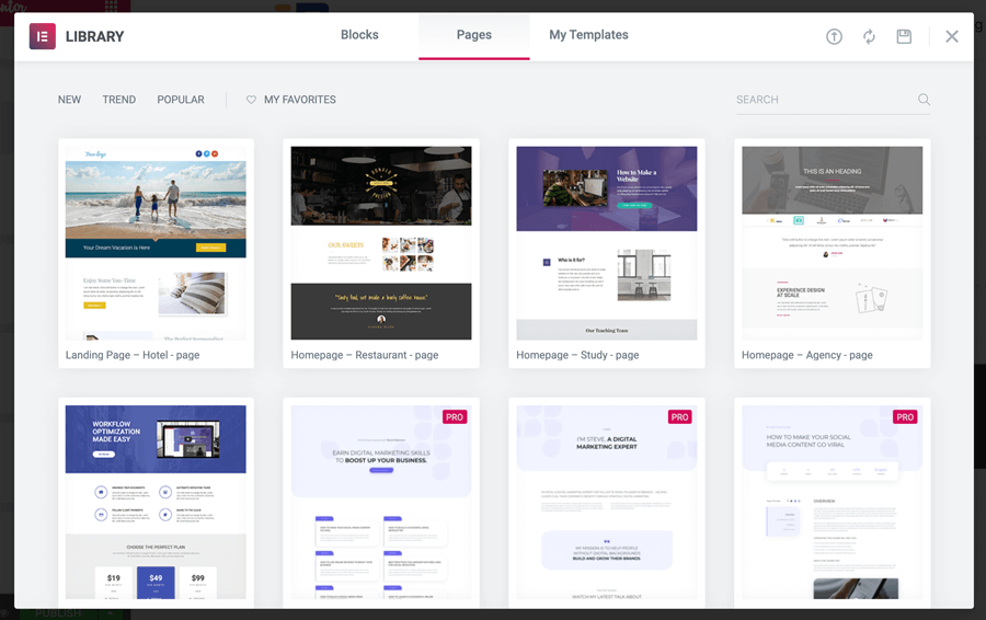
Trust me, now that you understand the ins and outs of the Elementor page builder completely, you can safely use these pre-loaded templates and modify them to fit your needs.
You are now a Pro Elementor user, isn’t it?
Next, let’s see how to export a saved template so that others can use it too.
3. How to export an elementor template
Did you know that there is an extreme demand for the Elementor template?
If you are a designer, you can use this opportunity to create a best selling Elementor Templates store or just give them away for free to get some visitors to your design portfolio.
Simply put, you can build a site like this yourself:
https://wpbuilt.co/all-templates/
Because of the popularity of Elementor, your options are just limitless.
Anyway, enough talking, let’s see how to export a template that you have saved.
We have to access the library again.
But this time, let’s go to:
Admin Dashboard -> Templates -> Saved Templates
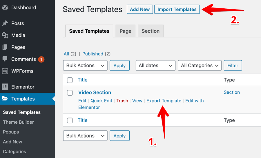
And then under the “Saved Templates” tab, you’ll find the template that we have just created.
You can use the “Export Template” to export the template and it will generate a “JSON” file which can be imported using the “Import Templates” button located at the top of the screen.
See, how easy it is? That’s why most of my clients really love Elementor.
If you are just using the elementor for the sake of designing the templates and exporting them, then you don’t even have to create a new page.
If you notice the above screenshot, there is an “Add New” button at the top left-hand side of the screen.
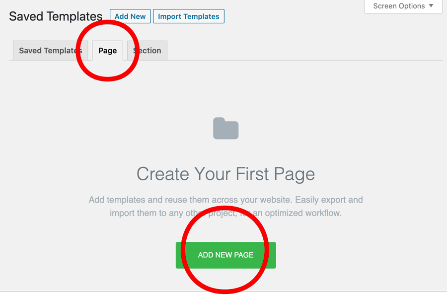
Instead of a small section of a page, You can also design a full-page template using the “Page” tab and export it.
The more use you Elementor, the more you understand how powerful Elementor is when it is compared to other page builder plugins.
The best part is, you can do a lot just with a free version. Isn’t it?
Here is the list of resources that provides an awesome list of pre-made Elementor templates. Either they are free or you can buy them for a good price. If you want to save time, just use them:
https://wpastra.com/elementor-templates-free-downloads/
https://wpbuilt.co/all-templates/
https://launchparty.org/free-elementor-template-blocks/
My clients just love the templates on those sites <3
Final Thoughts and Conclusion
And, That’s it.
That’s pretty how you use the free Elementor plugin to build awesome looking page designs without having to touch a single piece of code.
If you have built the above design all by yourself, then you can build any kind of layout without any problems.
Having said that, you’ll learn quite a lot by building more and more page designs.
So, do more to learn more :)
And since you understand almost everything about the Elementor, you are the better judge when its come purchasing the Pro version version of the Elementor.
Elementor Pro will let you build the Header and Footer of the website and ships with a good number of new pro templates and widgets which lets you build even more professional looking websites.
It’s a complete package.
Anyway, If you have any questions, keep them coming in the comments section below.
Happy playing around with Elementor!
LOOKING FORWARD TO INTERACTING WITH YOU!


 © 2026 UsableWP. A project by Naresh Devineni.