Creating a footer for our website
Every website will have a footer, and it is located at the bottom of every page on a website, just below the main content.
If the main content and the sidebar bring you business, the footer area protects you from the legal issues that come with that business.
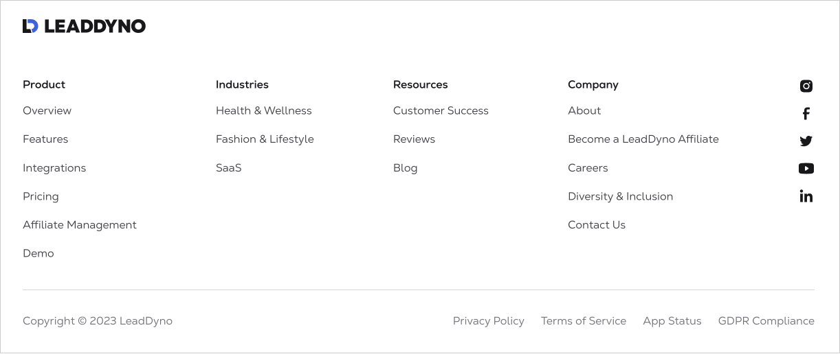
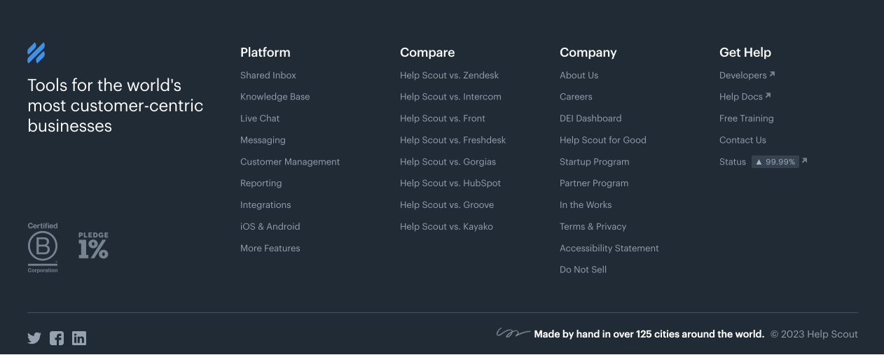
An ideal footer area should at least contain the following elements:
- A copyright statement – to protect your website content from getting stolen
- Links to legal pages such as Privacy Policy, Terms of Use, etc.
But there is much more to a footer.
Apart from the legal stuff, depending on the type of the website, a footer could also contain:
- Hard-to-find links such as “Apply for a job”, “Affiliate Program”, etc.
- Links to some of the important pages of the website
- Awards and social proof
- Links to your social media accounts such as Facebook, Twitter, etc.
- A newsletter form (based on the goal of the website)
- Disclaimers – to set the expectations for the visitors
Some of these links and information are so important that they must be repeated on each page.
But there is no place for them in the header or the sidebar.
So, they find their home in the footer area.
But the footer is the website’s most underrated and under-used global part.
It makes me angry.
Most website owners still think that nobody visits the footer of their website.
They think like that because they assume that nobody will scroll till the end of a particular page.
So, they don’t try to utilize the footer as effectively as other parts of the website.
But most website visitors do find the footer convenient and helpful.
To settle this misunderstanding once and for all, I want to share some common use cases.
Use Case 1: It is a standard that the footer is home for certain kinds of links and information.
The thing is, some users intentionally scroll to the footer to find links that are not usually found in the header navigation.
These are hard-to-find links such as Apply for a Job, Mobile App links, etc.
If a particular user visits many websites, they are conditioned to think that they will find these links only in the footer.
And when they don’t find what they expect, they’ll be disappointed and never return to your site.
For example, a link for a particular product’s affiliate program is usually put only in the footer. It has become a standard.

So, affiliate marketers usually scroll to the footer directly to find the link.
And when they don’t find it, they’ll think that the particular service doesn’t have an affiliate program.
The same logic applies to:
- Social media links
- Legal links such as “Privacy Policy”
Use Case 2: The Convenience
The footer provides convenient navigation for users who have already scrolled to the end of a page.
When the users reach the end of the page, because the footer is nearby, they use that instead of scrolling to the top of the website for using the header navigation.
This will improve the user experience of your website because you’re making things easy for your users.
Use Case 3: Conditioning the user’s mind to gain the trust
A site’s footer appears on every page of your website, right?
So, most product and service providers use the footer area to gain visitors’ trust.
For example, let’s say that you’re promoting a product, and after reading all the details, a user is considering purchasing your product but is still hesitant.
When users are hesitant, they will try to find more and more information to make a decision.
And in this quest:
- They will browse other pages of your website
- And they will keep reading the product details page from top to bottom and bottom to top.
This will make them see the footer multiple times in their journey.
In this scenario, the footer is a solid chance to condition the user’s mind to gain trust.
This is why product and service-related websites put awards and other social-proof inside the footer area:
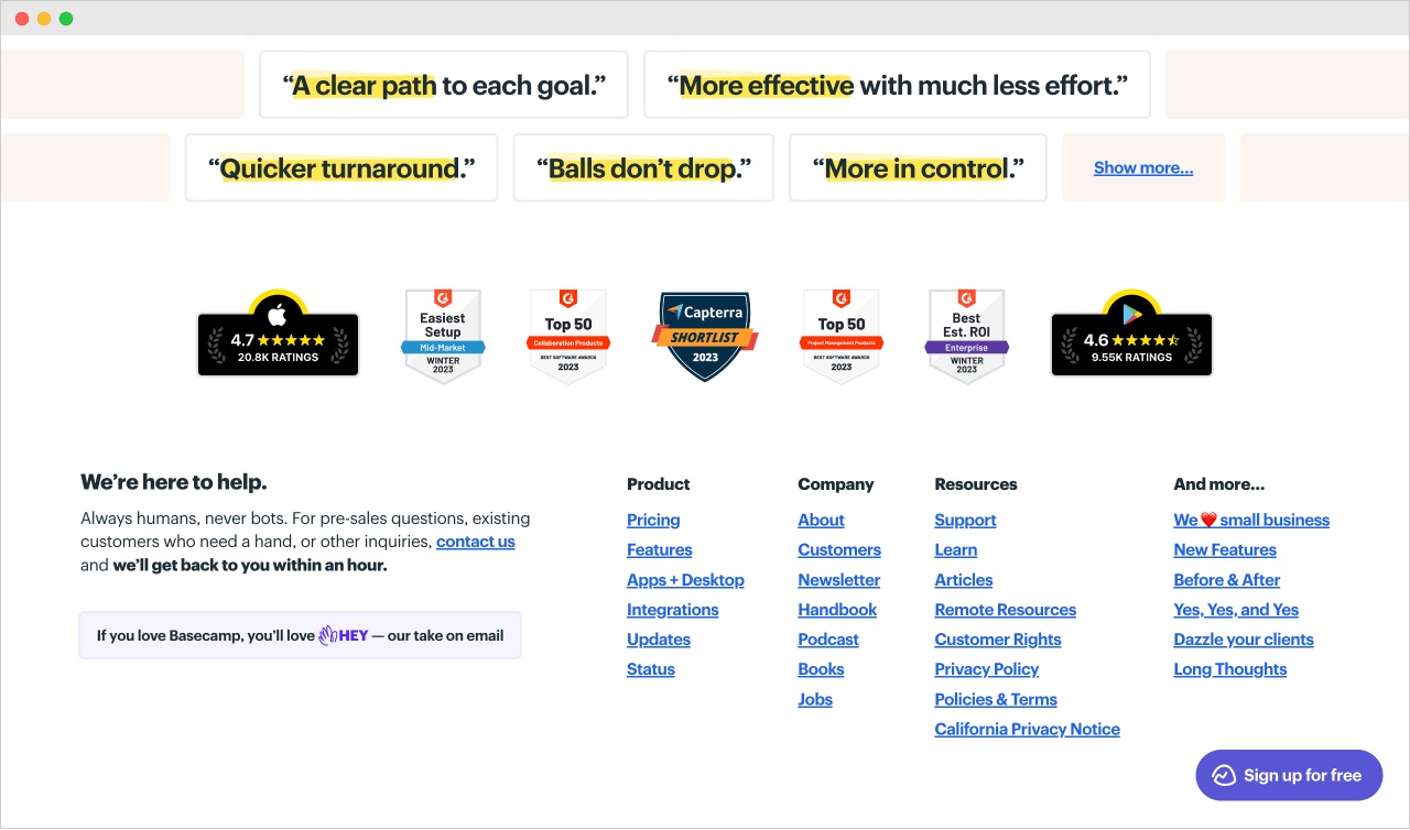
For example, the Basecamp website showcases its awards in the footer.
The thing is, 92% of people trust social proof such as:
- Awards and star ratings from third-party sites
- Logos of your well-known customers or clients
- Testimonials from happy customers
So, putting them in a footer area will only increase the conversions of your product or service.
And it will make people consider your other products too.
Anyway, I only want to convey one point with these two use cases.
We must use the footer estate properly to aid your website goals.
That’s all.
In the next lesson, we will see some best practices and common footer patterns so that you can build your site’s footer in an informed way.
 © 2026 UsableWP. A project by Naresh Devineni.