Creating our website header by adding logo, favicon, and the menu
Every website has a main header.
A website header usually contains the following:
- A logo
- Primary Navigation
- A Search Icon (if it is a blog)
- A Call-to-action button (if it is a business website)
For example, here is the header design of Stripe, a famous payment gateway:

It is a business website with a Call-to-action button on the far right.
Usually, the header design remains the same for every page on the website
This consistency is maintained to avoid confusion for website visitors.
And it is a common trend to remove the website header altogether from certain pages rather than changing its design.
For example, Stripe removed their website header altogether on its account creation page.
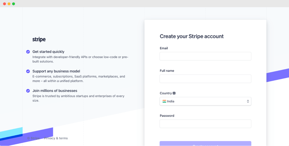
Most popular websites remove the header from their “Create Account” page so people can signup for their service without distraction.
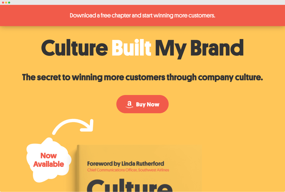
Removing the header is also a common practice for sales funnel-related landing pages.
For example, an ebook purchase landing page:
Common website header patterns
Now let’s quickly take a look at the other common header patterns.
Logo in the middle and navigation on either side

Navigation below the Logo
We will usually see this pattern on information-heavy websites.
Logo with hidden (off-canvas) navigation

We will usually see this pattern on portfolio/agency-based websites where navigation is not 100% critical for the website.
Logo on the left and navigation on the right

This is the most common pattern for small-business websites. We will be going with this pattern for our website’s header design.
Header with a top-bar
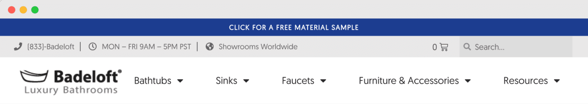
We usually see this pattern on e-commerce websites because quick navigation is essential for sales.
The conclusion
As you can see, you can definitely get creative in terms of the header design.
And most of the famous WordPress themes will quickly let you create these header patterns at the click of a button.
In fact, the free version of the “Neve” theme supports most of these patterns.
This is one of the reasons why I picked the “Neve” theme.
Anyway, In the next lesson, we will start building our website header by uploading the website’s logo.
 © 2026 UsableWP. A project by Naresh Devineni.