Fixing the white-space issues with the “Spacer” block and the “Content width” feature
First, let’s add some white space on the top and bottom sides of the section.
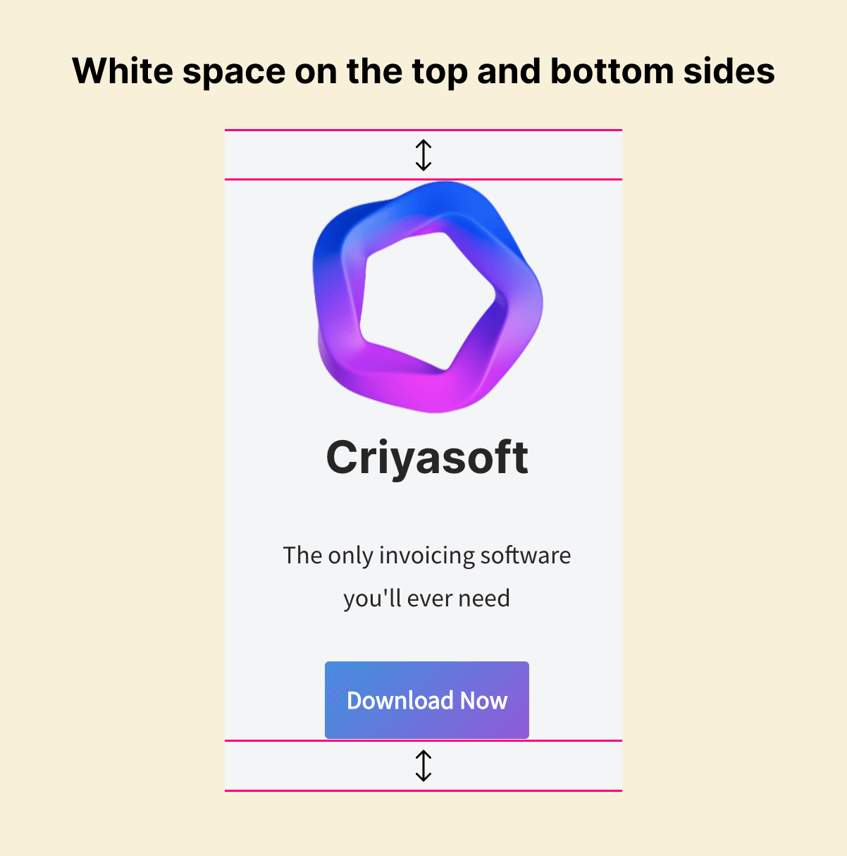
We can use the “Spacer” block to achieve this kind of white space.
We need to add a “Spacer” block on top of the Logo.
We must add a “Spacer” block after the “Download” now button.
Using the “Insert Before” option to add a spacer block on top of the Logo
First, select the logo image to bring up its “Toolbar Settings” and then click on the “Three dots” icon to bring up hidden options.
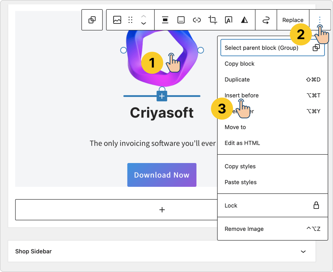
From the options, click on the “Insert Before” option.
This will let you add a block on top of the Logo.
Next, add the “Spacer” block and set its height to 40px.
Oops, 40px is a lot of space, so make it 30px.
We are using the “Insert Before” option because it helps us add a block before/above any pre-existing block and in a precise way.
This option also ensures that the “Spacer” block is added to the “Group” block.
We also have a similar option called “Insert After”. It helps us insert a new block after/underneath a pre-existing block.
So next, I have a small challenge for you.
Challenge: Insert a “Spacer” block after the “Download Now” button using the “Insert After” option
Make sure to set the height of the “Spacer” block to 40px.
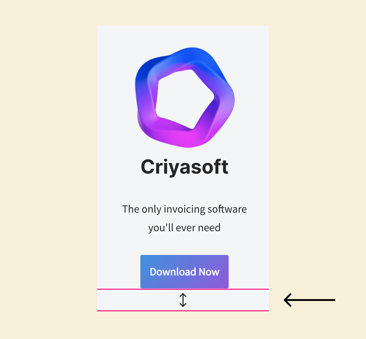
Solution
Selecting the “Buttons” block from the widget area is not easy. So better use the “List view” sidebar to select it and then use the “Insert After” option.
And the vertical spacing issue is now fixed:
Looking better already.
Next, let’s fix the white space on the left and right sides.
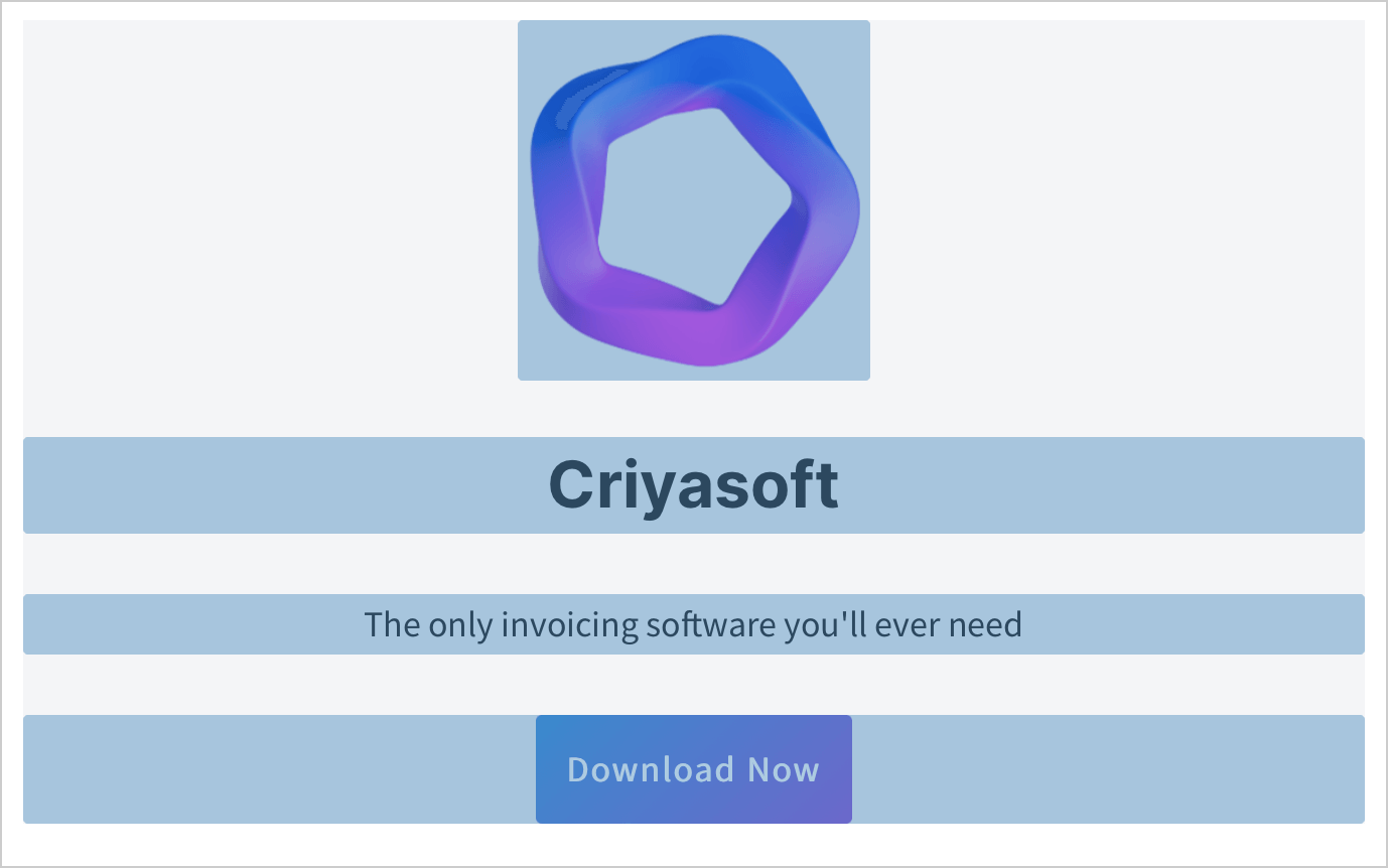
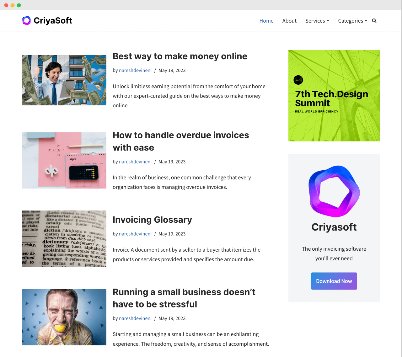
Currently, the paragraph “The only invoicing software you’ll ever need” is ramming into the edges of the box.
Add a content width of 80% to the “Group” block.
Currently, the nested content inside the “Group” block occupies all the width of the “Group” block.
If you notice the above image, apart from the Logo, the remaining three blocks occupy the entire width of the “Group” block.
The Logo is not occupying the full width because we have explicitly set its width to 175px.
So, the solution is to make the rest of the blocks occupy only 80% of the actual width of the “Group” block.
Unfortunately, apart from the “Image” block, WordPress doesn’t allow us to set explicit width to any other blocks.
But don’t worry.
Luckily, the “Group” block allows us to change the width its nested blocks could occupy using the “Content” option.
To access the “Content” option, first, make that the “Settings” sidebar on the right is open.
Next, Select the “Group” block by clicking on it. This will open up the settings related to the “Group” block inside the “Settings” sidebar.
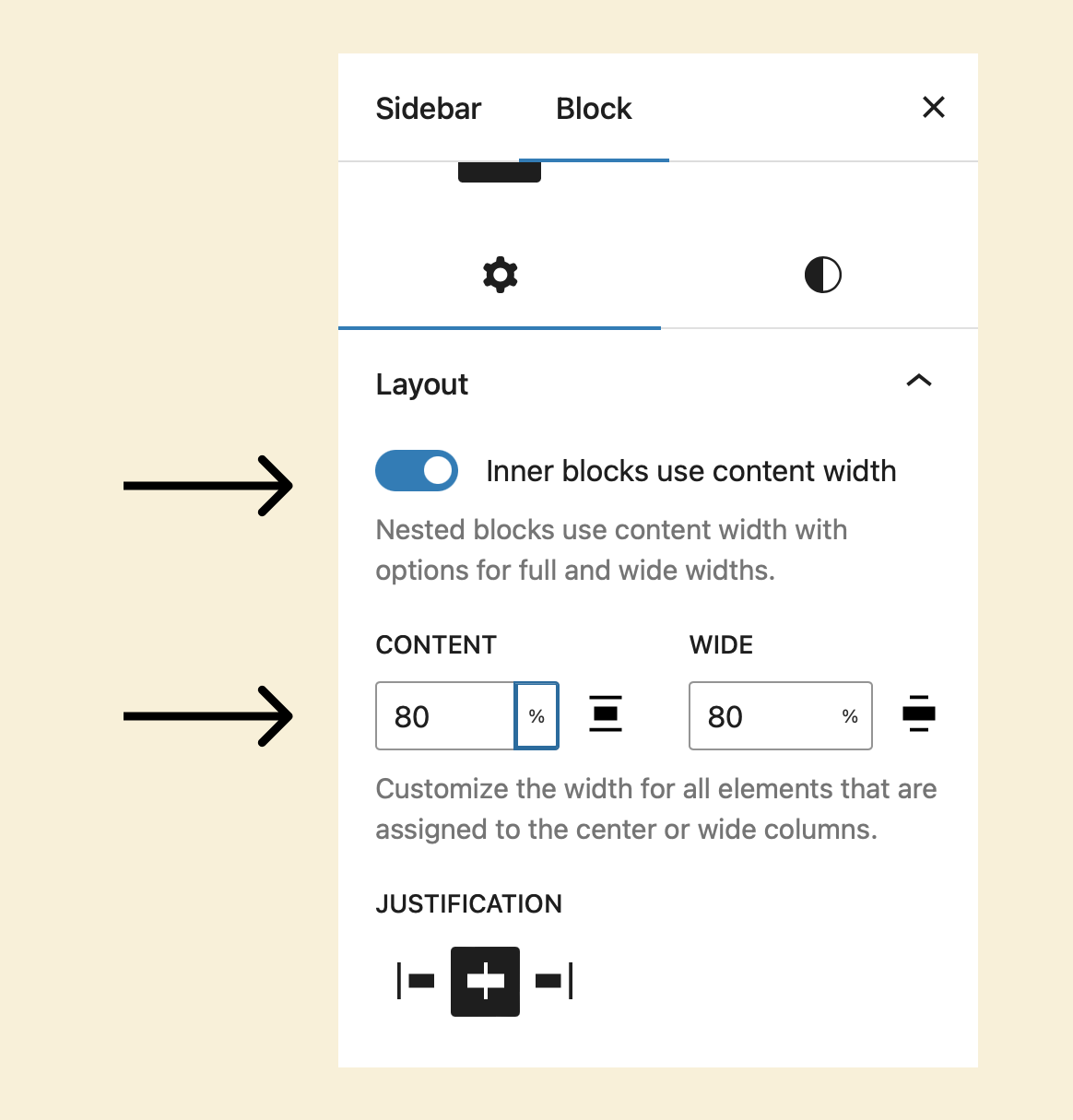
Next, ensure the “Inner blocks use content width” option is turned on.
Finally, for the “Content” option, put 80 as the value and choose the percentage % option for the metric.
This will make the content inside the “Group” block occupy only eighty percent of the actual width of the “Group” block.
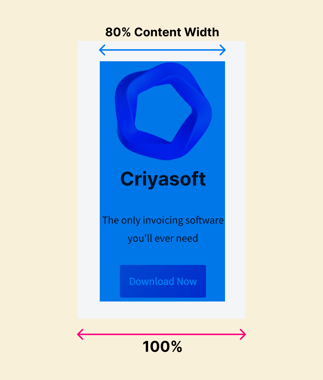
That’s how you add spacing on the left and right sides for the “Group” block.
I know it looks messy and hackish.
But this will change in the future in a positive way.
Here is what the final sidebar looks like:
Looking cool, isn’t it?

Yeah! Dope! But is it possible to add background image to the “Group” block instead of a background color?
Unfortunately, no!
But if you want to add a background image, try the “Cover” block
It is similar to the “Group” block but:
- It lets you add a background image instead of a background color
- You can also stick with a background color without using the background image
- It adds enough white space around the nested blocks automatically. You don’t have to fight with white spacing by adding spacers or changing the content width.
Here is a quick video demonstration of how to use the “Cover” block and build a fancy sidebar section:
Then why didn’t you teach the “Cover” block, first?
Hahaha…the “Group” block is much more powerful than a “Cover” block.
The “Group” block gives you good control over its nested blocks, but the “Cover” block doesn’t.
They both have their trade-offs, and you’ll know once you use them regularly.
In the next lesson, we will learn how to add “Widgets” to the sidebar.


 © 2026 UsableWP. A project by Naresh Devineni.