Changing the header layout because of the sidebar
Sometimes, a sidebar can blend in well with the existing layout seamlessly.
For example, I think that the sidebar inside the “single blog post” page blended well with the other elements of the layout:

But sometimes, a newly added sidebar could slightly disturb the balance of the existing layout.
This happened when I added a sidebar to the Homepage and archive pages of the website:
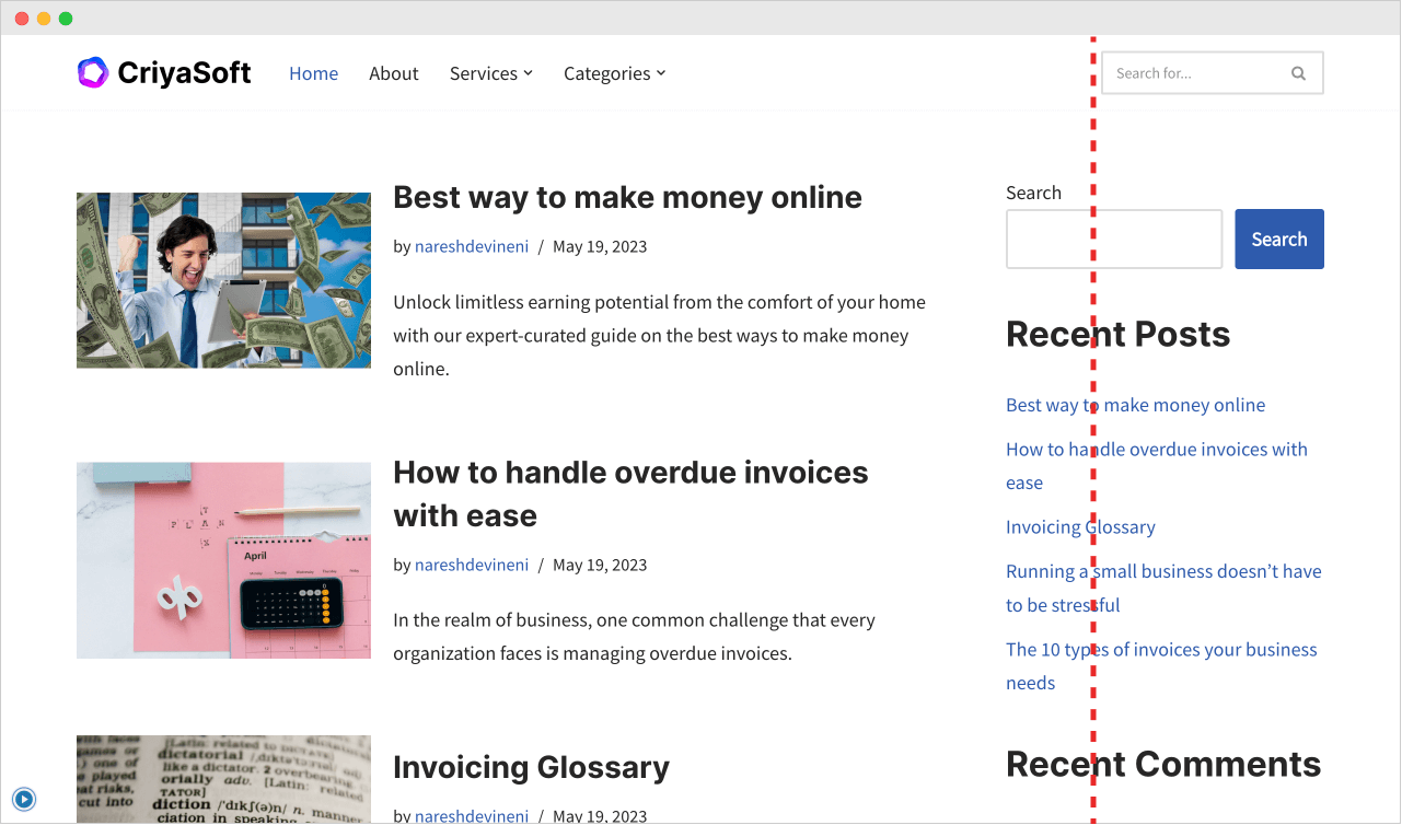
For some reason, I don’t like that the left edge of the sidebar is not aligned with the left edge of the search form in the header.
There is a sort of unbalanced feel to it.
It’s okay if you disagree with me. This whole thing is purely subjective.
Having said that, what could we possibly do to fix this layout issue?
I think we have the following options:
1) Remove the sidebar totally and bring back the old single-column layout

But I want the sidebar to promote my fictional product called “Criyasoft”.
It is not a good idea to miss the advantages of the promotional sidebar just because the layout is slightly disturbed.
So, moving on to the next action.
2) Increase the width of the search form in the header to match the width of the sidebar.
This is a good idea because the layout now looks balanced.
But the “Neve” theme doesn’t let me increase the size of the search form in the header. This is the same with many themes. Not just Neve.
So, we have to write some CSS code to increase the form’s width.
Do you know how to write CSS? If yes, go with this solution.
If not, let’s not touch on this option until you learn CSS.
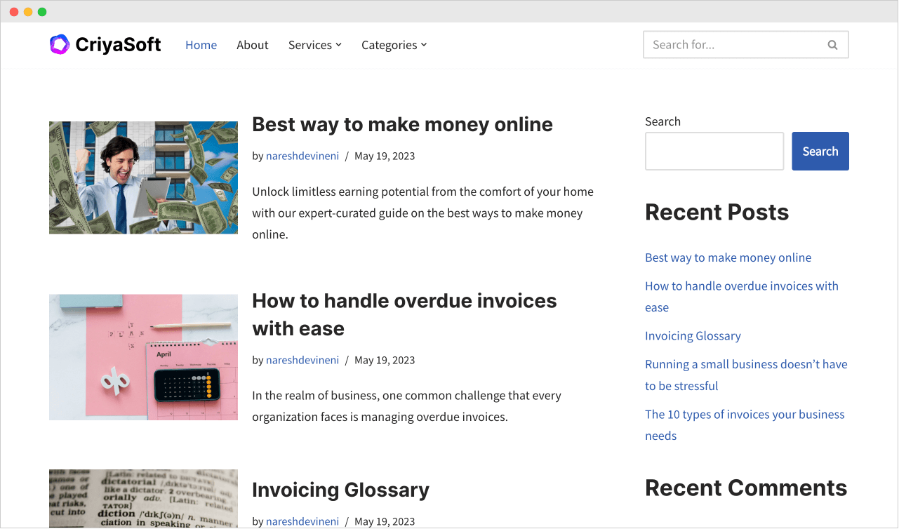
3) Change the header layout to make it look neat with the sidebar
This looks like a viable idea, and I like it because the “Neve” theme has other header presets.
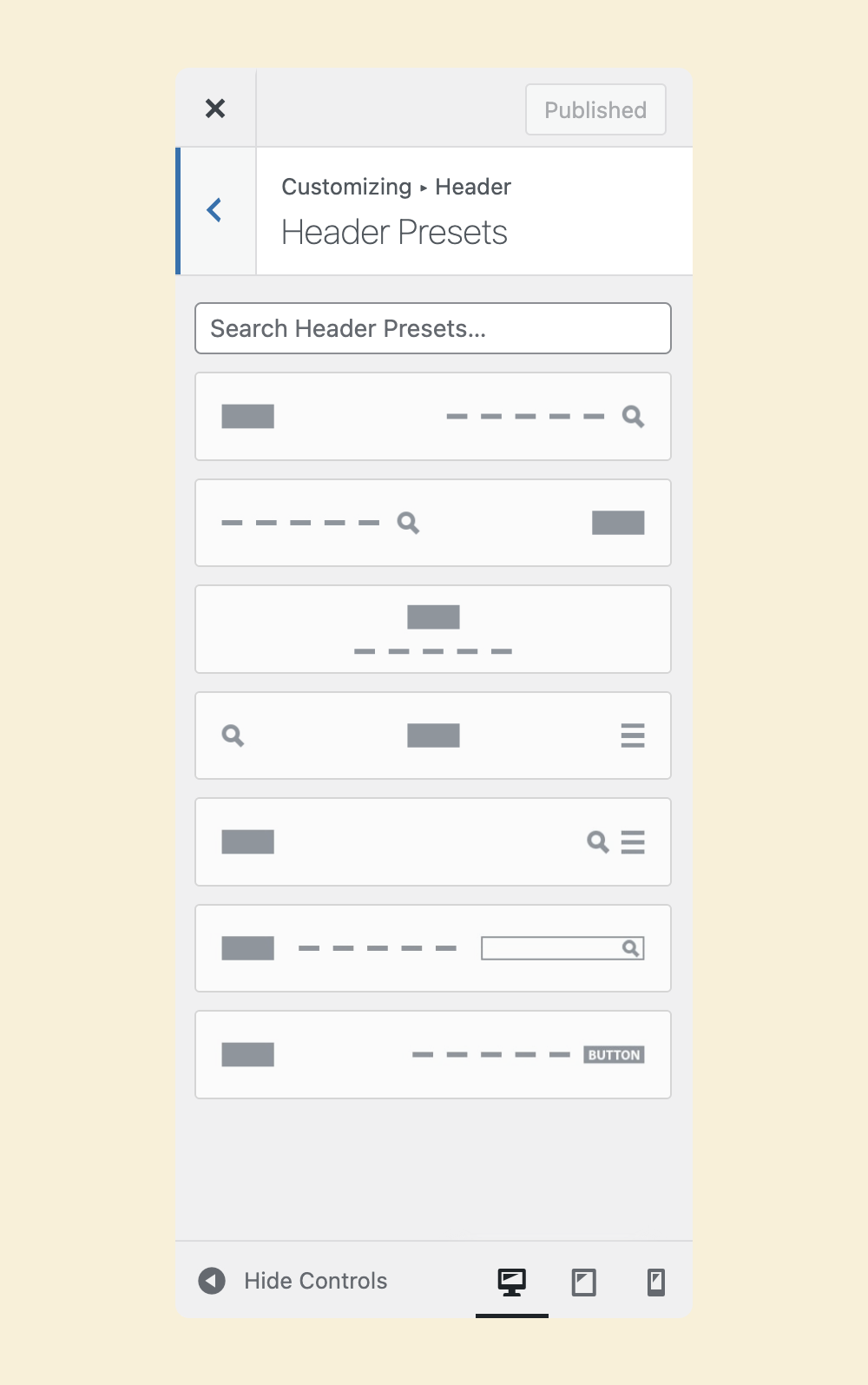
I will use the first preset with a search icon and navigation on the far right.
And there we go.

It is not great, but it looks better and works for now.
Anyway, in the next lesson, we will understan
d the widget areas of WordPress.
 © 2026 UsableWP. A project by Naresh Devineni.