Adding a background to the footer and fixing the spacing issues
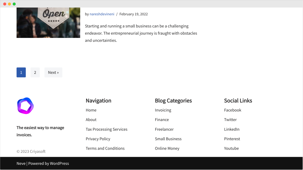
Here is the progress we have made so far with the footer:
Next, let’s add a background to the “Footer Main” section.
I want to use the color code #fafafa as the background color.
It gives the footer a nice half-white background color and separates it from the rest of the page.
To achieve this, click on the “Settings” icon of the “Footer Main” section inside the builder.
This will bring up the settings specific to the “Footer Main” section.
By default, the “Layout” tab is selected. But we need to switch to the “Style” tab.
And inside the “Style” tab, towards the end, there is a setting called “Row Background”.
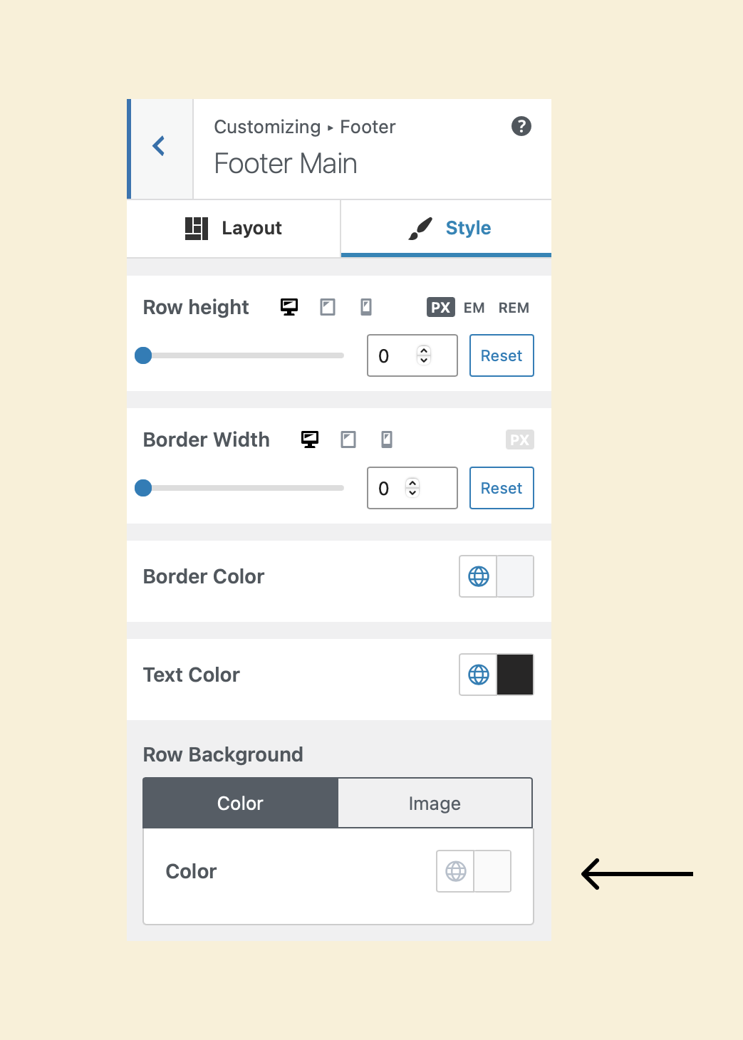
Choose the color #fafafa for it.
Finally, click the “Publish” button to save the changes.
That’s all.
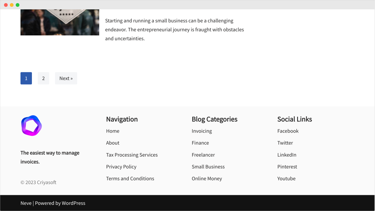
Here is how it looks on the frontend:
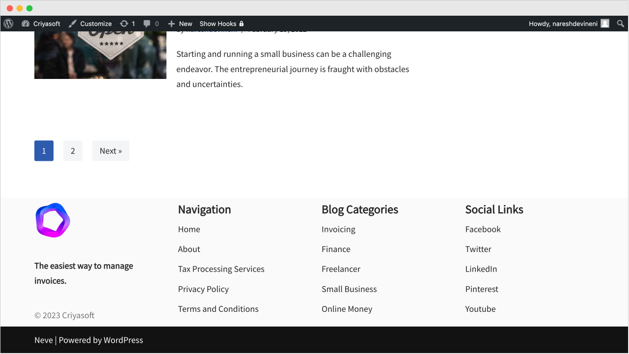
It looks like there is a problem with the spacing.
If you notice, the content of the footer runs into the edges of its background color.
It is happening in both the top and bottom directions.
But don’t worry.
We can easily fix this by adding top and bottom margins for each active component inside the footer builder.
Adding top and bottom margins to the individual components
First, let’s add 20px of top and bottom margin to the “Footer One” component inside the Footer Builder.
For that, we first need to access its “Layout” settings.
And we can easily access them by clicking on the “Adjustment” icon that is present inside the “Footer One” component box:
This will bring up the layout settings that are specific to the “Footer One” component:
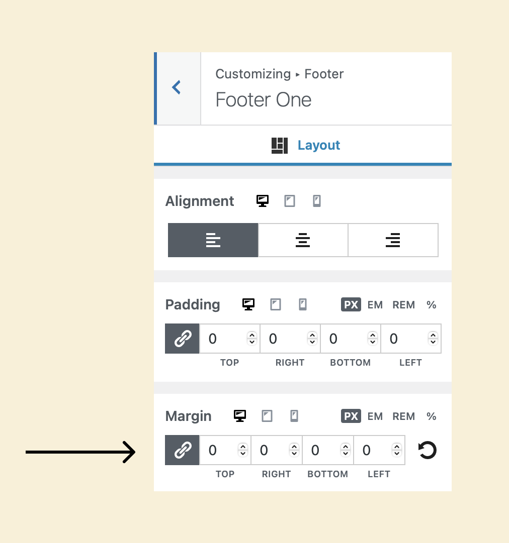
Now, if you notice, there is a setting called “Margin” and it allows us to add some empty spacing on all four sides of the component:
- Top
- Right
- Bottom
- Left
Currently, the margin for all the directions is zero.
But we want to add empty spacing on the top and bottom directions of the component, right?
So, first, let’s enter the value of “20” for the “Top” direction.
This will help us add an empty space of 20px on top of the logo.
Wait, what did just happen?
I tried to enter a value of “20” px of margin to the “Top” direction.
But the same value of “20” px was also automatically added to all the remaining directions.
And when I tried to remove the margin from the remaining directions, the “Top” direction’s margin is changing too.
Why?
This is happening because the “Link Values” option is enabled for the “Margin” setting.
If you notice, there is a “Link” icon beside the values of the directions.
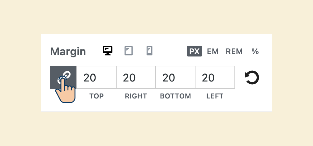
That is the “Link Values” option.
And we can disable it by clicking on it.
And once we turn it off, we can enter the values individually for the directions we want to add empty spacing.
In my case, I added 20px of empty spacing to the top and the bottom directions.
That’s all.
Finally, repeat the same process for the remaining components inside the “Footer Main” section of the builder:
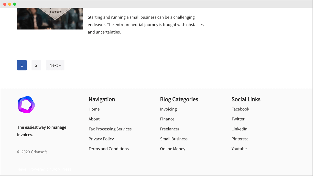
Finally, here is how the site’s footer looks now:
Wow!
The spacing now looks tidy!
This is all good.
But I don’t like the black bar that says “Neve | Powered by WordPress”.
The black color background is taking all the attention.
But we can’t get rid of the black bar because we are using a free theme.
So, what’s the solution here?
Simple! We need to tone down the background color so that it doesn’t take attention.
The finishing touch to the footer
Come on, let’s change the black background color to use the same background color as the “Footer Main” area (#fafafa).
To achieve this, click on the “Settings” icon associated with the builder’s “Footer Bottom” section.
Next, switch to the “Style” tab.
Then, change the “Row Background” to #fafafa.
Finally, click on the publish button to save the changes.
And here is how the bottom portion of the footer looks now:
Wow, did you see that?
Now the footer design looks nice!
In fact, as a positive side-effect, the text “Neve | Powered by WordPress” got lost in the background :P
It is now almost invincible.
I am the villain 😈
One shot, two birds :D

This is the best possible footer design we can achieve with a free theme.
Isn’t it nice enough?
This footer works for most of the websites on the internet.
So, in the next lesson, we will conclude this module and move on to the next one.
 © 2026 UsableWP. A project by Naresh Devineni.