Challenge: Finishing up the hero section
Here is your super easy challenge
Underneath the button that we added in the last lesson:
- Add a paragraph that says “$29 / year – includes 12 months of updates & support” and set its font size to “Small”.
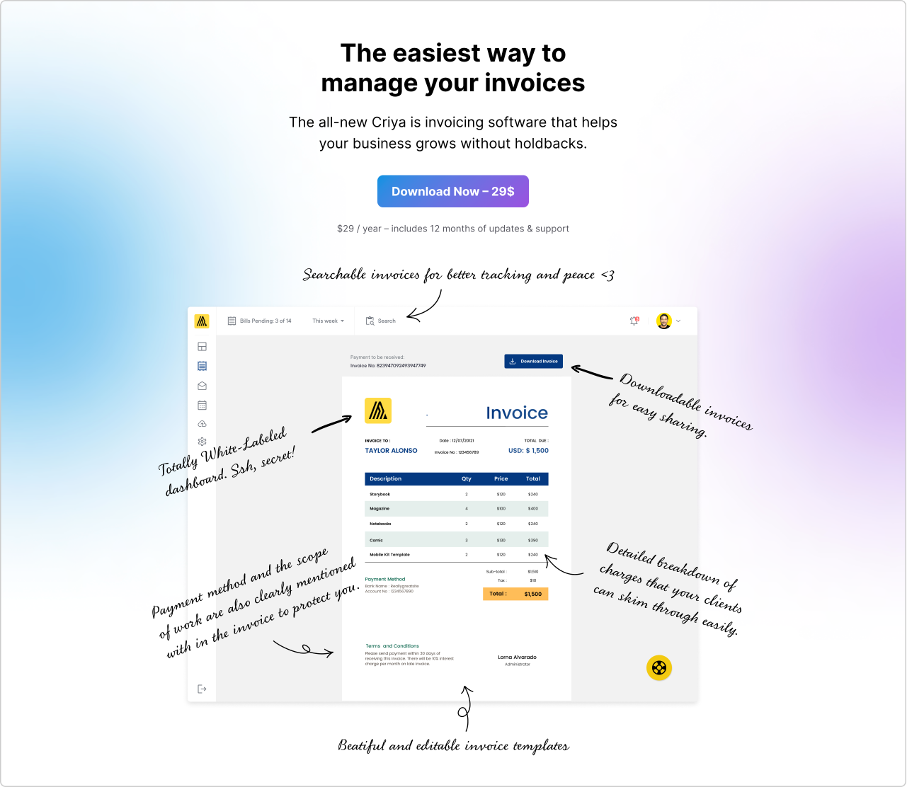
- Next, underneath that paragraph, add the image provided below and set the image width to 860px.
- Finally, make the “Cover” block occupy the entire width.
Solution: Adding a paragraph and changing its font size to “Small”
Solution: Adding an image right underneath the paragraph and center aligning it
Here is the final preview:
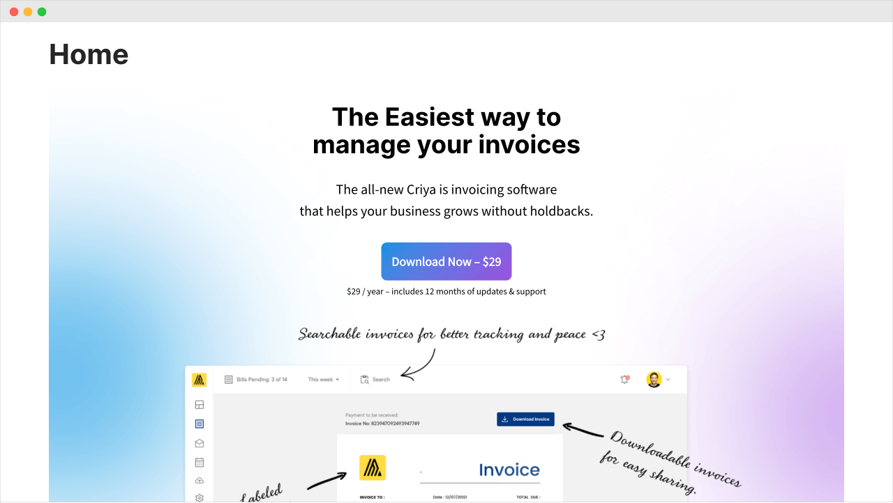
And bang! We have got cheated!
If you notice the above screenshot, there is no space between the button and the small paragraph that follows it.
But if you look at the Block Editor, there is an ample amount of space between them:

The reason behind this is pretty simple.
The Block Editor adds spacing between the blocks so that we can:
- Add new blocks
- Select individual blocks and do something with them.
This also tells us that we should check the preview every time we make a change inside the Block Editor.
Get into this habit, and it saves you a lot of time.
Anyway, here is your new, unexpected challenge.
Using the “Spacer” block, add 20px of space between the button and the small paragraph.
Solution
Sometimes, the default spacing between the two blocks is not enough.
So, we need to manually add the required space using the “Spacer” block.
Did you see that?
Using the “Spacer” block is the same as using any other block.
Here is a preview of the solution:
Looks neat, right?
But I can see one other problem, though.
The Hero section’s background image does not occupy the entire browser width.
And here is how we can fix it…
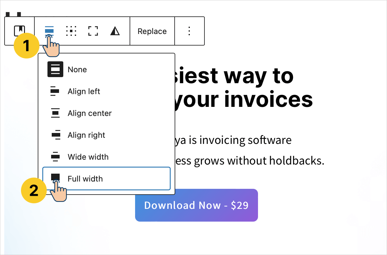
Solution: Make the “Cover” block occupy full-width
To achieve this:
- Select the “Cover” block (not any of its children)
- From its “Toolbar Settings”, click on the “Align” button and choose “Full Width”
And here is the final preview for this lesson:

Did you see that?
The Hero section now looks fantastic, isn’t it?
But there is one minor disturbance, and we will fix it in the next lesson.
 © 2026 UsableWP. A project by Naresh Devineni.